
Typography, or the design of letters, used to be confined to books, magazines, and ads, but that was pre-internet. Today? Different story. Typography art is everywhere, ranging from delightfully minimalistic to loud and proud. We’ve compiled 15 unique examples below that’ll have you ready to start creating typography art yourself. The best part — you can create eye-catching typography masterpieces right in PicMonkey. Let’s start with the inspo, then we’ll show you how!
What is typography art?
Typography art is the design of letters.
Wait, isn’t that the same definition as typography?
Absolutely. In itself, typography is an art form. And when you think of the design of letters, there’s a lot to consider. Font style...appearance..organization...all of these lend to the final visual, and the final visual should elicit emotion and convey a message to anyone who views it.
Human beings are multimodal learners. We can gather meaning from what something says, in addition to how it looks. That’s why superior typography art designers manage to kick their words up a notch, often using visual elements to complement literal meaning or add symbolism to the design.
Now let’s show you what we mean.
15 typography art examples
All of these artists are masters at their craft. If you’re just getting started with typography art, we’re totally in favor of you looking at more of their work and gathering TONS of inspiration for your own designs.
Chill Vibes by Jessica Hische
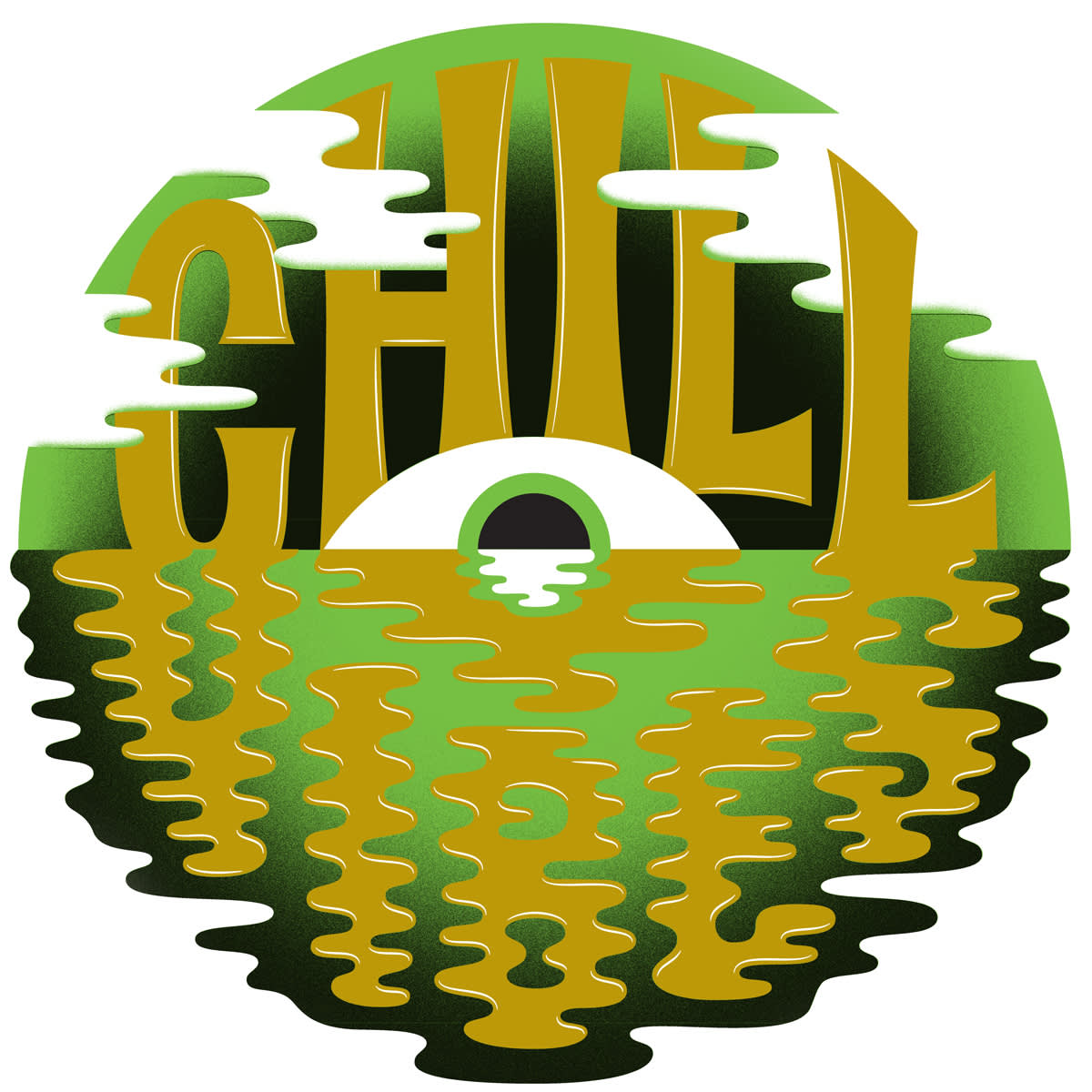
See this and more on Hische’s website.
Hische made this for a music-focused edition of Pop-Up Magazine, where she was tasked with visually representing her own feelings about music in California.
Besides a totally groovy color scheme, Hische layered the “Chill” text to give it a 3D look. “Vibes” is designed to look like it's part of the water, resulting in a final design that certainly gives off chill vibes.

See this and more on Hische’s website.
Another example of Hische’s involves creating typography out of...typography. Descriptive words in cursive styling come together to form Splenda’s capital ‘S.'
Hische says the words are what the Splenda team felt represented the brand, making this design a perfect example of using typography art as an eye-catching form of branding.
Today is a Good Day by Ben Johnston
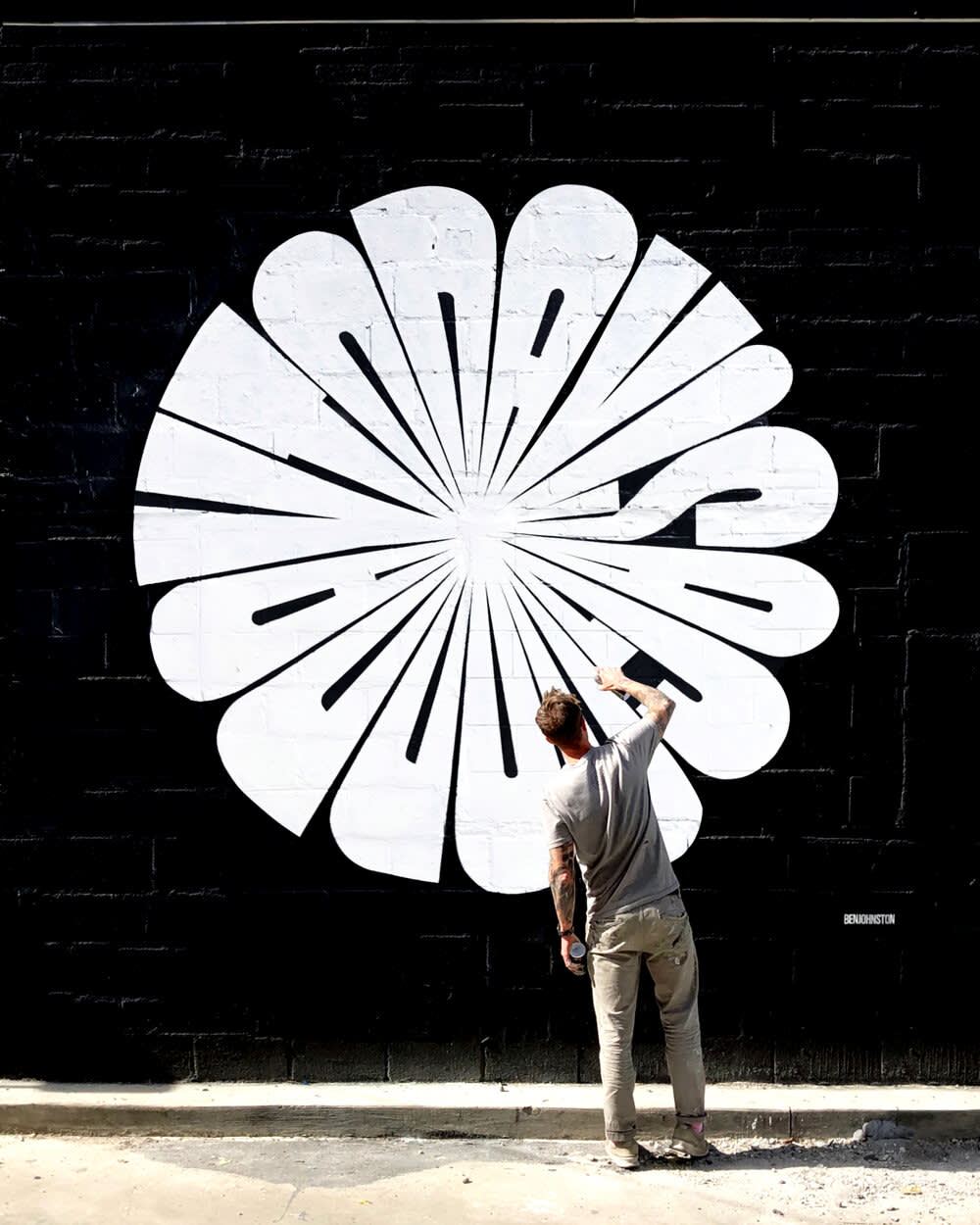
See this and more on Johnston’s website.
Johnston uses custom typography for murals, advertising, and public art, like you see here. We’ve talked about before using curved shapes in designs — humanity tends to have a natural appreciation for circular images, logos, watermarks, etc.
In Today is a Good Day, there’s something comforting about the symmetry and perfect letter spacing. Also, if you think this is a large-scale design, check out some more of Johnston’s work. Spoiler: It gets larger!
Swallow by Peter Strain

See this and more on Strain’s Instagram.
Strain’s work is deeply detailed, often combining stylized hand lettering with surreal imagery. His art takes inspiration from film and music, as well as social, political, and cultural issues.
Scroll through his collection and you’re sure to recognize a few faces (and see some incredible examples of typography art).
Big Brother and the Holding Company by Victor Moscoso
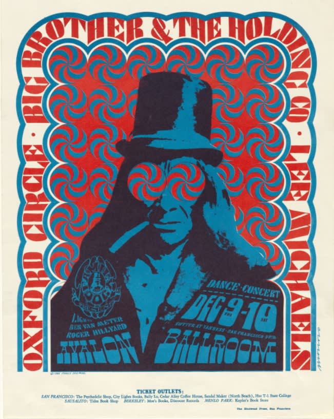
See this and more of Moscoso’s work at The Museum of Modern Art.
Victor Moscoso is a Spanish artist, known for creating psychedelic artwork. A lot of his most popular projects were rock posters, ads, and underground comix from the 1960s and 1970s.
Take this piece, for instance — a 1967 poster for Big Brother and the Holding Company. The piece makes use of typography in several different places, complementing the eclectic colors and design that is representative of Moscoso’s style.
Pop-Up by James Victore

See this and more at Victore Posters.
Victore has an eclectic collection of posters on his Behance profile, all imbued with various iterations of typography art. This one channels a look of yesteryear: finger painting.
Finding Definitions by Scott Albrecht

See this and more on Albrecht’s website.
Albrecht describes his approach to art as being largely informed by typography. He looks for ways to deconstruct letterforms, as we see here. Worth noting, too — this is a woodwork piece!
Hand lettering art by Pommel Lane

See this and more at decor8.
Lane uses beautiful, handmade lettering over imagery in order to tell a story. These designs are perfect examples of text informing imagery and imagery informing text.
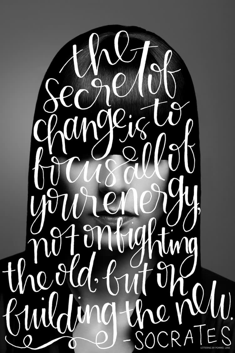
See this and more at decor8.
Too Much Night, Again by Pae White

See this and more of the 2013 exhibit here.
Pae White debuted Too Much Night, Again at her 2013 exhibit in the South London Gallery.
This is string art, where an artist arranges colored thread by stringing it between different points. The result is often a geometric pattern or other representational design. In this case, it’s typography!
The Vilcek Prize design by Stefan Sagmeister

See this and more on Sagmeister’s website.
The Vilcek Prize honors the achievements of foreign-born Americans within the fields of the visual arts and biomedical research. It’s personalized to the award recipient and is made via 3D printing.
Sagmeister describes the award as a “very sharp, high typographic pyramid that takes its cues from carefully set typography.”
Stripes by André Beato

See this and more on Beato’s Behance profile.
Fun fact: If you stare long enough at this design, your eyes will hurt.
Beato contorts otherwise straight lines to create typography in the design’s center. We see his initials — do you?
Yep by Charles Williams
See this and more at Made Up.
In an interview with designboom, Williams said (about wanting to become a graphic designer) that “I used to like drawing 3D letters, just using the shadows to show the 3D blocky forms. I like to pretend I’ve progressed beyond this early fixation, but we all know that’s not the case.”
Well...now they’re animated 3D letters.
In It Together by Graffiti Arts
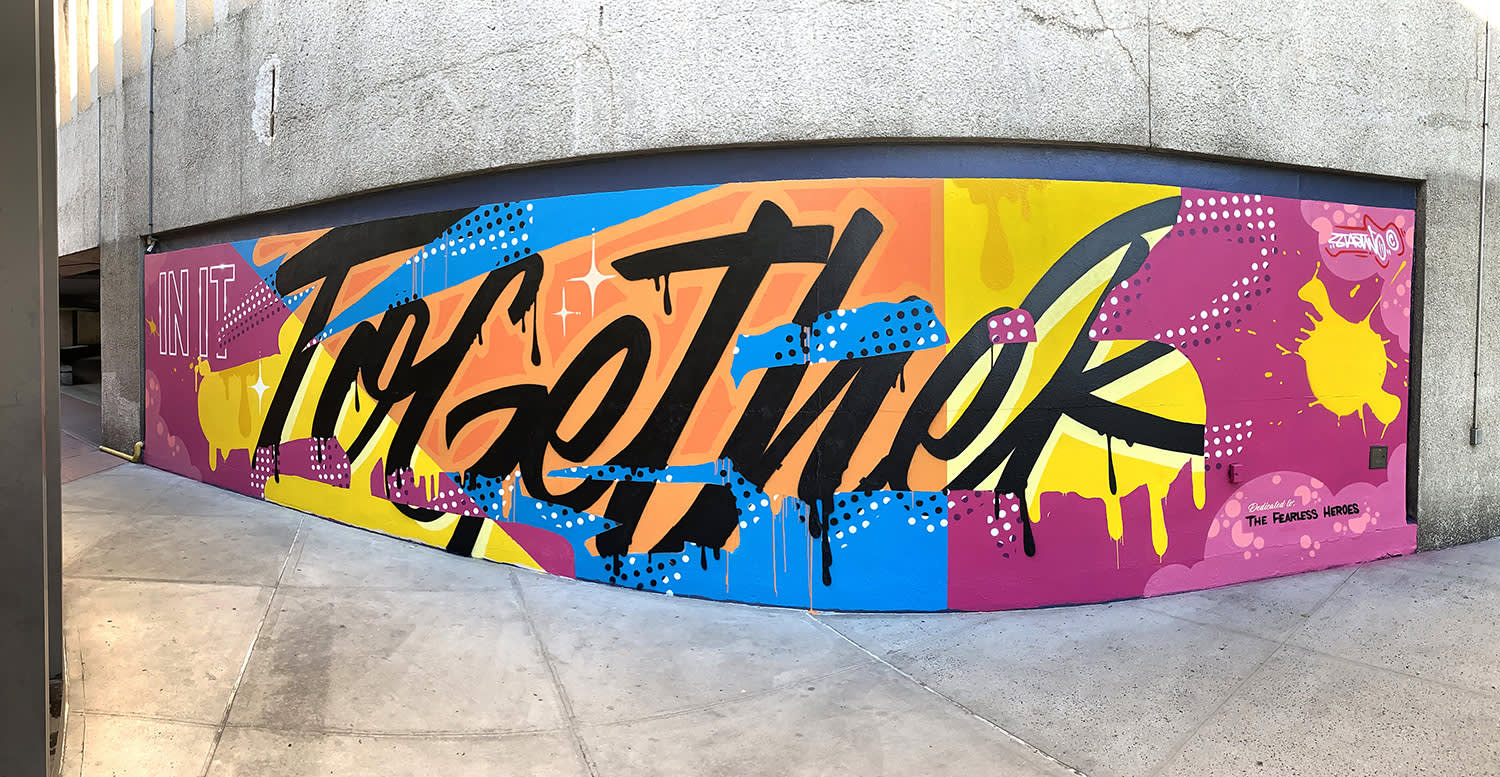
See this and more on Graffiti Arts.
Graffiti Arts was commissioned to create this typography art design in appreciation of first responders and the Elmhurst Queens, NY community.
Vibrant colors intersect with a bold font type to form a layered and multi-dimensional work of art. You might’ve seen Graffiti Arts’ murals elsewhere — their graffiti and street artists work nationwide!
Summer by Margaret Scrinkl
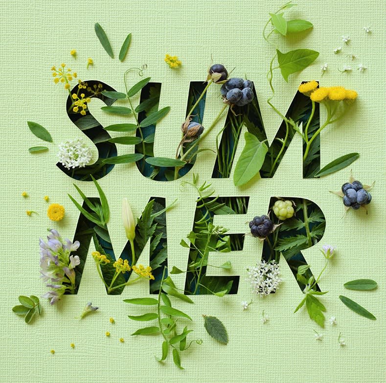
See this and more on Scrinkl’s Behance profile.
Scrinkl fills her bold typography with imagery for a super eye-catching (and seasonally appropriate) look.
5 ways to create typography art in PicMonkey
Feeling inspired and ready to create? Here are 5 ways that you can start channeling your inner-typography artist using PicMonkey!
1. Use a handwritten font as an image overlay
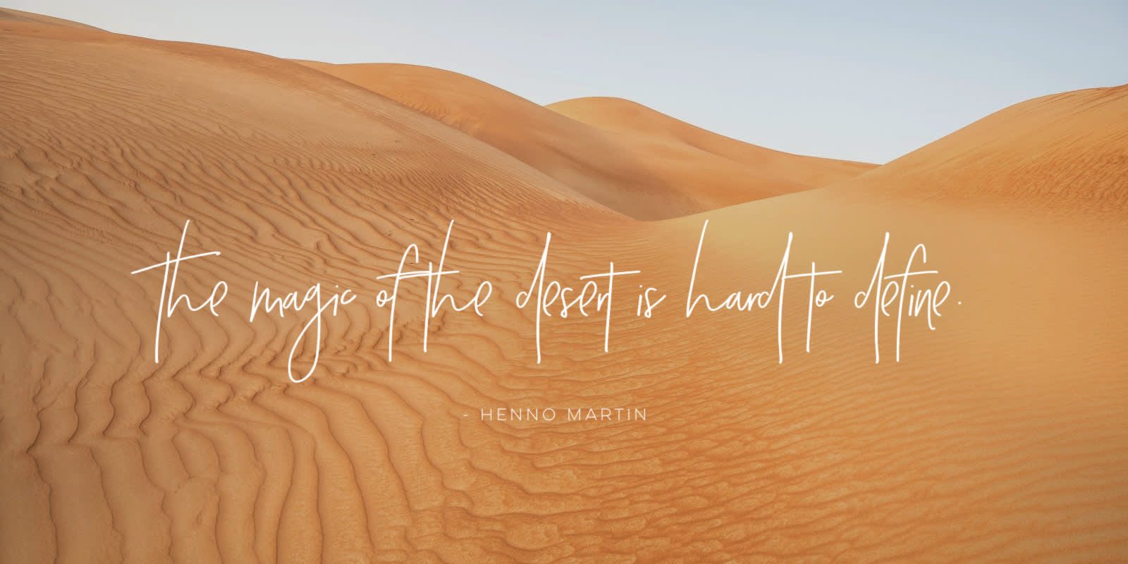
You have hundreds of fonts to choose from when designing in PicMonkey. Select a handwritten font like Bombshell Pro, Saturday Script, or La Belle Aurore, decide what you want to say, and place it over a relevant image.
To add text to a photo in PicMonkey:
Open your image, or choose one from our Shutterstock photo library.
Click the Text tab on the left, then click Add text.
Customize your font, text color, size, letter spacing, and more.
2. Layer text on photos

Make your typography art multidimensional by layering text on your image!
To layer text on a photo in PicMonkey:
Open your image, or choose one from our Shutterstock photo library.
Click the Text tab on the left, then click Add text.
Use the eraser tool to erase parts of the text where you want it to appear behind an object or subject in your image.
Explore more: Layer Text on Photos for High-End Designs
3. Fill text with an image

If you found yourself staring at Margaret Scrinkl’s Summer design for extra long, then filling your text with an image might be just the right kind of typography art for you.
With your text layer selected in PicMonkey:
Click Fill with image in the Text Tools menu.
Upload your own image, or use a stock photo.
Explore more: How to Put a Picture Inside Text with Clipping Masks
4. Make typography art from graphics
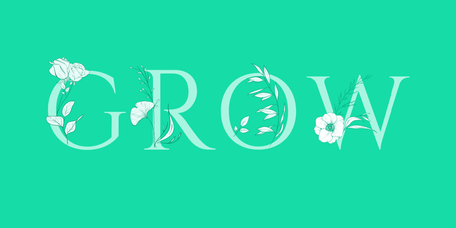
There isn’t just one way to make typography art using PicMonkey’s graphics — you can use multiple graphics at once, use them as embellishments to your text, or even use them to create typography.
To use graphics in PicMonkey:
Start with a blank canvas or template.
Click the Graphics tab on the left.
Select your graphic(s).
Customize using the left Graphic Tools menu.
5. Curve text for a unique look

Try adding a bit of curvature to your typography, or creating circular text for logos, watermarks, ads, and more.
With your text layer selected in PicMonkey:
Click Curved text in the Text Tools menu.
Select either “Circle” or “Arc”.
Adjust as necessary.
Explore more:
