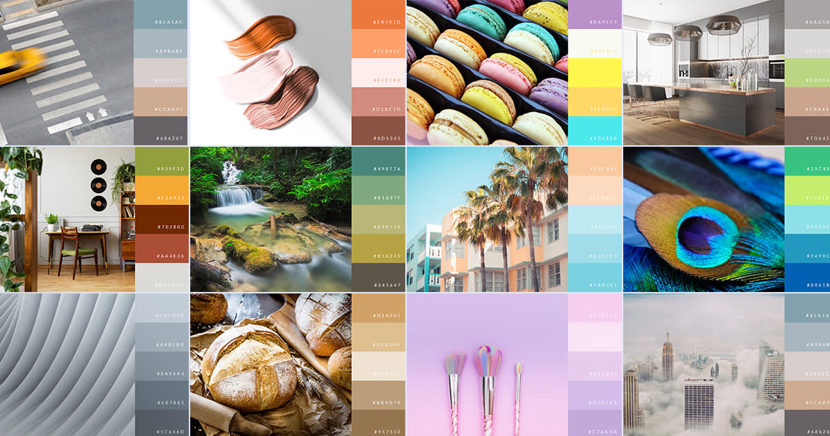
The real MVP behind any dazzling design is its color palette. Colors speak to our senses. They purvey feelings and ideas that can directly influence an audience and steer consumer decision-making.
Combining colors can also be a one-stop shop for nasty headaches. Ask any disciple of color theory. It’s not always easy to start from scratch when there are literally hundreds of different colors at your disposal. That’s why we’ve taken it upon ourselves to make your designing life SO much easier.
Below, you’ll find 100 color combinations to get your design juices flowing. This list can be pretty overwhelming, so we’ve organized our combos in a way that should make navigation simpler. Feel free to peruse our entire list, or use this table of contents to jump to a specific section.
Basic color combinations 101
If you’re completely new to choosing color palettes, here’s a quick rundown on basic color combinations. There are five basic color combinations we’d like you to keep in mind (and you’ll see all five of these in our examples).
Analogous colors
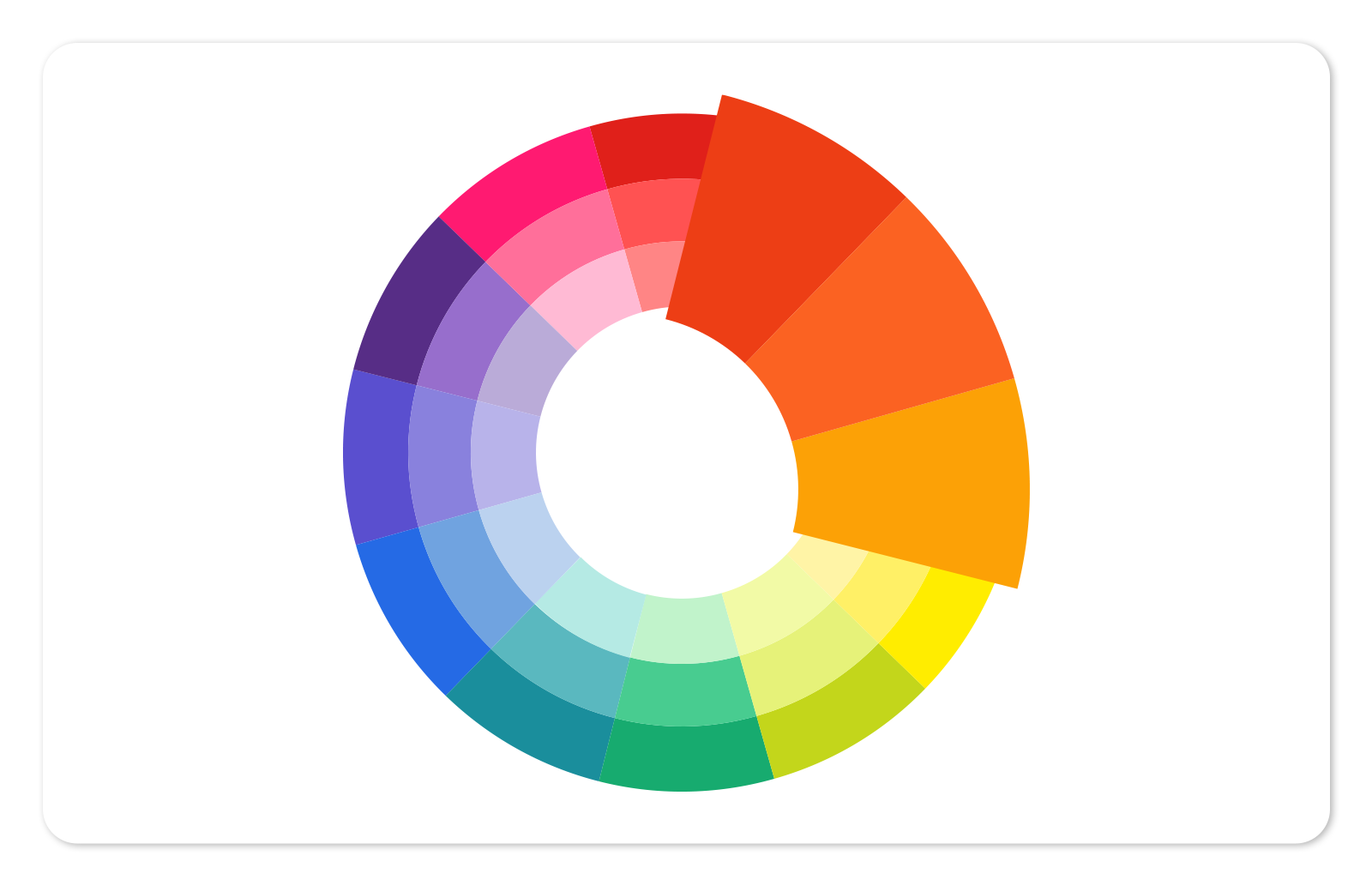
Analogous colors are those that are next to each other on the color wheel. They naturally match, offering a soothing and serene feeling to any design. It’s harmony in action.
Complementary colors

As their name suggests, these colors complement each other quite well. On the wheel, they sit across from one another. They’re ripe for contrast, which means a design that’s both vibrant and exciting.
Examples: Purple & Yellow or Blue & Orange
Triadic colors
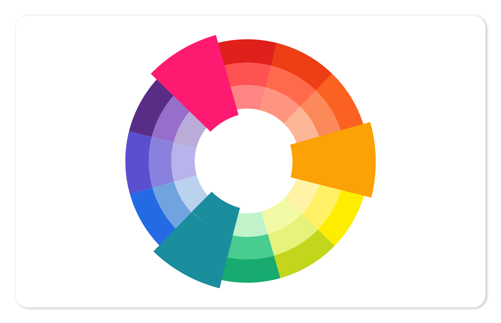
Triadic color schemes come from colors that are equally spaced on the color wheel, forming a triangle. If you use a triadic color scheme, you still want one color to be the star with the other two singing backup, so that your design doesn’t become too loud and crowded.
Example: Teal, Orange, Fuschia
Tetradic colors
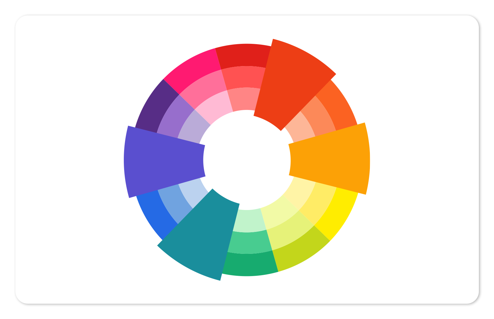
For an advanced color scheme, try a tetradic grouping. This uses four colors, or two complementary pairs. A nice contrast is guaranteed, just make sure to balance your choices. Since these colors are on opposite sides of the wheel, you’ll have both warm and cool hues in action.
Example: Purple, Teal, Rust, Tangerine
Monochromatic colors

Monochromatic color schemes use only one hue’s variations. The result is a design whose colors blend together perfectly and offer a refined look. Since you’re using different tints and shades of a single hue, you can still capture plenty of contrast throughout your design.
Example: Cinnamon, Burnt Orange, Orange, Salmon
Warm and cool colors
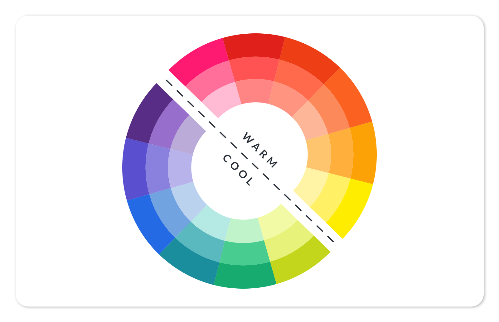
Last bit of information before we jump into examples: understand the difference between warm and cool colors. While there’s some debate about which colors are warm and which are cool (especially when green’s involved), the quickest method to deciphering warm from cool is to split your color wheel in half. Right side’s warm, left side’s cool.
A note on how to use these palettes for your own designs: download or screenshot the image and import it into the PicMonkey editor. Use the eyedropper tool to quickly pick up a color. Or enter the HEX code into the color picker. Learn more: How to Use the Color Picker
SEASONAL
1. Elephant sunset

Complementary colors fuse to create something that’s both warm and serene.
2. Natural energy

Variations of blue and orange pair well together. We’re reminded of a spring or summertime sunset.
3. Squash soup

For something reminiscent of fall (or just for superior contrast), combine dark colors of warm and cool hues. Look at how well the burnt orange contrasts with indigo.
4. Pumpkin spice

Nothing says fall more than various tints and shades of orange. Green and black complete the look, adding an earthy feel to the palette.
5. Tuscan vineyard

It seems like there’s a perpetual golden hue that comes with the fall season, and this palette captures that golden aesthetic in full. Blue and green blend well with the warm colors, adding balance to the look.
6. Coast at dusk

Dark shades make this palette cool and natural. Neutral variations of brown serve as a staunch contrast to refreshing blues. We’re left with feelings of peace and serenity.
7. Winter

Not only do cool blues foster calm and harmony, they’re also a popular choice for companies out to establish trustworthiness as one of their virtues. Despite the wintery vibe that comes with a palette like this, the rich contrasts make it suitable for many different designs.
8. Fall

Ultra rich colors combine in this palette to create that warm fall look we all know and love.
9. Summer

Light and bright colors are perfect for reminding an audience of all those joyous summertime feels.
FOOD AND DRINK
1. Pizza party

These rich and rustic colors will leave anyone with ‘za on the mind.
2. Matcha tea

If not for the use of gray, this would be a purely monochromatic scheme. Regardless, the green variations blend harmoniously.
3. Grapevine

There’s a certain elegance and majesty that comes with purple and its variations, like in this sophisticated combination of violets and chartreuse.
4. Coffee beans

Coffee’s only one of the rich flavors you can put on someone’s mind when using this color palette. And beyond culinary subtext, this array of monochromatic browns is well-suited for earthy designs.
5. Spice rack

Have you ever been to a spice shop and seen the rows of spicy splendor lined up side by side? They’re vibrant, just like these colors suggest. Use for a bold design.
6. Berry brights

A delicate tint of pink offers plenty of opportunity for contrast with darker shades of red. This is definitely a palette that packs a whole lot of sumptuous passion within its colors.
7. Juicy pear

When you want a final design that’s down-to-earth and organic, this combination of neutral colors does the trick.
8. Citrus cocktail

Light and refreshing is the name of the game when these colors come together.
9. Mint chocolate chip

Brown against variations of green is a match made in heaven. The key here is using brown as an accent against an already layered combination of green. As a result, it pops.
10. Farmers market

Brown’s earthiness + green’s naturality + orange’s energy = an authentic and fresh color scheme.
BOLD AND VIBRANT
1. Ladybug
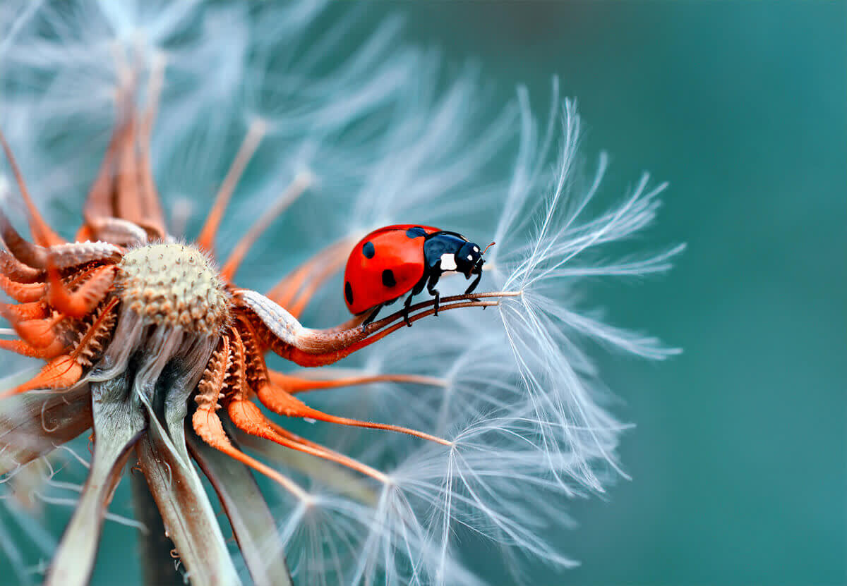
Red and green are complementary colors that coexist like two peas in a pod. A dab of red in this scheme sticks out...well, like a ladybug on a blade of grass.
2. Sunny mornings

Joy, happiness, and good vibes come from yellow-dominated color palettes.
3. Giftwrap

For a little extra flare (if it’s warranted), go with some bright pastel colors.
4. Analog retro

If you’re aiming for vintage but not too far in the past, these colors call back to the ‘90s with gusto.
5. Birds of paradise

Notice how well these colors blend together, so that the final palette is bold but not overly brassy.
6. Jewel tones

Sometimes you just want colors that speak for themselves. Nothing wrong with that.
7. Greece

The real star here is the dark shade of gold. It’s a bold accent to an otherwise subdued color scheme, but can still maintain the soothing ambiance that the blues and gray cultivate.
8. Coral reds and blues

By default red is a flashy color. Mix with blue and you’re sure to have a rich palette that will make any design sparkle.
9. Warm paint

Subtle flashiness is also welcome, like we see here with quieter colors that still blend together to create a striking scene.
10. Peacock
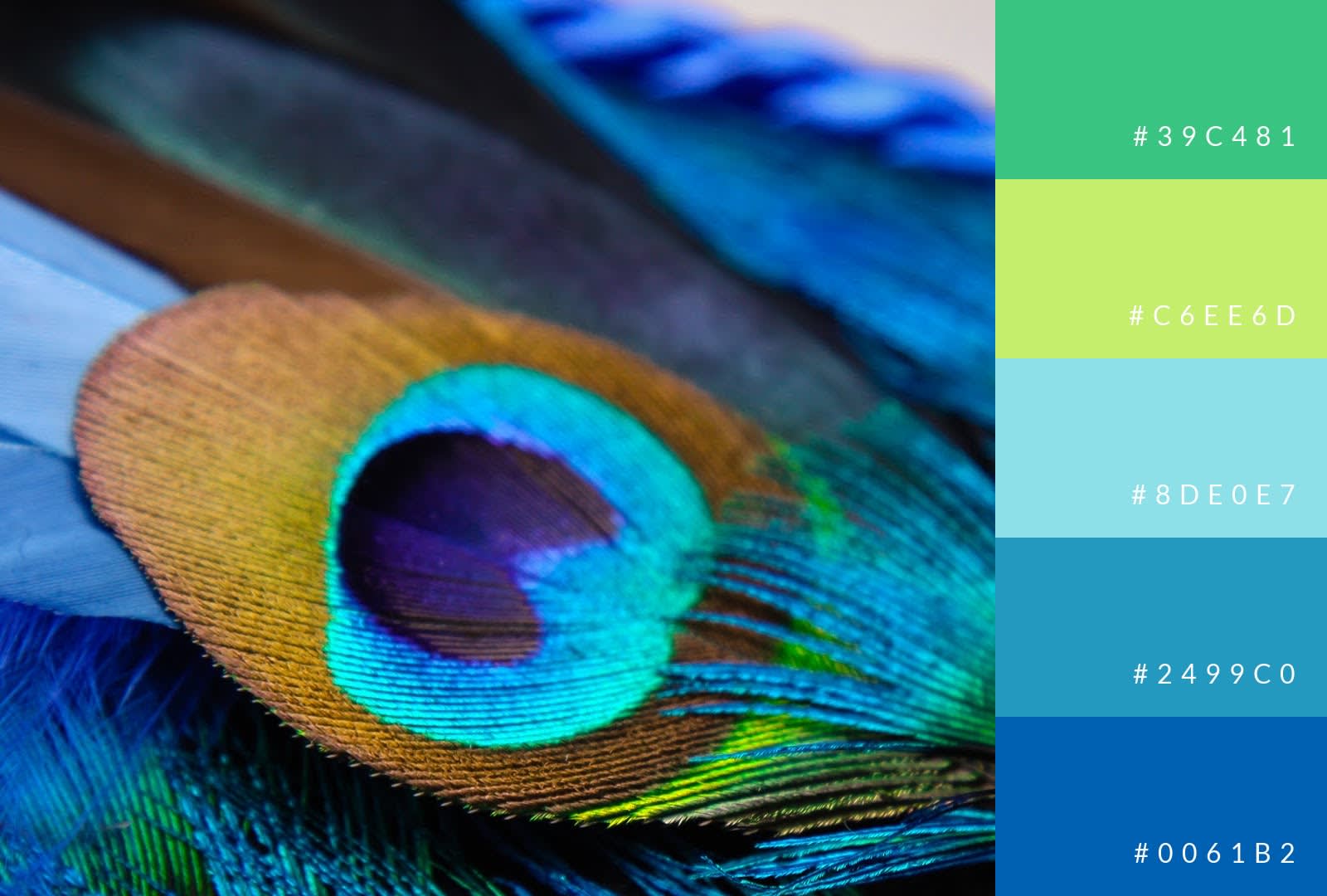
Peacocks aren’t ostentatious; they’re just living their best lives! This color combo can add energy and exuberance to any design.
11. Complementary colors

Orange and blue pair beautifully together. Both are full of energy and, when used in multiple shades, form a radiant palette.
12. Blues and pinks

You don’t have to use an image full of bold colors in order to make a dazzling design. Just pick specific boldies and watch as they make your more delicate colors sing.
13. Neon lights

Nothing’s more lively and full of energy than a palette stocked with neon colors. If you’re worried about creating something without an inside voice, try using cooler shades that still breath on their own.
14. Vintage car

A great way to create contrast is by using a lighter tone as your background and then peppering it with more saturated colors.
15. Soaring reds & soft blues

When you want red in your palette but not its natural ferocity, try some of its darker and bolder shades. It should come as no surprise that they blend brilliantly with lighter tints of blue.
16. Vintage diner

Maybe you do want to time travel well into the past. In that case, this palette’s flashy, neon-infused scheme gives you the opportunity.
17. Tree frog

Tree frogs are known for their bright colors. With this palette, you can channel that same visual splendor. Use orange and blue as accents to a dominant and diverse green medley.
DARK AND NATURALISTIC
1. Soft leaves
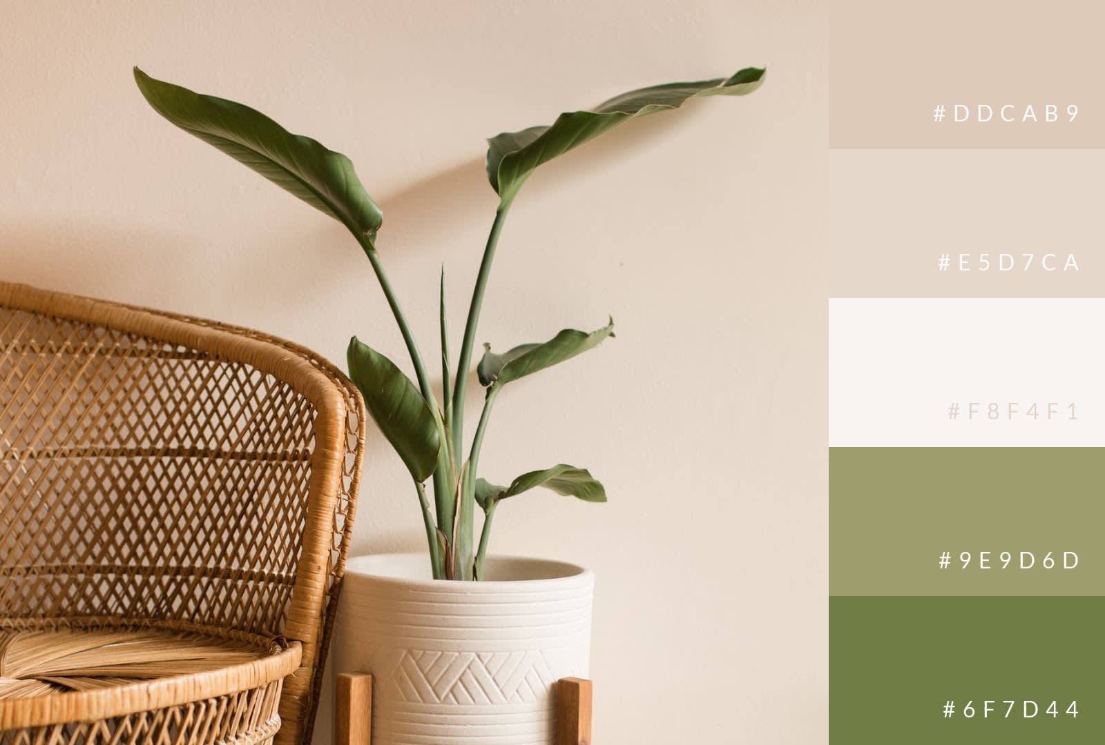
For something gentle and homey, try neutral colors with green as the contrast.
2. Natural stone

These might be quiet colors, but they do a superb job of blending together and creating a balanced palette.
3. Rural getaway

The single use of green with an otherwise neutral palette creates a rustic feel.
4. Wedding reception

Wedding receptions are all about elegant vibrancy, like in this palette, where naturally rich tones have been subdued for a super sophisticated look.
5. Beachy

If you want your audience daydreaming about those long beach days, try using this dark palette. Contrary to our previous “beachy” example, this one adds a bit of nostalgia to the mix. Its intentional lack of flashiness might not put people at the beach, but instead get them feeling it.
6. Ride the waves

Surf’s up! Green and red are meant to shine, especially when red is used in short supply against an otherwise diverse palette of greens, and some blend-friendly gray.
7. Green and gold

Don’t worry, no one’s going to think you’re affiliated with Slytherin House. What they will consider, though, is the refined and elegant design before them.
8. Arch rock sunbeam

For something that’s adventurous but grounded in earthiness, try this west coast color combo.
9. Joshua tree

Similar to arch rock sunbeam, Joshua tree embodies the look and feel of a west coast national park. This captivating multi-colored palette nods to nature and outdoor adventures.
10. Mountain lakes

Of course, you can always take your outdoorsy palette a step further and leave your audience in the mountains with this striking combination of dark colors (along with a tinge of light blue).
11. Mid-century modern

Encapture the Mid-Century Modern movement with this scheme of friendly colors.
12. River greens

For something naturalistic and refreshing, try this combination of greens, yellows, and brown.
13. Cool dandelion

Bold blues create the contrast point for a soft cream and dark orange. Together, this palette is simple and inviting.
14. Mediterranean

When you picture “Mediterranean,” there’s a good chance the image is embellished with bright color. That’s why we love this palette so much. It’s a gentler and richer version of tropical colors.
SUBTLE AND SOPHISTICATED
1. Shaving cream

This is a rockstar palette for any product that you want to market as sophisticated or luxurious. Black backgrounds are sleek, and they play incredibly well with light contrasting colors.
2. D.C. morning

Sometimes subtlety comes from balance. That’s what you get with this palette — there’s not necessarily a “leader” in the mix, which is why it works so well.
3. Nautical

This is another case of orange meets blue. Only this time, dark blues blend together to create a clean contrast with equally rich oranges.
4. Night and day

We all crave for that night out where everything seems to go right. We look good, feel good, and have good times. It’s a luxury, as this palette’s colors suggest.
5. Sophisticated warmth

For something modern and sophisticated, try using warm colors against neutral whites and grays.
6. A New York minute

This is a subdued palette sure to bring your audience away from the bustling humdrum of daily life and into the clouds of dreams and aspirations.
7. Bold accent red

The title of this palette says it all — red was born to be an accent color. And since it’s not used brashly in this color combo, it creates a sophisticated look.
TOTAL SCENE STEALERS
1. Sparkler

These scene stealers are all about outstanding contrasts and mesmerizing blends. In Sparkler’s case, burnt orange and soft cream contrast beautifully with shades of black and white.
2. Starry night

It’s not Van Gogh’s Starry Night, but it is a dreamy combination of dark blues and black, working in tandem with eye-catching shades of yellow and orange.
3. Milky Way

The trick with this color palette is to use these colors wisely. Seems like common sense, but consider the combo — this palette is stocked with bright, shimmering teals that can easily draw eyes. Match against your darker tones for a truly provocative color scheme.
4. Cinque Terre

This splashy palette draws inspiration from beautiful seafront cities across the world.
5. Golden gated

If you use this palette, you’re committing to an easy scene stealer. A reddish-orange plays devil’s advocate with an otherwise subdued combo, and in the best of ways. Try this if you’re looking for something that’s warm, harmonious, and visually inviting.
6. Red contrast

We’ve mentioned this before: red loves to play the part of contrasting color. Notice how it pops in this multi-colored palette, reunited with blue and unique uses of beige and orange.
7. Soft snow

For something cool but glowing, try this tantalizing combination of purples, pink, and blue.
8. 2021 Pantone colors of the year

Pantone’s 2021 Colors of the Year are Ultimate Gray and Illuminating. And guess what? Together, this somewhat unlikely color combination creates a brilliant contrast.
9. Mountainous sunset

If you want to transport an audience to a sunset-laden mountain peak, use these delicate but cooperative colors. We’re drawn to sunrises and sunsets, so eliciting this idea via color is a powerful way to create with intention and make a stunning design.
10. Lionfish

In some ways, this palette hearkens back to our sparkler mixture. The emphasis is on contrast; in this case, a tint of orange along with one of its darker shades, placed against similarly deep shades of blue. Dabs of white complete the memorable look.
MONOCHROMATIC
1. Business-like

Okay, so this isn’t a totally monochromatic palette, but it relies heavily on blues and is the perfect way to channel blue’s penchant for evoking authority, trustworthiness, and reliability.
2. Polar bear blues

On the contrary, this is fully monochromatic. These cool blues might literally make people cold, but they’re also helpful for establishing a sense of freshness and tranquility.
3. Fresh greens

It’s interesting how different colors can create their own modified version of a shared feeling. Like "polar bear blues," this green palette certainly has its own freshness factor. However, it also adds the nature element, forming a palette that’s particularly useful for promoting fresh and organic products or eco-friendly initiatives.
4. Calm before the storm

For something moody and mellow, try this mashup of bluish-gray hues.
5. Fresh spring grass

Deep variations of green form a pure and visceral look.
6. Grays

Grayscale is an unsung hero. There’s a lot you can do with an all-gray palette, and it’s a popular choice in modern design, as well as for creating futuristic-looking aesthetics.
7. Browns

Nothing says naturality and earthiness better than a monochromatic brown palette. Use for Earth-centric designs, or for baking products and services! Don’t we see these colors in baked goods?
8. Blues

More blue, more cool colors, more balance and calm.
9. Greens

More green, more life, more vivid colors.
10. Yellows

This is the epitome of loud; use only if you think it fits your brand. Admittedly, yellow is probably better as an accent color (and easier on the eyes); however, there’s no question that it’s the happiest of hues, so it definitely has its place in designs.
11. Oranges

For a design teeming with energy, youthfulness, and creativity, try an all-orange palette.
12. Reds

A monochromatic red palette offers something fiery and intense. If you’re looking to emphasize love and passion via a provocative color scheme, this would be a good choice.
13. Pinks

Pink also offers commentary on all things love, but in a gentler and more refined way. It’s not as garish as red, and its various tints and shades blend well to create an inviting palette.
14. Purples

Purple isn’t used in excess when it comes to branding, but it’s still a worthy consideration. Its connection to royalty and nobility can’t be ignored. Additionally, its lighter tints are a powerful choice for imagery meant to emit mystery and intrigue.
PASTELS
Get a mega dose of pastel inspiration, read: What are Pastel Colors and How Do I Use Them?
1. Pastel balloons

Pastels are fun and bright. For a cheerful design, try out this eclectic combination.
2. Spring

Pastels are often seen during springtime. If you’re running a spring promotion or just want to give your audience the spring feels, consider using a splashy combination of pastel colors.
3. Lavender fields

For a subdued pastel look, try out darkers shades of pink and purple.
4. Cheerful celebration

Pastel purples, green, and yellow combine for a jazzy palette.
5. Trendy brights

Yes, you can still create contrast with brightly colored pastels, as we see in this palette.
6. Palm pinks

The beauty of pastels is that they can be loud and proud, or gentle and refined. We see the latter with Palm Pinks, opting for darker shades to create a relaxing look.
7. Sweet popsicle

If you’re looking for an uber sweet look, try mixing these fruity pastels.
8. Peaches

Technically, this is a monochromatic palette, but peach is a popular pastel color so we decided to put it here. Like natural orange, peach can be energetic and inviting.
9. Blushing bridal bouquet

For something reminiscent of springtime flowers or a gorgeous bridal bouquet, try out this combination of pinks and greens.
10. Baby pink

Pink pairs extremely well with contrasting neutral colors and creates a clean look.
11. Honeycomb

If you want the splendor of golden honey but the sophistication of dark gray, this palette does both.
NEUTRALS
1. Neutral paint

Well-mixed neutrals create eye-catching looks of their own. We see this with "neutral paint," where variations of brown contrast splendidly against white.
2. Modern gray

Remember when we said gray belongs in modern designs? Here’s proof. It works beautifully as a background to accentuate the various browns.
3. Black and white

Black and white have been a natural duo for years and years. This palette uses them to create a sleek and modernized look.
4. Rustic neutrals

For something more rustic, lean into the use of brown over all other neutral colors.
5. Urban living

A predominantly neutral palette is the impetus for using a single color as a vibrant accent. Such is the case in this color combo with green against an otherwise gray/brown backdrop.
6. Serene spa

Neutral colors also offer their own version of serenity when mixed well. If you want a subdued look that’s also incredibly calming, take advantage of a palette like this.
7. Neutral warm tech

Modern grays craft a magnificent backdrop for reds to shine.
8. Mauve mania

"Mauve mania" is next level subtle, with a delicate balance of colors that speak to the power of minimalism.
Your Turn
Hopefully, one or more of these color palettes has you inspired for your next design. And the journey doesn’t stop here. Color might be a complex design element, but we have plenty of resources to help keep the learning going.
With our color palette generator, you can craft a palette from one of your very own images, or tap in our massive Shutterstock photo library and find a pic that says exactly what you want your brand to say. If you’re looking for exact colors, we’ll show you how to find them by using hex codes. We’re ready and willing to be your color concierge and help you turn great ideas into unforgettable designs!
