Ahh, the mysteries of Curves. Maybe you’ve asked yourself before, “What is it? How does it work? Am I s’posed to know what the line thingy does?” And maybe those unanswered questions keep you out of Curves. For people just trying out Curves, it can seem confusing and intimidating. It’s not, really.
Curves is like a more robust version of the Levels tool. After watching this tutorial, you’ll understand what Curves is doing, and how indispensable it is to the photo editing process.
What the curve means
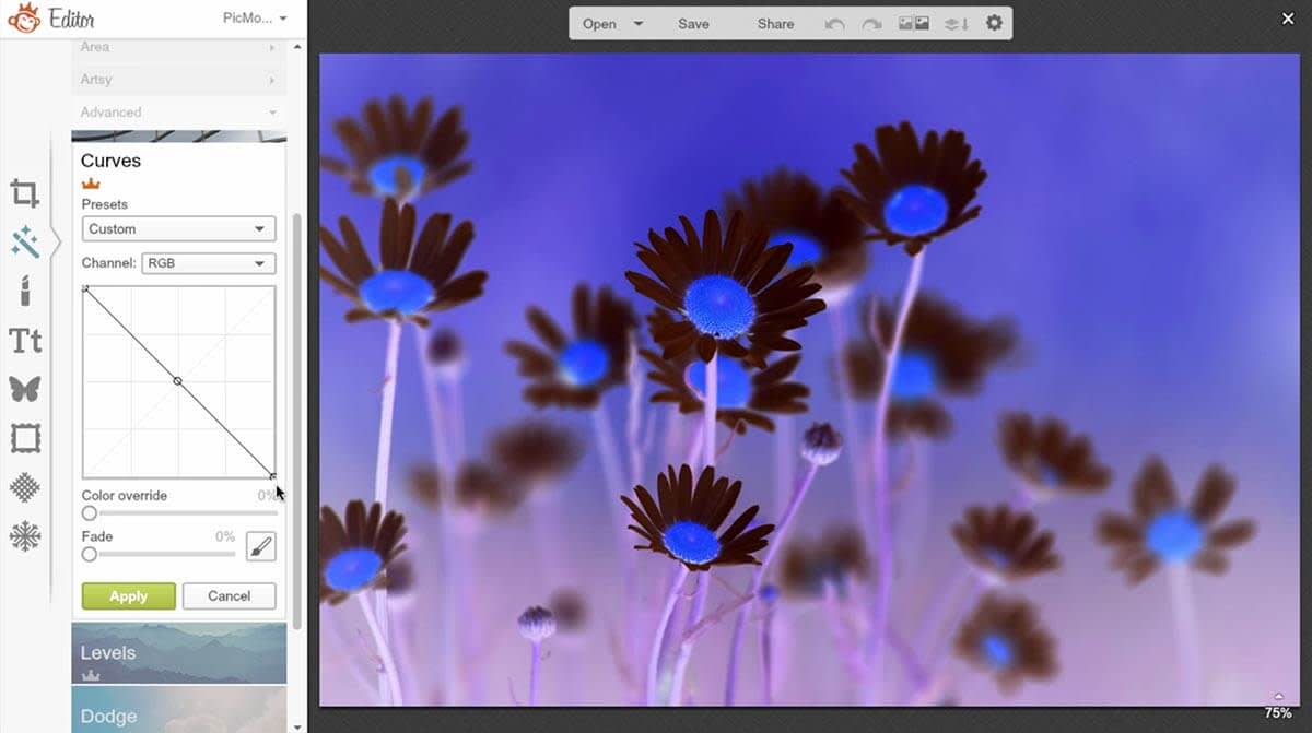
Opening the effect, we see that it defaults to a straight, diagonal line. The left side of the grid represents your shadow tones, the center your midtones, and the right is your highlights.
The line is the tool you use to manipulate these tones. If I pick an anchor point in the shadows—the Shadow Realm, if you will—and bring it up, the adjacent tones are brought up with it.
Wield the power of the curve with anchor points

But, as you can see, it moves the entire Curve. Curves is called curves because it forces your adjustments into gradual, curvy transitions from light to dark. It tries to avoid sharp angles, which produce harsh steps in brightness across tones. You can fix the line with anchor points. Just click on the Curve to assign new anchor points. If you want to get rid of a point, just command-click on a Mac, or ctrl-click on Windows.
Let’s try it again with anchor points. Because we’ve anchored the middle, we can see that the output tones in the middle are getting closer. By mapping the shadows up, we’re shifting more tones to the middle area, and thus decreasing the contrast.
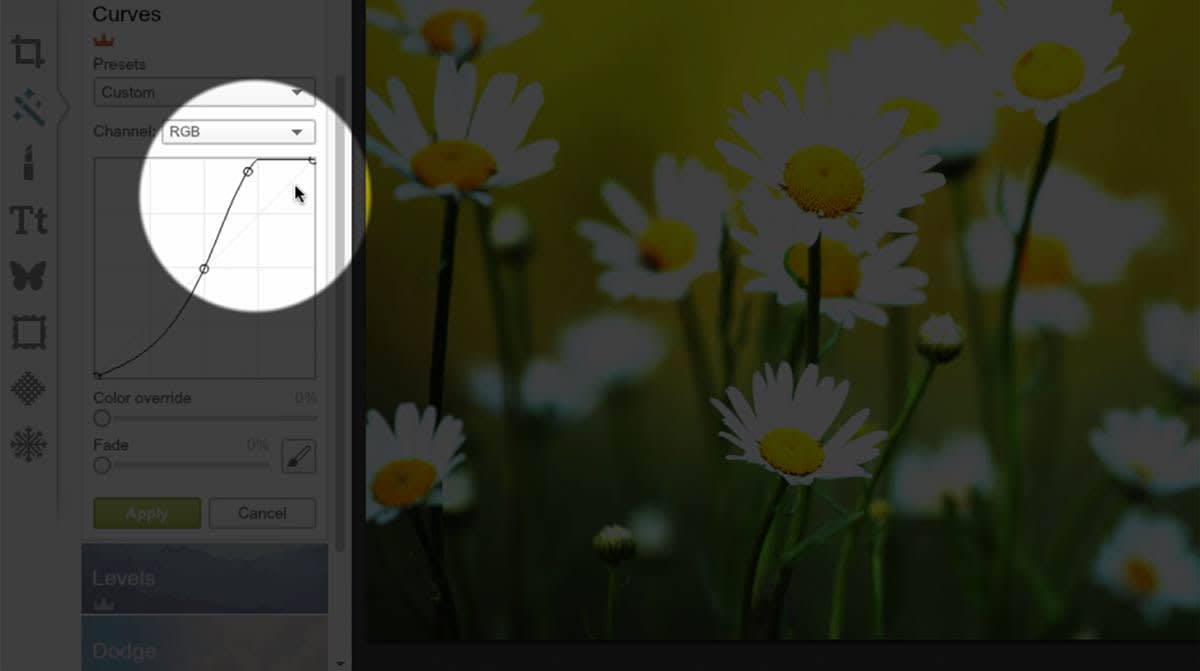
If we bring that same point further down into the Shadow Realm, we’re shifting midtones out of the middle range, darkening the shadows and thus increasing the contrast. The curve is starting to look like an S, which is what a curve looks like when we’ve increased the midtone contrast.
This is one of the most common Curves adjustments. Raise the highlights a tad, and lower the shadows a little bit. It’s the classic “contrast curve.”
Going off the map
If we were to drag the curve so far down that the line bottoms out (see how it’s a flat line?), that shows that any shadow tone to the left of that point is remapped to be completely black.
The X-axis is telling which pixels are the darkest tones, and the Y-axis is saying how dark those darkest tones are. If you bring up the dark anchor point on the Y-axis, you’re redefining the darkest tone, saying, “everything that was black, I want you to make it gray, this gray.”
Similarly, if we jack up the highlights until the curve hits the top, it shows that any highlight to the right of that point will be completely white. So if you take your curve all the way up, it will remap every tonal value lighter than that point to be completely white.
The proof is in the presets

If you want to see more of these adjustments—and how they relate to your image—in action, take a look at some of the presets.
Exposure +1 brings the curve, up. Exposure -1 takes it down. Darken Shadows bottoms out the shadows, Low Contrast shifts tones into the middle range, and High Contrast shifts them out of the middle range. Feels right, right?
Diving into RGB channels

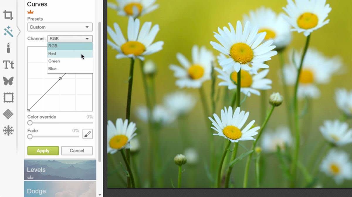
Now that you know how the actual curve works, let’s get nitty gritty. Notice that we’ve been in the RGB channel this whole time. It’s a combination of the red, green, and blue values. But you can easily control these channels separately.
If we go to green and pull down the shadows, what we see is that greens in the shadows get darker. Effectively, it might look like a tinting effect, but technically, that’s not what’s happening. We’re just darkening the tones of the image where there is green to show. We’re not adding or removing any color, we’re increasing and decreasing the brightness of the existing color tone (in this case: green).
Color correction and beyond

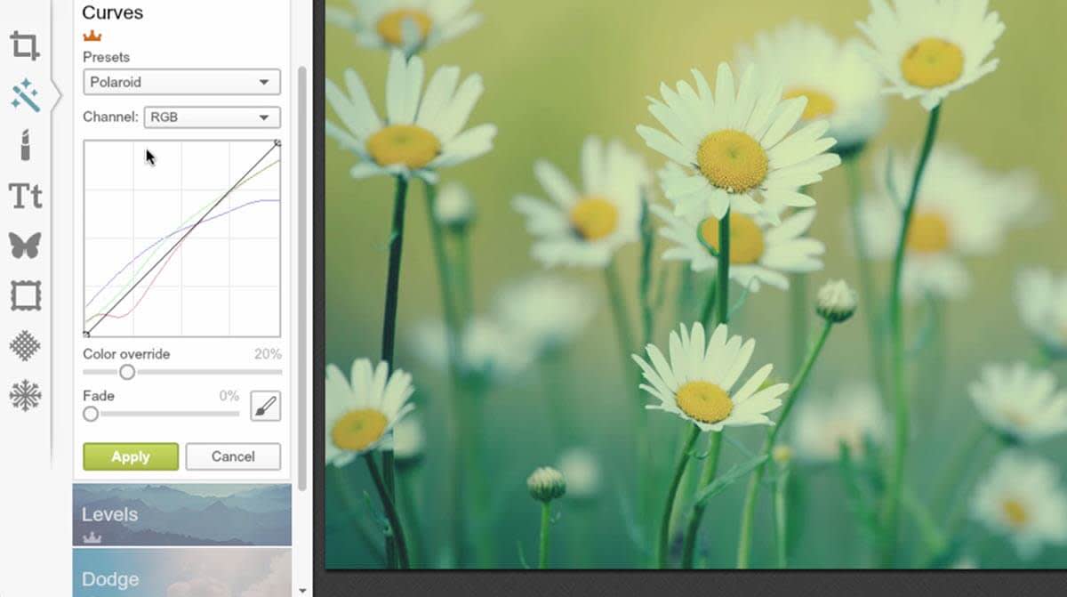
Color channel manipulation is usually for color-correction work, or emulating a certain film look, because certain films are more sensitive to certain colors of light.
If you look at a Curves effect preset (like Polaroid), you can see that the individual color channels have their own adjustments. The blue and green channels are shifted to the midtones, giving it that washed out, low contrast polaroid look.
See, that wasn’t so hard, was it? You’re all set to be a Curves master, which means there’s pretty much nothing you can’t do! Try out your new powers right now, in the Editor.
