
Whether you’ve mastered the art of the infographic or you’re new to this phenomenon, you’ve come to the right place. Today we’re chatting about the timeline infographic. The word infographic quite literally means “informative visual art.” While some could argue all art is informative, timeline infographics map out what happens and when. And though most associate timelines with historic dates, they’re not limited to that.
We can assure you timeline infographics have drastically changed since the conventional poster found in your high school U.S. History class, so let’s dive into their modern expressions here, as well as show you how to easily make one in PicMonkey for your personal or professional needs.
Why use a timeline infographic?

Image: Juan Martinez
Let’s be honest. No one wants to read a 100-page essay on the History of Life (and we’d like to speak to whoever thinks that’s a fun assignment). Instead, why not highlight the basics with a timeline infographic? It’s the best of all worlds: puzzles, maps, textbooks, and art rolled into one.
Notice how this timeline infographic requires the reader to spend time with its symbols in order to make meaning. The color codes are found on the right. Deciphering them allows us to understand the Phanerozoic timeline on the bottom. From there, we can integrate the correlating information. Neat, right?
Like any form of art, timeline infographics break up linear and conventional forms of learning. They infuse elements of play. Implementing play while learning has been proven to increase social, emotional, physical, and cognitive functions, so consider these a favor for the human brain.
Why timeline infographics are superior modes of info

Image: Michela Lazzaroni
Why are timeline infographics superior modes of information? You mean, besides the fact that humans are 65% visual learners, retain 80% of what they see, and can experience both play and art while learning?
Timeline infographics make it so that you can cater to a specific mode of learning. If you’re creating the infographic, you’re crafting it to match your needs. If you’re reading one, you have free reign to interpret it in the way that’s most comfortable for you. Like art, timeline infographics are interactive. While they do present a linear map of time, the way in which you digest that information is up to you.
Timeline infographics are best for:
Unconventional learning styles, including interactive, experiential, or creative learning
Displaying maps, codes, puzzles, or art
Using acronyms, symbols, or graphics as a means of learning
Erring on the side of right-brain learning styles (creative, intuitive, visual, patterns)
Appreciating hybrid learning genres
The truth is there’s no one who can’t benefit from a timeline infographic. Even the most analytical, science-driven, left-brained folk can math-it-up with the right infographic format. We’re here to encourage you to do what’s best for your audience and what coincides with your need for an infographic. Now let’s look at some more examples.
Top 10 timeline infographic examples
1. Fuel your workforce
Lovin' this design? Customize your own in PicMonkey.
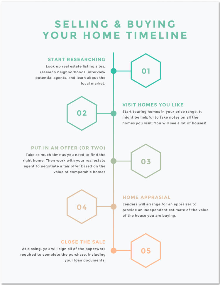
Though classrooms are a common home for timeline infographics, they’re certainly not the only place. Real estate buildings, public bulletin boards, libraries, and sales offices are perfect homes for this infographic style.
Whether for your next business meeting or training material for new hires, effective visuals tied to crucial information are sure to boost work performance.
2. Track evolution

Image: Tomáš Müller
As humans, we’re all students of life. Depending on your personal hobbies, academics, or profession, the chances of you needing to examine the evolution of something are high; whether that’s about space or when hotdogs came to be. While you’d surely learn a thing or two doing this infographic for yourself, this format is best for demographics like National Geographic, a museum, the workplace, or a classroom. Letting others witness your creation is the artistic aspect of timeline infographics.
3. Manifest your destiny

Lovin' this design? Customize your own in PicMonkey.
Like many timeline infographics, this one has a dual function. While you can use it professionally to build a following or teach a class, you can also use it to manifest your own success. Consider it an advanced dream board.
When designing, know that the right colors don’t only boost your mood, they help you creatively visualize the feeling of your success. Once you embody that feeling, that’s how the manifestation comes to be. Be sure to share your manifestation on social to gain support for your dreams!
4. Become a better consumer
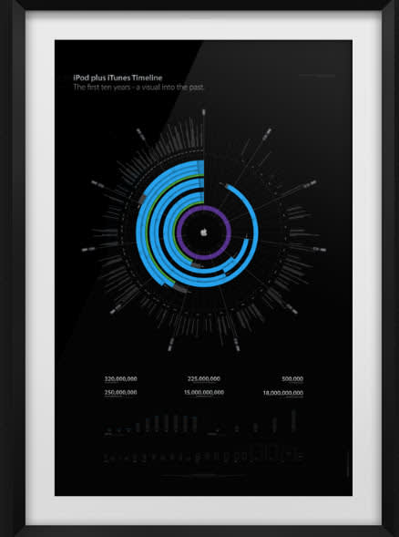
Image: Filip Chudzinski
Every single product, company, and person has an evolutionary story. Timeline infographics help us better understand the (hi)story behind every creation. Understanding where we come from helps us appreciate where we are. Integrating info in this format creates intention behind the consumerist decisions we make. (Because let’s be honest, timeline infographics are far more accessible than 2 a.m. rabbit holes on the interwebs studying the Apple corporation. Make life easier on yourself, it doesn’t have to be that way.)
5. Wed on time
Lovin' this design? Customize your own in PicMonkey.
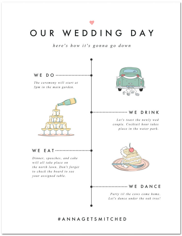
Timeline infographics don’t have to be science or statistic-driven. Make a simple timeline infographic with the perfect balance of color, graphics, and text. With limited space for text, be concise with your message and let the other elements speak for themselves. Remember, it’s all about evoking a feeling.
This timeline infographic has a white background, which seems appropriate for a wedding. If you’ve been to one, or have had one, you know these special events also have a set program. Adults are no strangers to scheduled fun. Don’t knock it ‘til you try it; it’s important. Get your guests excited with timeline infographic invitations and announcements!
6. Sell products

Image: Home Advisor
It’s true that knowledge is power, and timeline infographics prove it. Here, refrigerator graphics symbolize the longevity of the product. The sheer volume of symbols adds innate value for the consumer and reads as a valid source of information. In a world of endless, not-always-trustworthy content, we have to be smart about how we share the truth.
Also, this infographic is far more digestible than reading an article on refrigerators, unless you’re dying to know what inspired the invention of the Frigidaire FDS 13T2 in 1960 (no judgment). This effective infographic is achieved by way of consistent fonts, colors, and limited text.
7. Stay clean
Lovin' this design? Customize your own in PicMonkey.
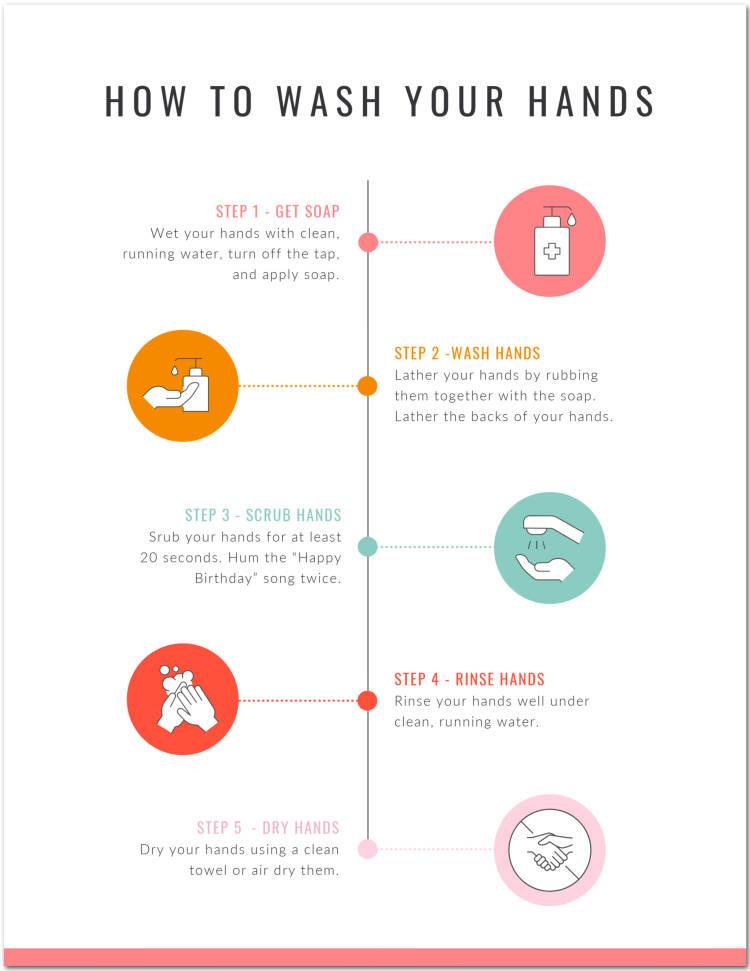
Common knowledge makes it hard to remember why we do what we do sometimes. While no one will question why we need to wash our hands (hopefully), these timeline infographics illuminate step-by-step processes for diverse environments like classrooms, hospitals or medical offices, and public bathrooms.
In a skim-reading, how-to culture, the goal for these infographics is for the reader to know everything upon glancing at each step; great for social media. Whether your platform is designed to educate, inspire, or attract, timeline infographics do all of the above. For followers who stick around a while, the supportive text remains to deliver the info that all infographics promise.
8. Track seasonal changes
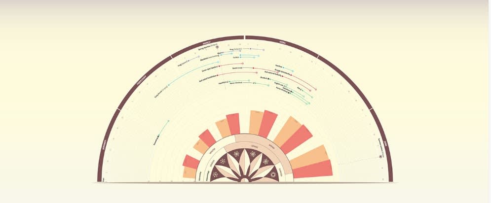
Image: Valentina D'Efilippo
Did you know that the human biorhythm is drastically influenced by the seasons? Remember when we used to wake at sunrise and sleep at sunset? Probably not. But timeline infographics are a great way to monitor seasonal changes and their impact on humanity (if you’re into that kind of thing).
This spheric design wisely mimics the sunrise-sunset pattern. Before crafting your timeline infographic, consider the concept you’re posing. Part of combining info with art is that you get to be as abstract or conceptual as you like, so long as that important information shines through. Heck, let Jackson Pollack inspire your next creation; who are we to stop you?
9. Make a plan for your plan

Lovin' this design? Customize your own in PicMonkey.
Just like art, timeline infographics have a “meta” element to them. They help you make a plan for your plan, whether it be personal, professional, or recreational. Organization prompts sustainable changes in the brain, so again, consider these a favor.
Let timeline infographics be your reminder to bring fun, color, and vibrancy to the logistic, analytical, and practical parts of your life. Integrating these left and right brain concepts often can make for a more integrated life.
10. Make people laugh
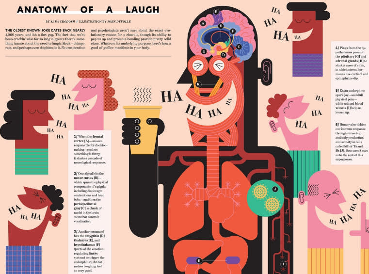
Image: Folio Illustration Agency
Once you know your infographic’s demographic (that’s fun), get clear about the central focus. This infographic has more content than others we’ve seen, but it still balances text with graphics and consistent “HA HA HA’s” to ensure a smile.
For your infographic, always work with purpose in mind, no matter if that's for concept, graphics, colors, or text. Identifying your intention sets the tone for your timeline infographic before you even start designing.
How to make a timeline infographic in PicMonkey

See more timeline infographic templates.
Ready to make your own timeline infographic? Here’s the quick how-to in PicMonkey:
On the PicMonkey homepage, click Create new > Templates, then type “timeline infographic” in the search box. Pick your favorite.
Use the tabs on the left to customize images, graphics, text, and effects.
When your design is finished, click Download on the top toolbar and export as a JPG, PNG, or PDF (a PicMonkey Pro feature).
And if you’re like, Hang on, PicMonkey peeps, I’m more of a make-my-own creator, we see you, fam.
To make a timeline infographic with a blank canvas, simply click Create New > Blank Canvas. Choose your size, or set your own dimensions and then click Make it! The same tools apply as if you were using a pre-designed template, so go nuts.
If you’re amped up on timeline infographic inspo like we are, that means it’s time to (kindly) kick you out of the nest. Now that your intensive training is complete, we trust you can fly free. We’re lucky to guide so many creatives to their digital art potential, so thanks for being one of ‘em. Now go map out the evolution of the next best thing and we’ll look forward to seeing it.
