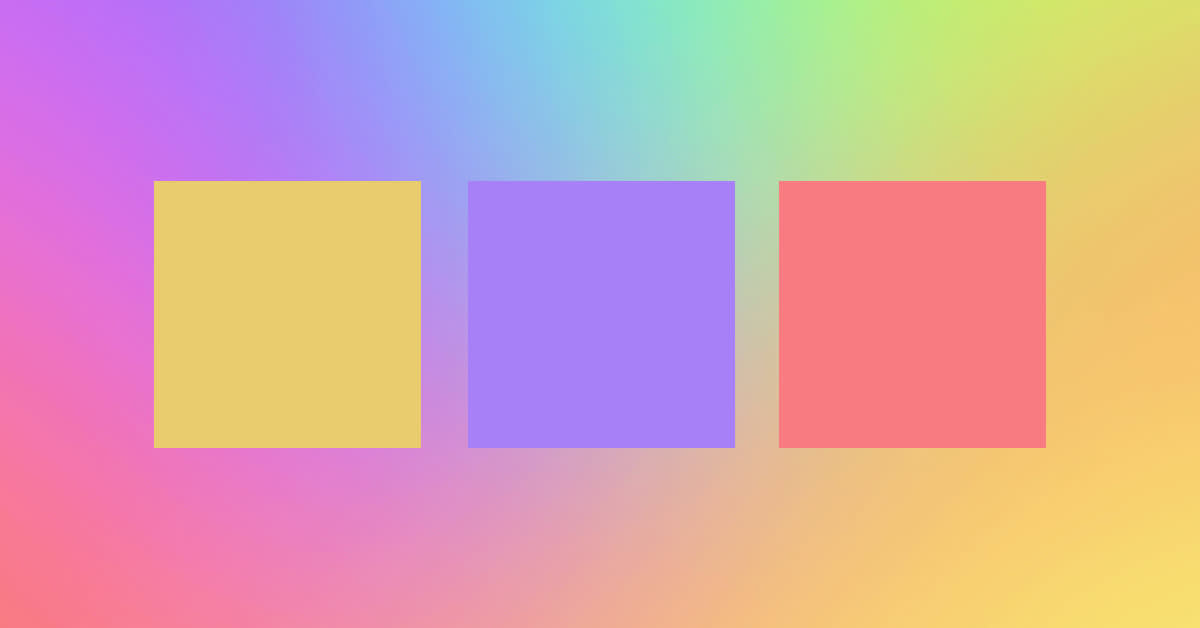
Remember Pixar’s 2015 film Inside Out? It follows an 11-year-old girl’s personified emotions — Joy, Sadness, Anger, Disgust, and Fear — as she tries to cope with a cross-country move. Each of these “characters” is a specific color: Joy radiates yellow, while Sadness is composed of monochromatic blue. Disgust emanates a sickly green, Anger a bright and fiery red. Fear wears pastel purple. Why? Because color meanings influence the way we perceive the world around us.
All colors carry their own meanings and symbolism. Some of these meanings are culture-specific, while others have been shared throughout the world for hundreds, if not thousands, of years. If you're choosing colors for a brand color palette or just getting deeply geeky about color for all your projects, we're here to help.
In this article, we’re diving down the color spectrum rabbit hole and dishing out everything you need to use colors purposefully. We’ll give you a tl;dr version of color theory, talk branding, and then review color meanings one-by-one with examples of them being used effectively in designs. Afterward, you can hop on over to PicMonkey’s editor and get started designing, or paint yourself in all the colors and relish in the knowledge of knowing what you mean. We suggest the first option.
Looking for a specific color? Jump right to it:
Color theory 101
Let’s get started with a few deets on color theory. If your inner-academic is fired up, definitely take a gander at our full post on the subject.
Credit the traditional 12-spoke color wheel to Sir Isaac Newton in 1666. There are a couple different versions of this wheel today, depending on what you’re doing. For art and visual design, we stick to the RYB (red-yellow-blue) color model. In other words, red, yellow, and blue serve as primary colors on the wheel. Since they’re considered the wheel’s foundation, they can be used together to build themes of simplicity, reliability, and strength.
Secondary colors are orange, green, and purple. They’re formed by mixing two primary colors together. Tertiary colors spawn from mixing a primary and secondary color. Red + purple = magenta, red + orange = vermillion, blue + purple = violet, blue + green = teal, yellow + orange = amber, and yellow + green = chartreuse.
Your end goal with colors is to create harmony among your choices. That’s why it helps to know the ins-and-outs of your color wheel, as well as what people think and feel from looking at different colors.
What follows is a color-by-color rundown on meanings and symbolism. Some of these meanings are shared, while others are country or culture-specific. We’ve also included a few examples of colors in action to give you some design inspo.
The meaning of red
Red is a bold and fiery color, used to symbolize everything from heat to passion to love to anger. It can also be a warning (ex. that stop sign you rolled through yesterday).
Many Asian countries consider red a symbol of joy and good fortune. We see this prominently in China’s use of red during its Chinese New Year celebration. In parts of Africa, red represents mourning; similarly, it’s viewed in other areas of the continent as a symbol of life and health.
Examples of red in art and culture
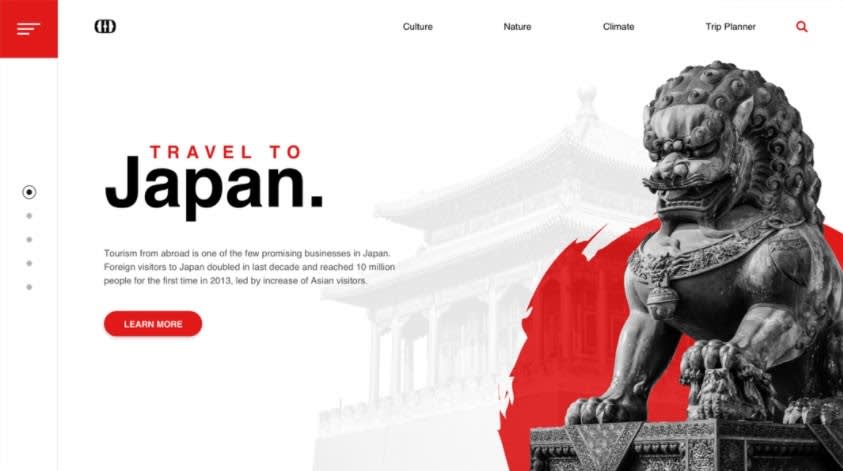
Image credit: Zoltán Czékmány
Red is one of two colors used in Japan’s flag, and it’s understood to be a symbol of strength and passion. Hence the application of red here, using color to embody Japanese culture.

Image credit: Shahriar Ahmed
This concept uses a monochromatic red palette to merge passion and product (the guitar). Beautifully blended reds capture the passion that comes with learning a musical instrument.

Image credit: Jerry_W
There’s an abundance of red in this design, noticeably pairing with the copy “Make It Possible” to push forward the idea of passion and hard work trumping all else.
The meaning of yellow
Given its supremely vibrant hue, yellow is associated with joy, happiness, and humor. However, it’s also sometimes used to represent jealousy and fear. Like red, it can symbolize warning or caution (think yellow lights, hazardous tape, yellow cards in soccer, etc.). In China, yellow is viewed as a color of glory and wisdom. It’s also considered a masculine color, used in China’s traditional yin and yang symbol to represent yang. Yellow’s relationship to the sun makes it a color widely seen throughout the world as bringing warmth.
Since traditional yellow is inherently bright and flashy, it tends to work the best as an accent color in designs. Or, play around with monochromatic variations so that you can use yellow’s less intense tints.
Examples of yellow

Image credit: Majid Abparvar
Notice how Spring Insurance uses the color yellow to counteract any negative feelings that might come from having to turn to insurance when unable to work because of an illness or accident.
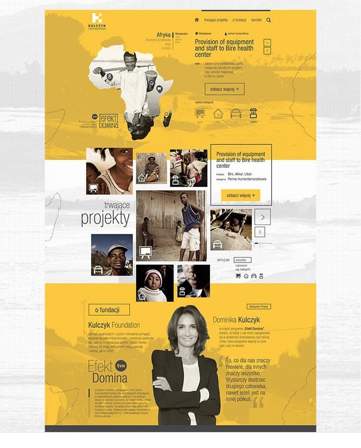
Image credit: Marcin Piwnicki
Yellow effectively encompasses the warm and altruistic mission of the Kulczyk Foundation. This is a perfect example of matching color to your brand’s identity.
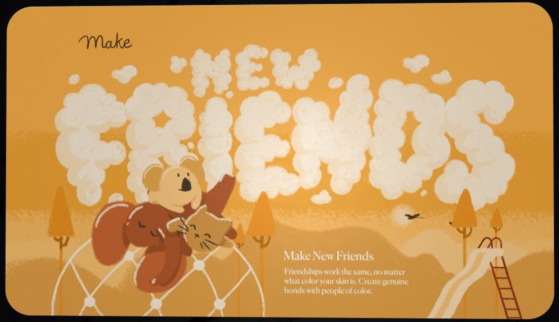
Image credit: Hello Monday
In this unique take on talking to kids about racism, a warm shade of yellow is used to promote harmony and friendship.
The meaning of blue
The last of our primary colors, blue is one of the most popular colors in the world and carries several different meanings. It symbolizes calmness, stability, harmony, wisdom, and sometimes sadness (Feeling blue?). It’s also a weather-related color, used to represent the cold.
There’s an authoritative component to blue, as we’ve seen it used in military and police uniforms across history. Because of this, many brands use the color as a way to establish trustworthiness and dependability.
Examples of blue-heavy art and design

Image credit: Up and Away
Blue is well-used throughout this design to create something serene and calm, well-suited for Up and Away’s services. No one wants to be uber-stressed on the big day.

Image credit: Extej Design Agency
Speaking of stress, talking about finance can be quite complicated. A subtle way to streamline understanding is with cool and collected colors, as seen in this Universal Trading landing page.

Image credit: Huy Tu
It’s clear from Monkey Express’s copy that it’s using blue to emphasize trustworthiness and dependability in its services.
The meaning of orange
Our first secondary color on the list, orange represents creativity, happiness, freedom, and success. It’s an energetic color, and with its relationship to fruits like oranges, mandarins, kumquats, and tangerines, it also carries a refreshing connotation.
Orange is a loud color that’s best suited for equally boisterous and energetic brands. If your brand is something a bit more traditional, orange is probably not the way to go.
Examples of orange in design

Image credit: Freebies
Given orange’s energetic and youthful nature, it’s a premier color choice for educational companies and organizations. Just look at how it complements this sample education template.

Image credit: Kálmán Magyari
M Connect uses two variations of orange (and some brown) to achieve a boisterous and excited look.

Image credit: Anastasia Kravez
We all like food, which is why orange works so well as an accent color in this food delivery website design. It draws our eyes to the most important copy and the most important image...of...food!
The meaning of green
Green’s traditional hue relates to nature and life. It’s the color of choice for almost any environmental movement (think “go green”). Green also represents wealth. On a related note, it can symbolize greed and envy (“green with envy”). And don’t forget about our Pixar example, which showed us that green can be used to suggest sickness, disgust, and/or nausea. To top things off, green has a longstanding place in Irish tradition, representing luck and good fortune.
As a designer, where do you even begin? Our simple advice: understand what you’re trying to say. Since green is malleable in meaning and symbolism, knowing exactly what you’re going for can help you use the color appropriately.
Examples of green-based color schemes

Image credit: DStudio
Color plays a very informative role here, embracing the idea that green is suggestive of wealth and money.
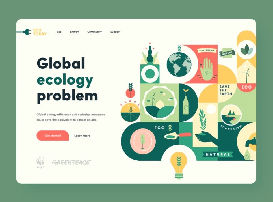
Image credit: Baten / Orizon
No question that green is a solid choice of color to use in this eco-friendly project. The various tints and shades emphasize the underlying ecological context of the website.

Image credit: Dicky Indrayan / One Week Wonders
In this e-commerce website concept, green is used to provide a modern and refreshing presence on the page.
The meaning of purple
Purple is a majestic color, having long served as a powerful symbol of royalty and nobility. It’s also one of mystery and intrigue. Its lighter tints are seen as feminine and, sometimes, seductive, while darker shades represent elegance and extravagance.
Examples of purple in branding
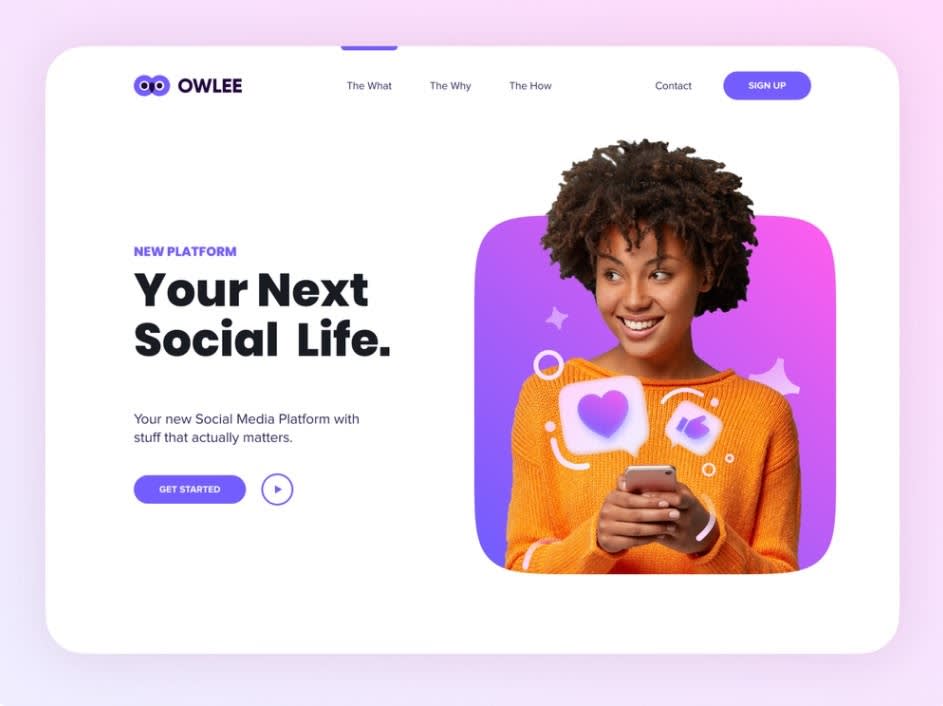
Image credit: Stian / unfold
Owlee’s use of purple grasps at the intrigue and potential stature that comes from social media, acting as a nice contrast (with some help) to the dominant white background.

Image credit: Dawid Pietrasiak / Netguru
Monochromatic purples are used across Codex’s landing page, serving almost as a beacon for the user’s journey. All variations of the traditional purple hue contrast well with the white background.

Image credit: Dennis Pasyuk / unfold
SparkFilms also employs variations of purple. The result is a clean and vibrant look full of rich color.
The meaning of pink
Of all the colors on this list, pink probably has the strongest association with femininity. It’s the color of choice for baby girls (for some), serves as the marquee color for breast cancer awareness and is widely symbolic of all things love and romance.
This doesn’t mean that pink can’t be used in designs for brands looking to appeal to anyone. It just means that there needs to be intention behind how it’s used and what tint(s) or shade(s) are selected.
Examples of pink in design

Image credit: Matt Wojtaś
Check out how well this dark pink contrasts with its black background, offering a refined look on the page.
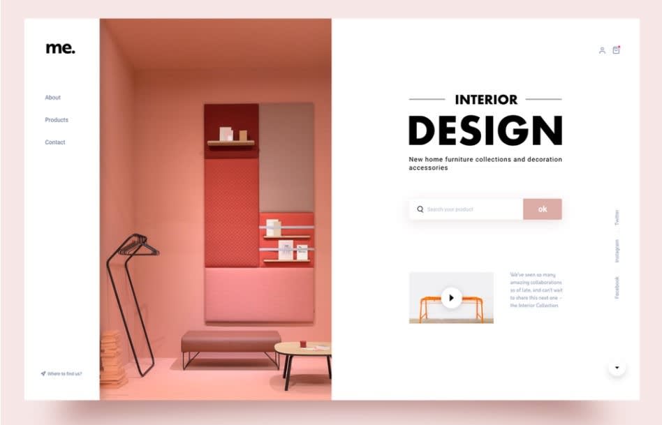
Image credit: Joël Dos Santos
In this case, pink is used to suggest a look. Its complementary variations create balance and give the page a delicate and inviting feel.
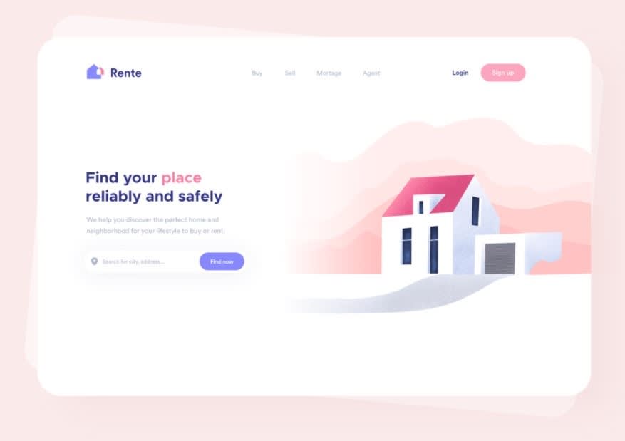
Image credit: Andreas Kruszakin-Liboska
Pink is used in Rente’s design to put consumers at ease. Its variations are soft, welcoming, and harmonious.
The meaning of brown
Brown is a hue that’s representative of nature and the earth. Some view it as a sign of security, stability, or wholesomeness. It also has culinary connotations; natural foods, coffees, beers — any of these merit the use of brown.
Examples of brown-heavy color schemes
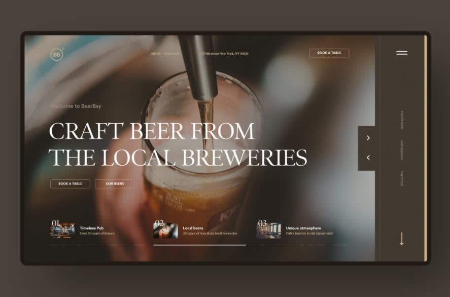
Image credit: Matt Wojtaś
Brown is a natural choice for Beerbay, embodying the natural colors of craft beer.
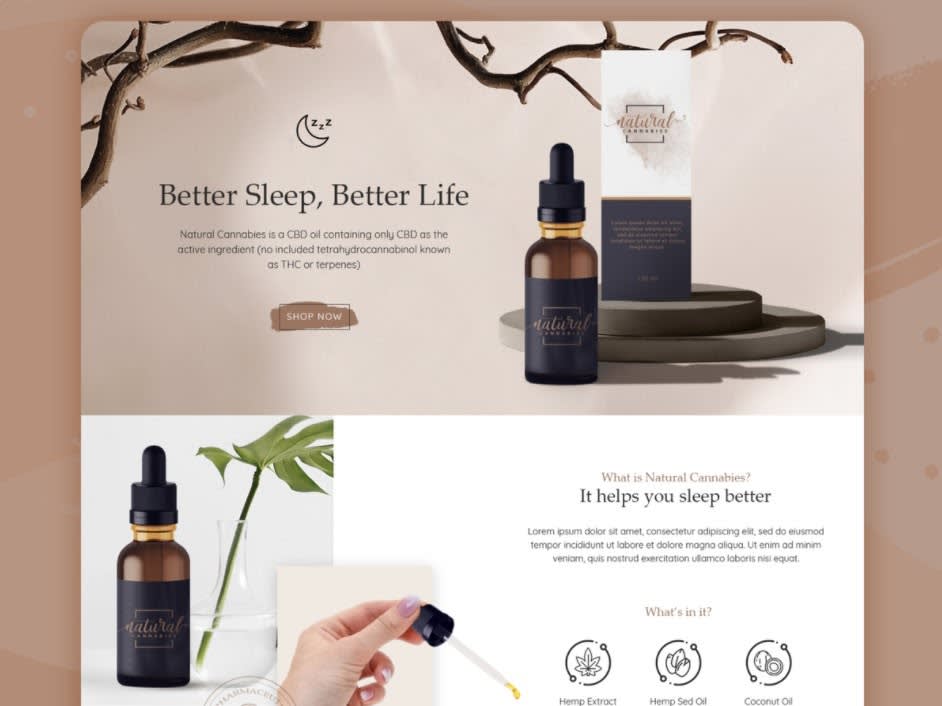
Image credit: Kharirotul Latifah
Here, brown acts as a glue between product and earth. With the product being natural CBD oil, brown is an effective color choice in creating cohesion and emphasizing the naturality of the product.
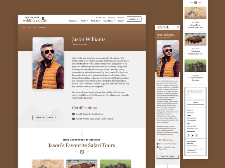
Image credit: Matt Brown / 829 Studios
Brown plays an earthy role in this design, amplifying the nature of the service being advertised.
The meaning of black
Black represents a history of death, grief, sadness, and evil. So, yeah...not the most uplifting. However, there are a slew of other representations for black. It’s an extremely sleek color for designs and can be used to symbolize luxury, elegance, sophistication, and professionalism. It’s not all doom and gloom. Since black is the darkest of colors, use vibrant contrasting colors to really make your design pop.
Examples of black in website design
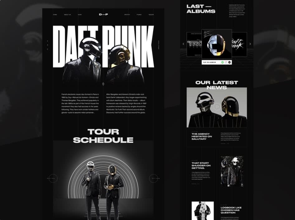
Image credit: Achraf Elkaami
Subtle variations of black and unobtrusive uses of white make this Daft Punk website concept a sleek, brand-specific design.

Image credit: Angel Villanueva / Orizon: UI/UX Design Agency
This mock-up for Beats really packs some punch, and all because striking colors are used against a black background. It goes to show how you can use black as a backdrop for making other elements of your page stand out.
The meaning of white
Purity has been synonymous with the color white for thousands of years. Additionally, white is suggestive of perfection, honesty, and youthfulness. There’s also an aura of simplicity and modernity that comes with white. It’s a popular choice in minimalistic designs.
Examples of white as a background and accent color

Image credit: Taras Migulko
As a background, white allows for other elements of a design to leap from the page, as seen here.

Image credit: Kevin Dukkon / Fintory
In these icons, white is used as both a background and contrasting color, providing simple and clean looks.
The meaning of gray
Like white, gray can offer a sense of modernity or minimalism to any design. It’s often attributed to balance, formality, sophistication and, sometimes, moodiness. Gray’s neutrality gets a bad rep for being “dull” or “boring”. Far from the truth. Grayscale color schemes are sleek by nature. Add vibrant contrasting colors and you have yourself a striking design.
Examples of gray in logos and websites

Image credit: Kakha Kakhadzen
If you have a bright logo, why not see what it looks like in grayscale? Then you can reserve the old school look for a special event or vintage product line.
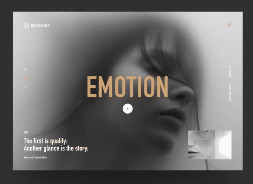
Image credit: Caroline
Gray’s another color that plays well as a background, leaving you with plenty of opportunity to use contrasting colors and highlight other elements on the page.
Final words
As you can see, choosing colors and working with their meanings is like looking into a star-filled sky. It’s endless. That’s why it’s so important to have a clear vision of who you are and what you want to say, so that you can then tailor colors to fit your brand.
All colors have their place in the spotlight. Whether you’re browsing warm hues like yellow, orange, red, and pink, the cool tones of blue, purple, and green, or mulling over neutral colors such as brown, black, white, and gray, ask yourself whether or not they truly speak to the meaning of your brand.
If you’d like more on color design with PicMonkey, check out our piece on choosing exact colors using hex codes, or jump over to our full-on collection of color pages and insights!
