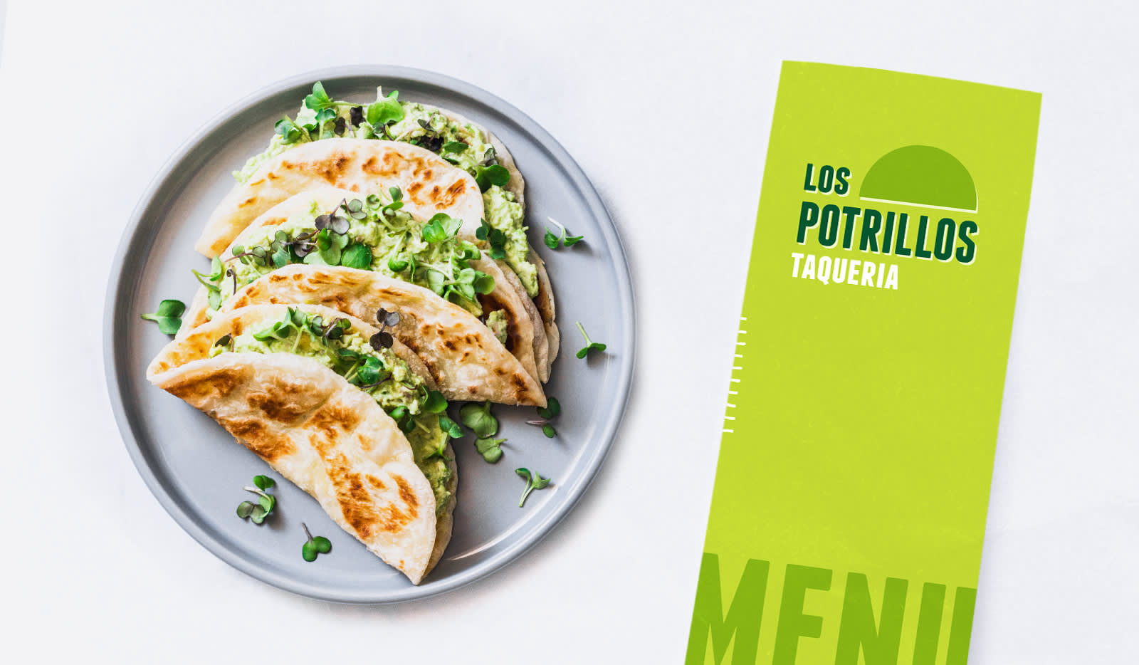
Brochures are kinda like Polaroids: they’re back. Or maybe they never left? For a long time though, it seemed like brochures had been pigeonholed as theme park entrance handouts or college tour party favors. However, they’re still pretty handy-dandy marketing tools, especially for small businesses. Think budget-friendly, brand-centric, and versatile.
Two ways to design a brochure in PicMonkey
Now, with the ability to add multiple pages to your design in PicMonkey, creating print or digital brochures is much more seamless and simple! We’re talking about designing front/back folded brochures and those clever multi-page digital brochures you may have recently downloaded to browse a restaurant menu or spa offerings, for instance.
We’ll learn how to make both styles in this article. Read on for the complete tutorial, along with design tips and examples.
Learn how to design the front and back of a tri-fold brochure
Quick steps for designing a tri-fold brochure
Start with a printer paper sized blank canvas.
Click Settings to create a 1 row x 3 column grid.
Click the Pages icon (plus sign in lower right corner) to add a second page to your design.
Download and print yourself or send to your local printshop.
Tri-fold brochure design

Tri-folds are the OG brochure design. If you’re embarking upon a door-to-door marketing campaign or attending a big marketing event, these come in clutch.
To get started, open a blank canvas, then visit Settings to layout helpful gridlines. This’ll make designing your tricky triple-faced brochure much easier (and they won’t stay there when you save and print). To help visualize the design, we’ve labeled each section.

In order to create a complete brochure, click Pages and add a second page. Stick to your brand when designing. You can use hex codes to find the exact colors you need. Add company-specific images for that personal touch, and customize however you want. And how ‘bout that text? When it comes to the fine art of brochure design, your copy matters just as much as your images. Use one of our text layouts for something that’ll complement your imagery like cream in coffee. Even better, layer your text onto photos for a brochure that POPS in customers’ hands.

Once you’re done, it’s time to download and print. If you’re a PicMonkey Pro subscriber, you can download your finished product as a PDF and immediately send it to your printshop, or print yourself. Otherwise you can download as a PNG or JPG (PNG will have better quality and we recommend this file type for printing) — each page will save separately.
Digital brochure design
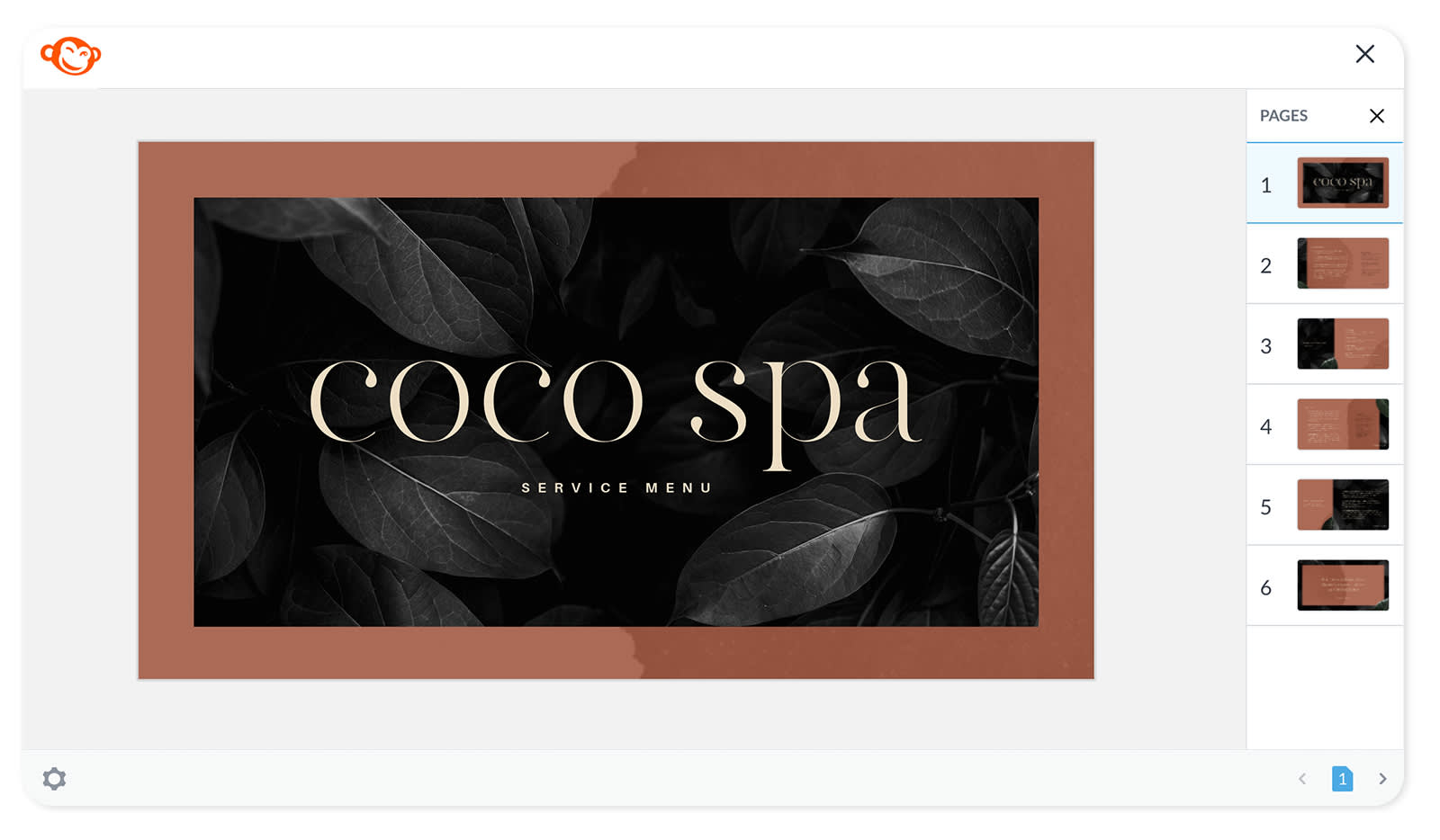
These days, digital brochures are much more common than paper brochures. Small businesses like to offer downloadable pamphlets that list contact information, services, special offers, etc. Restaurants digitize their beautifully designed menus so that diners still get a bit of the in-house experience when ordering to-go or delivery.
If you’d like to design a digital brochure, you’ll still use the Pages tool. However, this round you’re not limited to only two pages. You’re digitizing this beaut of a brochure-in-the-making, so you can add as many pages as you want (well, up to 30)! Then, cash in on that PicMonkey Pro subscription and download your brochure as a website or email-ready PDF document.
Brochure design tips
Ready to rock? Check out these tips first, then see them in action with tons of amazing brochure design examples below.
1. Solidify your message before designing
Ask yourself the forever important question: Why am I making a brochure? Knowing this is crucial to crafting a solid message and avoiding a final design that looks like a mad scientist experiment of messaging and tone. Maybe you’re putting together a flashy brochure for an upcoming expo or including customized menus with your restaurant’s to-go orders. Whatever the purpose, know before you start, and then build your messaging around it.
2. Consider simple designs
A clean design with simple text and high-quality photos will always stand above something cluttered and loud. Unless abstraction is part of your brand, you’re better off opting for a minimalistic design that touts your message over all else. Company photos add personality, but if you feel like the quality is lacking and don’t have time to organize a professional photoshoot, you can always browse our massive stock photography collection.
3. Keep things brand-focused
Treat brochures as they are: extensions of your brand. This means you want everything on the page — be it tradish tri-fold or digital masterpiece — to speak to who you are as a business. Consult your branding guidelines and make sure the copy font matches your brand. Same goes for colors and styling. If you’d like, you can even craft a brand color palette from one of your images! Pretty cool.
4. Get creative with digital designs
We’re not at Harry Potter levels of magic yet with traditional tri-folds, but you can go full-on wizard or witch with any digital brochure design. Wanna wow your customers with something that moves? Add video, or animate a picture, text, or graphic (without even having to utter “Locomotor”). Take your pop culture relevance to the next level with GIFs. Better yet, self-made GIFs that relate to your brand. You have plenty of options for making magic happen.
5. Tri-fold or digital: Which one should I make?
How about both? If your business has a professional website and you think your brochure has a place on it, you can easily create both versions in PicMonkey, and you’ll notice with our below examples that almost every traditional tri-fold could be transformed into a digital brochure. For example, if you’re a local restaurant, you probably want tri-folds and digital menus. To make things even easier, start with one of our menu templates.
Ready for some design inspo?
Brochure design examples for restaurants
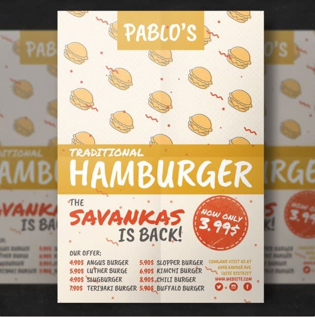
Source: freepik
This sample concept excels at integrating graphics into its visual design for extra flavor (pun intended). Graphics are a versatile design choice, as long as they fit your brand. They’re trendy, customizable, animation-friendly, and easy to use. Upload your own or borrow from our collection.
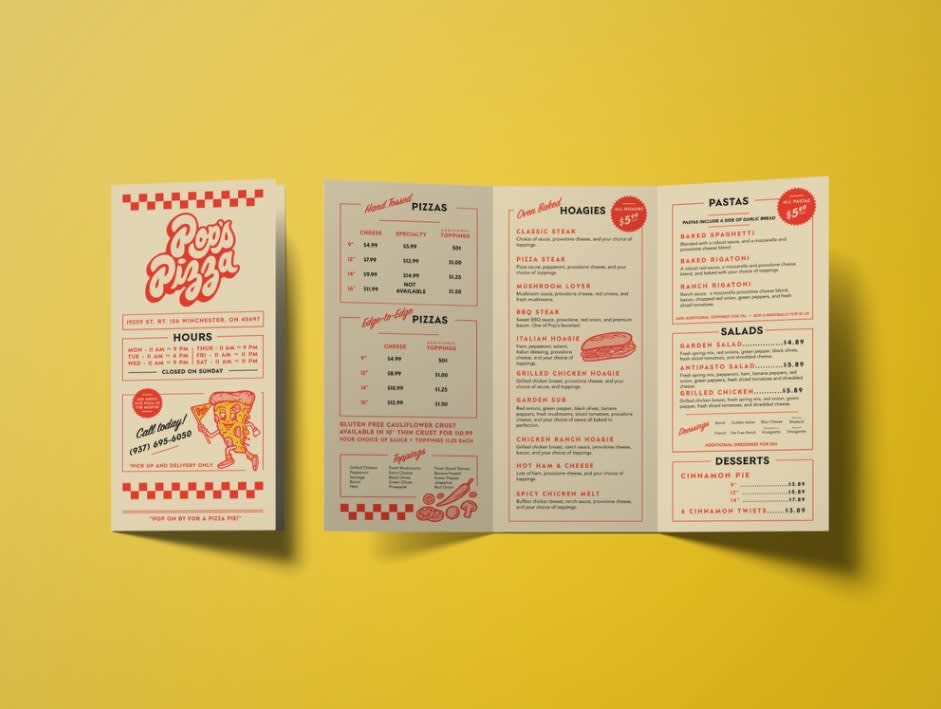
Source: Chelsea Bunn
This is a company that knows its brand. It’s as traditional of a design as is the brochure’s functionality: a clean and organized menu for customers.

Source: MD TUFAZZAL HAQUE
Your eyes might read this design more as a flyer than brochure, but digitize it with a few extra pages and that narrative changes. What’s more, a digital menu offers many different design options. You could easily use something like this as an intro to your menu, or a closing page.
Brochure design examples for salons & spas

Source: Katya
If using a brochure to share your services and prices, simple wins more often than not. This design adheres to an intentional color palette and imagery to highlight what customers really want to know when they open up the pamphlet: What’s available, and how much does it cost?
Source: nuruzzaman hridoy
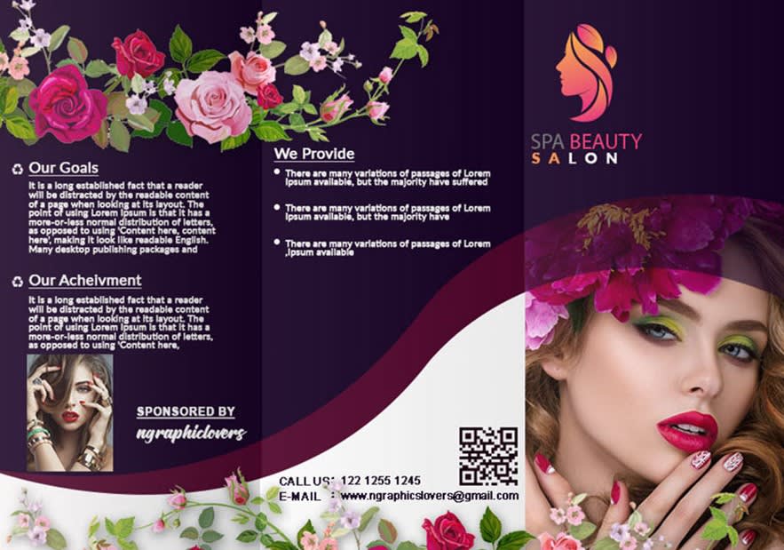
Notice how colors and images play off each other in this example. A bold palette meshes with flowery imagery. It’s perfect for the business, and a lesson in thinking about complementary relationships between elements of your design.

Source: Key Prints Agency
Food for thought: Not all printable brochures have to be tri-folds. Since JOJA Nail’s brochure was designed in landscape fashion, it’s able to feature larger and more detailed imagery. Plus, a brochure like this doesn’t just have to live at front-of-shop. You can easily save it as a PDF and use it on your website for all of those digital customers.
Brochure design examples for health & wellness

Source: Ashan Designer
Catchy copy attracts the eye, followed immediately by a list of business services. If you’re a personal trainer or gym with a slogan you’re known for, it might have a place on the front of your brochure.
Source: Kyle Anthony Miller / Brass Hands
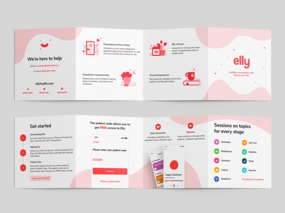
Health & wellness information is often process-based, with a specific flow to it. You can almost picture this brochure as a landing page. It’s well-organized and clean, using graphics where appropriate and intentional colors to highlight copy.

Source: Mayank Rathi
If you’re crafting an information-heavy brochure, opt for simplistic design. The Good Food Box’s minimal color choices help define its text-heavy areas.
Brochure design examples for churches
Source: Visual Jams
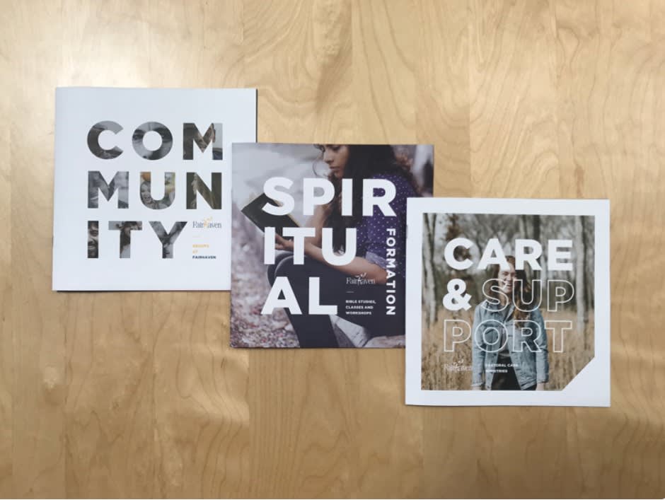
These spirituality-themed brochures adopt the same idea as JOJA nails: Brochures come in all different shapes and sizes. Another cool visual element on display in this example is placing a picture inside of text. You can do that in PicMonkey using clipping masks.

Source: Nicole Langford
Besides supporting the business itself, brochures make great marketing materials for events and series that you host, like in the above example. If your church is starting a new round of programming, use a brochure to get the word out during general services.
Source: Tylor J Reimer
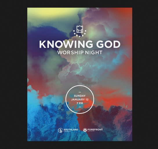
Spiritual designs benefit from unique, otherworldly blends of color. Consider how you can use stylized color palettes to evoke specific feelings in your audience.
Other brochure design examples
Source: Kamrul Islam
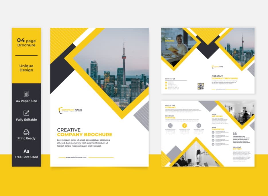
We’ve seen the influence of shapes and geometric patterns in our designs for thousands of years. Implementing shapes into your brochure is a clever way to help organize your information and attract eyes at the same time.
Source: Ariful islam
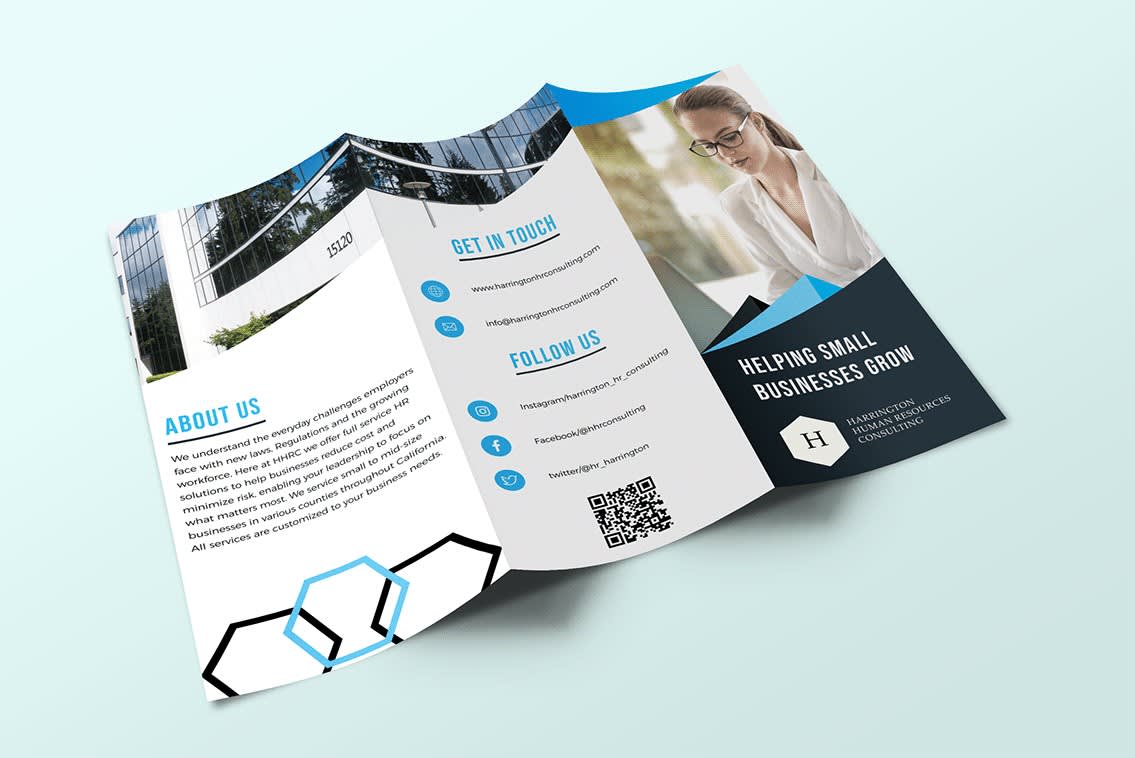
It’s worth mentioning that a business-specific brochure should include any and all contact information, like in this example. This is particularly important if you’re passing these out far from your location — how can someone find you online? Let them know.

Source: Aashim K
And finally — here’s the most extreme of visual brochuring (yes, we did just make up a new verb). If your business has vibrant, sprawling landscape images to feature, always consider a larger page. It might not fit in someone’s pocket, but mega impressive imagery is going to attract eyes either way.
