Color is an exceptionally important piece of the web design puzzle. No two color schemes are alike, and it'd be irresponsible to say that "ABC scheme" will work better than "XYZ." Every color carries its own symbolism. Really, website color schemes come down to who you are, who your audience is, and how you want them to feel when they visit your site.
If you're looking for color inspo, you've come to the right place. We've compiled 30 different color scheme examples to help spawn your own ideas. Just click on one of the categories below to get inspired, or start scrolling!
Types of website color schemes
Minimalistic website color schemes
“Simplicity is the ultimate sophistication.” — Leonardo Da Vinci

It’s simple, and sometimes simple is the best option. Black, white, and a burnt orange inform this design. Adding the drill’s harsh aluminum and dirty red only makes this color scheme more effective. What traditionalists might think of as male dominant colors are instead used for a female-driven design.

The less is more mantra plays well in this color scheme. A charcoal gray (that grows darker as we travel down the page), black, and white all come together to create a refined, minimalistic look.

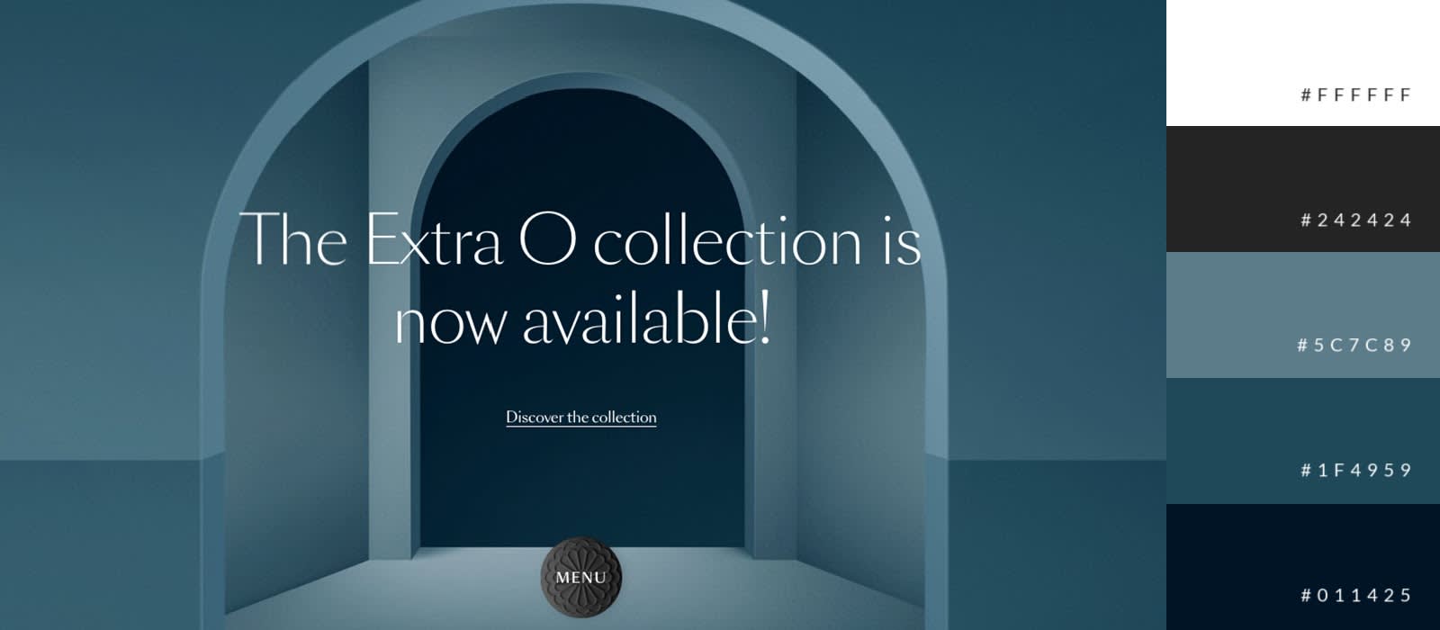
Monochromatic color schemes are a popular choice among designers and, particularly, minimalists. Why? Because it works. Like in this design, featuring a largely monochromatic blue palette, with contrasting white text.
Bold website color schemes
“The doors will be opened to those bold enough to knock.” — Tony Gaskins

Richness and saturation aren’t the only things that inform bold colors. The multi-layered combination of colors on this site is striking. It effectively employs a diverse palette of pastels.

Vibrant orange, green, and yellow work like spokes in the same wheel against a gray background. White and black also have parts to play, helping draw our eyes to the brighter colors.

What’s worth noting with Shelf Engine’s design is the bold contrast between black and teal. The design team has chosen colors that differentiate enough to make the site’s key images effectively leap off the page.
Futuristic website color schemes
“If you want something new, you have to stop doing something old.” — Peter F. Drucker

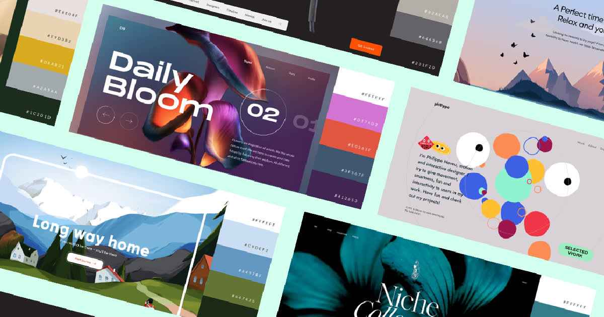
For Daily Bloom, the future is now. A radiant orange, mixed with a luscious purple and dark blue and green create something futuristic. The apparent white text accentuates the bold gradient color combo behind it.

Like Daily Bloom, EarCOUTURE uses a spectrum of colors to propel us into the future. In fact, it’s this mixture of primary and secondary colors — red, blue, yellow, green, black, white — and their accompanying hues that create spectacle; something we haven’t seen, something unknown. Something futuristic.

Neon colors highlight this futuristic design. Particularly, a reflective, neon orange that contrasts well with the black backdrop and white text. Subtle tones of blue and purple mesh with the orange.
Relaxing website color schemes
“Everything we do is infused with the energy with which we do it. If we’re frantic, life will be frantic. If we’re peaceful, life will be peaceful.” — Marianne Williamson

United Earth Space Force’s color palette is serene, alternating between a dominant off-white and earthly blue. Each color gets its time in the spotlight.

There’s nothing more chill than being full of optimism and delight, which is exactly what the color yellow can symbolize. This design takes that to heart, incorporating a friendly, macaroni-and-cheese-esque golden-yellow hue that, when coupled with minimal tones of red, white, and black, is friendly and welcoming.

Not only is reading a totally chill activity, but UBook’s color scheme is inviting. The warm colors brought forward by someone reading pair nicely with a calming black and white. Why would you ever want to feel stressed out when reading? UBook makes sure to address this with its website color scheme.
Professional website color schemes
“Without professionalism I’d be an amateur. And the clients I want don’t hire amateurs.” — David Airey

There’s nothing wrong with keeping things professional, and this color scheme does just that. It’s a basic black and white, influenced by refined tones of brown from the home’s interior design. The result is a site that’s both professional and elegant, exactly what you want when selling homes.

Subdued color choices come together to provide a look that’s polished and professional.

More housing, more professionalism. This website design employs an array of lightly toned colors against a white backdrop. Despite the intentional clutter, it’s a sophisticated look. The orange in Proto Homes logo also works well when used in the “Talk to Us” CTA.
Eclectic website color schemes
“You can’t wait for inspiration, you have to go after it with a club.” — Jack London

This color palette channels its inner-90s kid with a backdrop of rich green, canvas of white, and peppering of pink, orange, yellow, and light blue. It’s a blast from the not-too-far-away past that works.

The gray backdrop accentuates a zany compilation of colors from teal to blue to yellow to orange to red to burgundy. However, they work in harmony because of the intentional contrast.

Lots of cool things going on with Goliath. A lot going on, in general. Ultimately, the design features a heavy mix of primary blue, red, and yellow. Multiple shades of green, along with salmon, finish the design and leave us with a retro look reminiscent of the '90s.
Naturalistic website color schemes
“Look deep into nature, and then you will understand everything better.” — Albert Einstein

Jump paints a picture (quite literally) with cool blue and soft white tones. The real stars of the show, though, are the warm hues of orange, salmon, and red, which transport us to this scenic location.

Beauty is very much an earthly concept, and this website color scheme embodies that with rich green and earthly tones, along with an eclectic mix of vibrancy that pops against the natural colors.

Rudolph Care's luxury sun-friendly beauty products are accentuated by a balanced blend of neutral tones, along with a rich, contrasting orange.
Sophisticated website color schemes
“True class can never receive the highest grade...for its grade is endless.” — Denise Newsome

Notice two different types of white used in this website design. The contrast adds classiness, in tandem with the subtlety of the flowers’ stained yellow centers. A clean black backdrop refines the image and sells sophistication.

Dark colors are pros at eliciting luxury and sophistication. They blend well together. Such is the case with this design, where a solid black meshes with brown and an off-white. Subtle traces of teal add to the sophisticated look.

Nocta proves that classiness doesn’t have to stem from complexity. Black, gold, and a contrasting white work in unity here for a design that’s both refined and elegant.
Artistic website color schemes
“Drawing is vision on paper.” — Andrew Loomis

What’s unique about this color scheme is its back-to-basics approach. Simple uses of black, golden-brown, and the kin of magenta and violet go well with a similarly modest illustration.

Vibrant colors that speak to the earth and nature help create a super compelling design. In a matter of seconds, we’re transported to the picturesque view of a rural town nestled within a vast mountain range. Credit this visual experience to its authentic color palette.

Like Mount In, Master makes use of authentic and vibrant colors that liven its illustration. The serene teal of the sea against the light brown of the mountains create a welcoming atmosphere, and one worthy of joining.
Clean website color schemes
“Cleanliness can be defined as the purest emblem of the mind.” — Joseph Addison

Clean colors make TIDES’ website design a homerun. Blue and black complement each other spectacularly. The addition of white amongst the blue contributes to the clean look (not to mention, the blue’s design harkens to a river or stream). A squiggle of gold adds emphasis.

Another simple and effective palette here. Dark teal and black complement each other well. The white text is a clean design choice. Together, these colors create something delicate and balanced.

There is stuff happening in this design with the DNA helix and accompanying dots scattered about the page, but that doesn’t mean it isn’t clean. In terms of coloring, this scheme is clean to the max, primarily making use of just two colors: white and red.
Make your own website color scheme
Now that you've gotten the inspiration you need to get started on your own color combo, let PicMonkey help. Our Guide to Color page is loaded with information that'll help you understand color theory and how to use hex codes to find the colors you want.
Not to mention, there are details on just about every color available, plus our almighty color palette generator, which can create a color palette for you based off a photo! Or dive into some more color inspiration — we can't get enough, which is why we took the time to outdo ourselves with 100 different color combinations that you can use in your designs.
