Creating a brand color palette is an essential early step in establishing your brand identity and presenting it to the world, because the colors you choose visually represent your brand’s persona and aesthetic. Color palettes make it easy to quickly replicate your brand’s look when creating your website, digital assets, social media posts, and business cards. If you add a color palette to a moodboard containing images that represent your brand, you’ve got a lightweight brand design kit ready to go.
The psychology of color

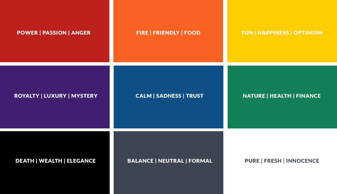
There’s more to selecting brand colors than simply choosing your favorite color. Different colors can elicit different emotions and reactions, and being aware of these can influence how your brand is perceived. Want to be seen as warm and friendly? Choose at least one warm color (think orange and red). Going for a solid, trustworthy vibe? Blues are your pal. Think about the industry you’re in and look at the colors they use.
But color theory ain’t all black and white (both of which are mourning colors in different cultures). Need help choosing the right colors? Keep reading, and also check out our article Color Theory: Choosing the Best Colors for Your Designs.
Choosing colors using the color wheel
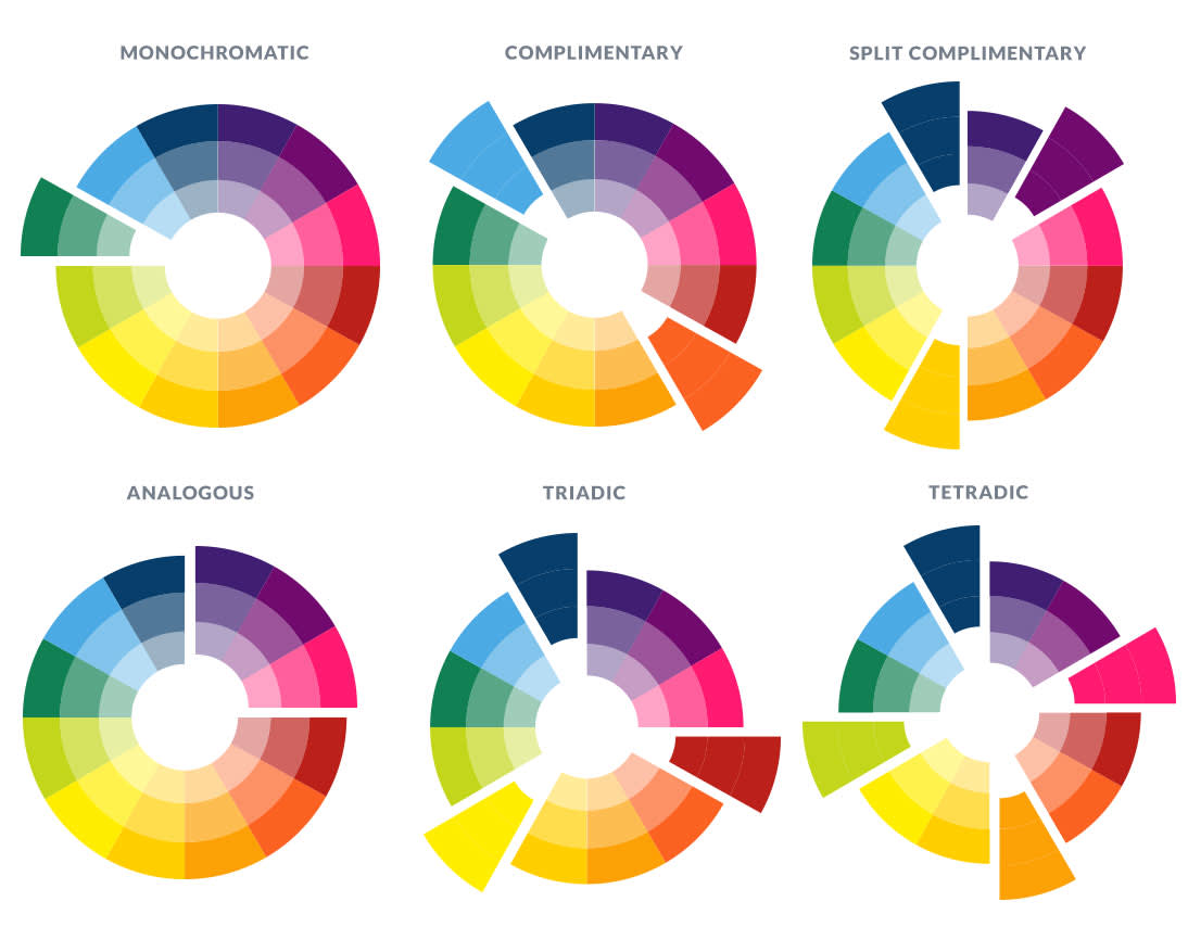
There are colors that play nicely together, and there are colors that are civil at best. Having an idea of which types of colors work well with each other can help you choose the right ones to create a harmonious color palette. There are several different ways to group friendly colors together:

Monochromatic: Different tints (base hue + white), tones (base hue + grey), and shades (base hue + black) of one color, plus a neutral.
Complementary: Colors opposite each other on the color wheel in different tones, tints, and shades.
Analogous: Colors that sit next to each other in the color wheel.
Split complementary: Pick one color and find its complementary color (the one right across from it on the color wheel). Then find the colors on either side of the complementary color. Those two colors and your original color make up a split complementary color scheme.
Triadic: Colors that are evenly spaced around the color wheel.
Tetradic: Two pairs of complementary colors.
Choosing colors from a photo

If you have a photo that perfectly captures some colors you want for your brand, it can provide a quick hack for nailing your color palette. And luckily you can use PicMonkey templates and the eyedropper tool to quickly extract those colors and add them to your palette.
Steps for grabbing colors from a photo:
In the PicMonkey editor, click the Templates tab in the blue column.
Type “color palette” in the search box and choose a design.
Click the photo in the design to select it.
In the Graphics palette that appears to the side, click the Replace button, and choose your photo from wherever it’s stored.
Click one of the color swatches featured in the design. In the Graphics palette, click the color dot at the top to open the color picking tools.
Click the eyedropper, and hover over the color in your photo you want to show in your color swatch. Click again, and the color you clicked replaces the swatch color.
Repeat steps 5 and 6 with the other color swatches in the design.
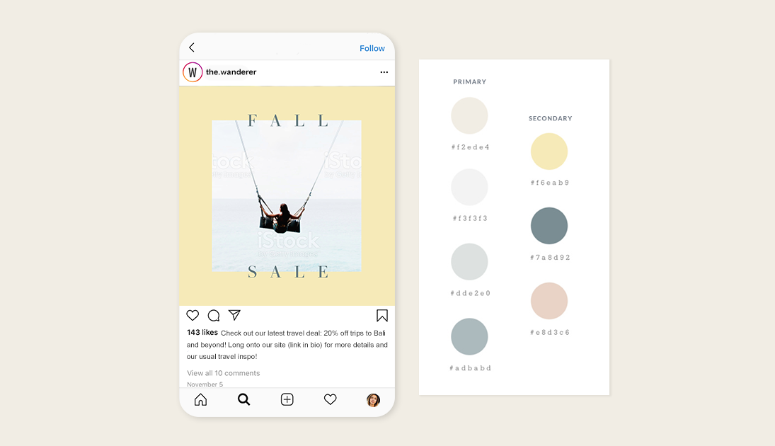
Note that the hex code appears in the box next to the color dot when you move the eyedropper over colors. It’s a good idea to include the hex code for each color in your palette. That way, you can always ensure everyone uses the correct colors when they create assets.
Creating a secondary color palette

If you’ve chosen the colors for your palette but still yearn to exercise your color muscles, you might consider creating a secondary color palette. A secondary palette can be used to mix things up or to enhance a campaign — think seasonal or flash sales. Use one of these palettes to set designs apart while still retaining a connection to your brand. We’ve got plenty more information on making secondary color palettes. Be sure to take a gander when you get a chance.
Save your brand colors and more in a Brand Kit

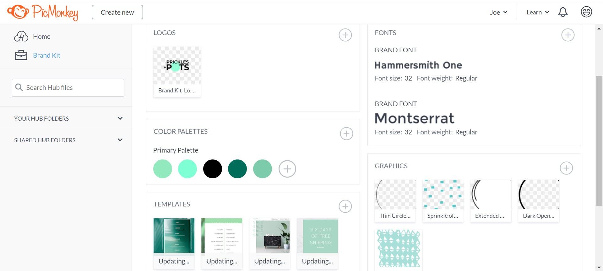
Pro subscribers can take advantage of the Brand Kit feature in order to save all their fonts, colors, graphics, photos, templates, and logos in one central location. When you stash all your fave branding assets, they "follow you around" PicMonkey as you design so they're always handy when you need to quickly grab an oft-used font or logo.
Not yet a Pro subscriber? You could be!
Displaying your color palette on a brand board
If you want to use images in your palette to show your colors in action, a brand board template can help you do that. After you find a template you like, click around in it and replace any photos with images you like from our stock photo library, or upload your own.
Use and share your palette
PicMonkey automatically saves your designs to the cloud, so you can access the palette you make wherever you are. And if you really want to be cool, use PicMonkey’s totally awesome collaboration features to share your color palette with your team, your designer, your product packaging vendor, or anyone you want. You can also share to email and your favorite social channels from within PicMonkey.
To use one of your palette colors while creating designs in PicMonkey, click the color swatch. This will bring up the Graphics palette and the color dot. Click the dot and the hex code will appear. Copy the code and it’ll be ready to apply to whatever asset you’re working on.
