Customize this template: Home Workout Equipment
Does your website feel sad, dull, or lifeless? You might just be in need of a hero. Heroes are huge-mongous, attention-commanding images that you can put on the homepage of your website to intrigue, beguile, and delight your visitors. A good hero image can help visually communicate what it is you do and provide a sense of who you are as a brand. A great hero image will help pull people in to explore the rest of your website.
Heroes usually live on your homepage but they can also be used on any other page of your website. (Even individual blog posts can have hero images.) And while most heroes are still photographs, they can also be graphic designs, rotating slideshows, and even short video clips.
To make a hero image in PicMonkey:
Find your perfect image. If you’re blessed with baller images of your own, you can use one of those. You can also browse our ginormous stock photo library to find a pic that works for you.
Crop it to the right size. The optimal size for your image is going to vary from website to website. Just remember, it’s usually better to go bigger than smaller. If your image is too small, it will be blurry, but if it’s too big, most sites will scale it down to fit.
Or resize it in PicMonkey. Just make sure Keep proportions is checked so that your image doesn’t stretch. If you only want to include part of your image, use the Crop tool.
Gloss it up! Apply Edits and effects to your photograph, add text and graphics, touch up faces, and just make it your own.
Looking for some hero inspo? Look no further! Scroll down for a hearty dose of design goodness.
Interact with your image
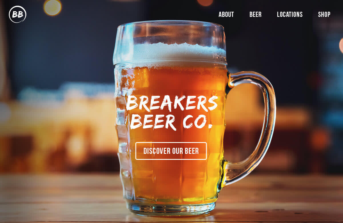
Hit ’em on the playful side by placing text so that it interacts with your image. This hero gets up close and personal with this company’s product (beer). Placing the text right on the glass and blurring the background helps emphasize the product even further.
More than just providing a captivating visual, the placement of the call-to-action button on top of the enticingly glowy beer gives website visitors all the more reason to click and find out what else there is to see.
Go graphic
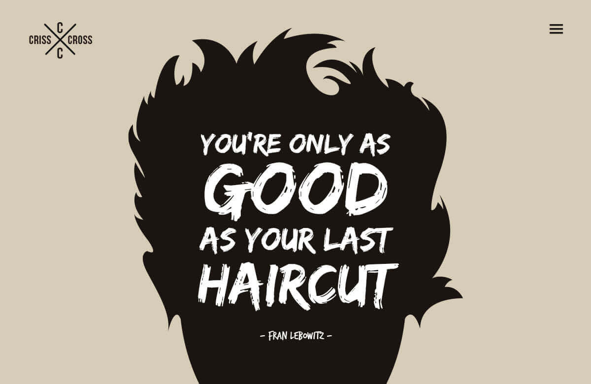
You don’t always need a fancy-pants camera to create striking images—sometimes you just need a couple of carefully placed graphics. (We made this one by combining a circle and a beard.)
This look manages to be minimal and dramatic at the same time thanks in part to the bold font and typographic hierarchy. Wanna make your own graphics but aren��’t sure where to get started? This logo making tutorial will help get you set up with the basics.
Use an action shot

Showing someone using your product or service is a great way to introduce yourself to a new visitor. It’ll quickly clear up what you do and can help establish a professional feel for your website.
Notice how the words and buttons on this page aren’t perfectly centered? Similar to the Breakers Beer Co. image, the text is interacting with the image behind it, but this time it’s letting you see exactly what’s going on in the image.
Set the scene

Maybe you offer a whole host of services and products that can’t easily be distilled down to one image. In that case, it might be better to evoke the feeling a person will have when they use your product or services.
With the sun just beginning to crest over these purple peaks, this image conjures a feeling of daring, adventure, and anticipation. Get this look by starting with Geometric graphics and erasing the tops so that they look like jagged peaks. Use slightly different colors in the same color range and layer them one on top of the other.
Flat lay all day
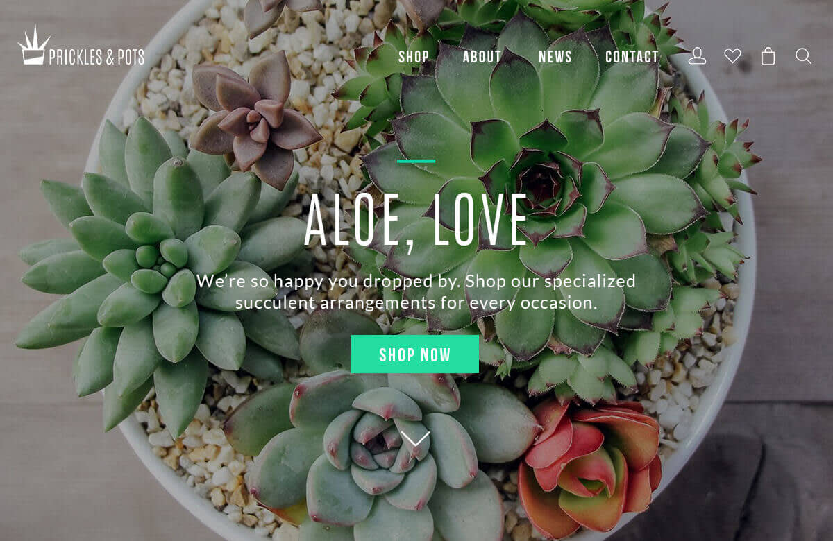
An undeniable fan favorite, flat lay images give your hero a chic, bird’s eye view of your product and instantly give your website a modern feel.
In this example, the image is darkened so that you can better see that white text. To get this look in PicMonkey, drag a Geometric graphic over your entire image and adjust the Fade slider to around 80%. You’ll be able to clearly see both the image and the words. When it looks good, go ahead and Flatten the image.
Play with blank space

Consider using an image that’ll give your logo room to shine. A pic with a lot of empty space might not follow traditional rules of composition, but that’s okay! As long as you balance the image when you add your text and/or graphics, it’ll look great.
This image is a flat lay where the photographer intentionally left some “blank space.” The wet spots on the black table add more visual interest than a plain black background would, but more importantly, it’s consistent with the rest of the image.
