Trends often go one of two ways: “everything old is new again” or “you ain’t seen nothing yet.” The direction is tied to context — what’s happening in the culture that’s influencing design or fashion or lifestyle? Is the trend a reaction to the culture or an agent of change that impacts the culture? That’s a question for the sociologists, but either way, we’re excited about the trends we’re seeing in the typography world. Lots of bold, exciting looks that will grab you by your lapels (if there are lapels in Milan this season, that is) and demand your attention.
Extra-loud, bold fonts

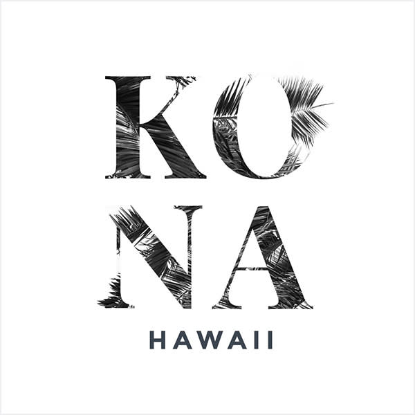
No way for us to miss this trend. A bold font like this commands attention, and it can easily turn text into a prominent design element — rather than only providing information, it can visually extend a brand or message. The big, chunky letters make it a natural candidate for masking (see below), which provides even more opportunities for innovative design.
Imaginative masking

Did we say masking? You bet we did. It was a design trend last year, and it’s still on our list of trends for 2019, especially when combined with some big ol’ fonts. Their size and shape makes them a natural for letting images or textures peek through their outlines.
Tip: You can use graphics as masks, too. Choose one from over 3,000 in our Graphics tab, or add one of your own. Select the graphic in the Layers palette, apply a texture to it, and bam! You’re masking!
Bold, beautiful gradients

Another holdover from our 2018 list of design trends, gradients are still going strong in 2019. Understated or in your face, gradients let you blend colors and create eye-catching backgrounds. Use gradients on text to pull in brand colors or to give emphasis to specific words.
Tip: Add a gradient to enhance the background of a flat design.
Minimal sans serif fonts

Can something minimal be a big thing? We think so. We’re seeing minimal sans serif fonts working really well in designs that use a lot of negative space. Using a lightweight font in the midst of a void can evoke powerful emotions, and these can vary widely depending on the design.
Tip: If PicMonkey’s bucketful of fonts doesn’t scratch your sans serif itch, peep our Free Fonts article for an annotated guide to all the font sources you could ever want in this life. There are tons of free fonts out there. Figuratively, we mean. We don’t know how much fonts actually weigh.
Attention-grabbing outline text

We’d like to (sorry) outline our reasons for liking this trend. Outline text, especially when used with a bold or thick font, can make your content imperative without being overwhelming. Easily read while letting the background or other images peek through, outline fonts can seamlessly integrate into many different designs.
Tip: Use PicMonkey’s Knockout feature (Text > Effects > Drop Shadow > Knockout) to make nearly any font an outline font. Move the Distance slider to 0, then experiment with the Blur, Intensity, and Fade sliders to get the look you want.
Custom everything

With all of the fonts out there, you can find something that fits your needs pretty readily. You can even use Comic Sans if you’re so inclined (please don’t be so inclined). One thing we’re seeing a lot of, though, is more and more designers tweaking their fonts for custom looks.
Tip: PicMonkey lets you manually alter or adjust fonts to make them unique. Applying textures, shadows, and curves is just the start. Changing the spacing and using tools like Nudge will get you a look that is 100% your own.
Highlighted type

Remember highlighting important stuff in your textbooks so it would stand out and you’d retain the info for the test? That works in your designs, too. A highlight draws the eye right to the text. This is currently trending in Instagram stories where people need text to stand out against a background.
Tip: Put a box from the PicMonkey Graphic tab around your text, choose a color for the box, move it down a layer, and you’re done. This works best with short text blocks — a long highlighted block would likely overwhelm most designs.
Layering text with other elements

Another trend from past years that keeps gaining steam is layering, and with good reason. It provides an easy, stylish way to integrate text and images, creating the illusion of depth and giving you the opportunity to emphasize content by moving it forward or backward in the design.
Tip:Select some text in your design, click the Erase tab in the Text palette, and erase some text to create a cool layered text look. A bit of a drop shadow can add some contrast that will make things pop.
Overdone type

If you’ve looked at cultural trends lately, you might feel like you’ve fallen into a circus tent. Neon colors, rave clothing from the 90s, sneakers inspired by anime and hot wheels, and animal prints (again!) are all coming your way — and often at the same time. Designers are going big and experimenting with new looks and combinations of styles; not just with images, but with fonts, too.
Tip: Do it all. Try adding textures and text effects to your fonts. Then add some more. One top PicMonkey trick is using the Touch Up tools on fonts — they’re not just for faces any more.
While we’ve got you pondering the future, feast your eyes on Graphic Design Trends for 2019.
