We want your words to sing—and, most importantly, be heard. It’s a tricky balance to hit all the right notes, with design that’s functional and artful. That’s why we built four text effects for readability and style: Drop Shadow, Knockout, Inner Shadow, and Curved Text. Try them out in the headlines and large-text parts of your designs and see what a difference they can make.
Quick steps for adding text effects
Click the Text tab (Tt icon on the far left), then click Add text button atop the menu.
Type your words in the text box that appears over your image.
Click Effects at the top of the Text palette, and choose Drop Shadow, Inner Shadow, or Curved text. (Knockout is a sub-control at the bottom of Drop Shadow.)
Adjust sliders for angle, distance, scale, blur and more. You’re done!
Now let’s get to the juicy details…
Get to know the text palette
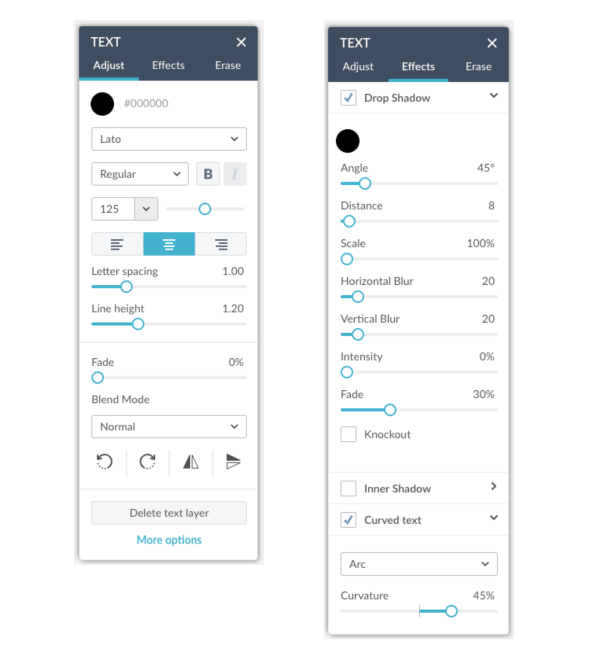
The Adjust section of the Text palette (left) features a fonts drop-down menu, letter and line spacing and more. The Effects section of the Text palette features shadows and curved text.
Now let’s get you more familiar with all the options in your Text palette. Click the Text tab on the left-hand side of the editor and add some new text, or grab a text object you’ve already created. Once your text is selected, the Text palette will appear to the side of your image like a gift from the content heavens, replete with basic edits, an erase tool, and the following legibi-licous beauties in its Effects tab (not to be confused with the Effects tab in the blue column on the far left side of your screen).
Drop Shadow
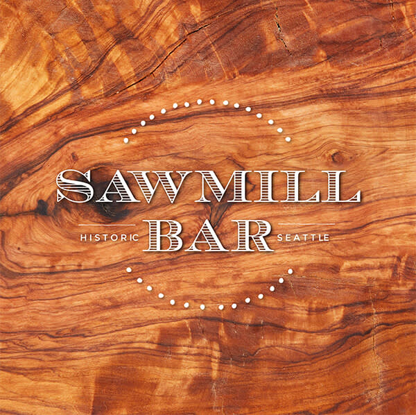
The reason drop shadows make text so readable is pretty simple: contrast. Any solid color text can lose its contrast (and thus definition) on top of a dynamic image. A dark shadow creates contrast against light text, and vice versa. It’s a go-to choice for giving flat text a dash of spice and contributing to the greater good of the design. You can adjust the angle to create a sun-soaked feel in any direction.
Tip: Keep the Scale and Blur sliders relatively low for the optimum popped-out effect. But feel free to go big and get funky.
Knockout
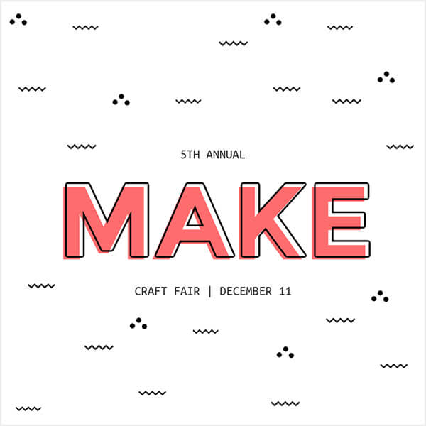
Let your image shine through your text with Knockout, the effect that turns drop shadow into just shadow by making text transparent. This effect is a quick-like-woah way to achieve an alluring see-through look, revealing the objects or simply the background color behind the letters. You can then experiment with the reflection’s color, blur, intensity, and so on. Works like a charm on chunkier text, like Poetsen One. Adjust the levels of the shadow first, then click the Knockout checkbox (directly below the Drop Shadow controls) to make the original letters disappear like vampires in a Polaroid.
Tip: For a stunning stroke effect around your text, reduce the distance to zero and then fiddle around from there. Try some neon colors to get a retro “late-night pizza sign” look.
Inner Shadow
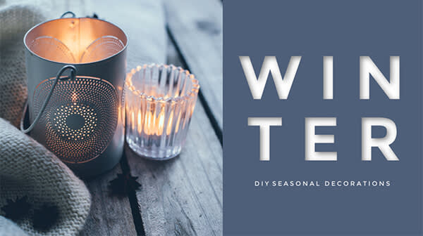
Not to state the obvious, but Inner Shadow brings the shadow inside your text. This ends up being super useful if you want your text to look like it’s been stamped into the background, like your very own fancy-schmancy letterpress text effect. At the right levels, the illusion of 3D is so legit, you’ll want to crawl right through the screen into the letters.
Tip: Change your font color (in the Basic tab of your Text palette) to something besides black before testing this effect.
Curved text
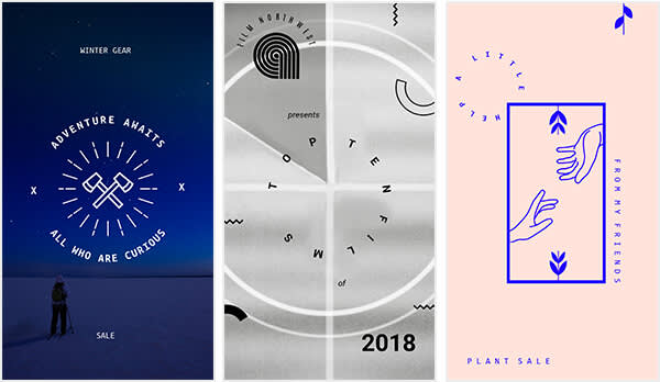
Another on-the-nose name here for an endlessly reusable effect—this hotshot tool rounds out and curvifies your words so they’re a smooth (and sexy) read. No two designs are created equal, so experiment with curve intensity to nail the results you seek in your heart of hearts.
Tip: Over-curving a line of text can impair readability and veer into trippy territory. But there’s a time and place for over-curved and even circular text! Certain badges and logos, for example, are defined by their roundabout text.
Read more: Get Ahead of the Curve With our Curved Text Tool
Customization tips
1. Color: Click the color circle and you’ve got four ways of choosing a hue. The eyedropper is extra handy for matching a color in your image.
2. Angle: Choose which direction your implied light is shining from. Can be a teeny perfectionist preference or a crucial detail, depending on the design!
3. Distance: A little gets you fun and poppy-outty, and a lot gets you horror movie titles or a nifty twin/clone sort of feel.
4. Horizontal and vertical blur: These sliders give a poltergeist-y look, or a sense of motion. Or inebriation, if that’s what you’re going for?
5. Fade: Adjust this slider when you’re finished with everything, as a final how-far-are-we-going-with-this decision.
More fun things to do with text
One of the neatest tricks you could pull with your text is removing it—a portion of it, anyway. Using the erase tool in the Text palette, try some fine-point erasing to weave words into a scene. Layering text and photos by erasing bits here and pieces there can create stunning visuals, like humongous words veiled behind a mountain range or objects being pierced by pointy letters.
And why stop there? Explore the editor’s main Effects tab on the left-hand side for added oomph—many of them work swimmingly when applied to your text.
