Maybe you volunteered to make invitations for the company holiday party, in an attempt to (finally!) gain your boss’ approval. Or you leapt into entrepreneur land and need to create brand assets for your budding biz. Whatever the reason, you need to design something. And if you’re new to the design game, your first attempts might make you believe that you hit your artistic prime at age 5, when your mom hung your crayon-and-macaroni portrait on the refrigerator.
But don’t hurl your computer against the wall in a fit of creative exasperation just yet, newb. Here are some expert graphic design tips and tricks to help you master your task, and start thinking like a designer. And if you wanna employ your newfound knowledge while you read, open a blank canvas in Design or find a template to customize.
All hail the graphic design hierarchy
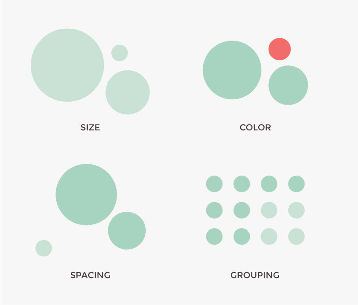
When you opened this article, you were able to easily identify the title and subheadings. This is because these elements were given different visual weights—the title is in the largest font, and the subheadings are in a smaller font than the title, but larger font than the rest of the text. Both the title and subheadings are bolded. This creates a hierarchy.
Hierarchy is important because it helps eyeballs flow through your document and brains process it easily. If your graphic design elements aren’t given different visual weights, you won’t have any hierarchy, and your viewer won’t know what’s most important. It’s kinda like being in a room full of people speaking at the same time and same volume—somebody needs to be louder if they’re going to be heard.
There are a few ways to give things different visual weight, including:
Size
Color
Spacing
Grouping
Having one dominant element is usually best, but a successful design with two top dogs (like a large header and call to action) is possible if the rest of your composition is balanced. Typically, the dominant element should be the most important part of the message. This idea applies to all of your visuals, and you can see how it specifically applies to text in our article about font hierarchy.
Spatial awareness
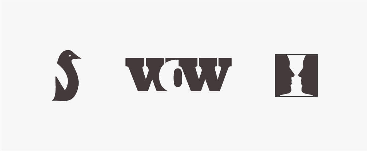
There are two kinds of space when you’re talking design: positive space and negative (a.k.a. white) space. Positive space is occupied by your design elements, and negative space is the empty space that surrounds the positive space. When the two make beautiful music together, your designs look balanced, polished, and clutter-free. Negative space can also be used to create some super-cool eye trickery.
How will you know if you’ve found that just-right amount of positive and negative space? The tough part is that there aren’t any hard-and-fast rules here. As one PicMonkey graphic design pro put it, “Ultimately, it’s not about the volume of negative space. It’s about the balance of elements and eliminating the things you don’t need.”
Using fonts in your graphic design
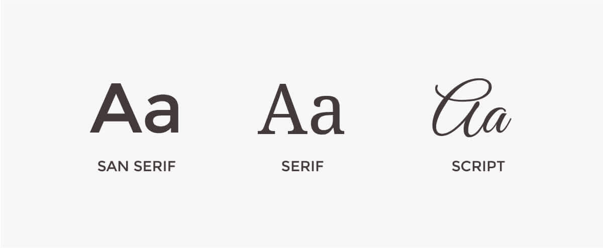
Fonts are oodles of fun, and they also have a ton of design power. There are two big things you want to consider when using fonts:
Don’t use too many. Most of the time, one typeface will do. Maybe two if you’re looking to add some contrast (think something scripty for a header and a simpler counterpart for body copy). For more about selecting and using typefaces, check out our article on font pairing, and remember that you can always keep it interesting by varying the size, weight, and position of a single typeface.
Remember readability. If you’re ever tried to read bright red, size eight text in a calligraphy-inspired typeface, you know that readability is important. Keep your words clear by thinking about the color, size, spacing, and style of your typeface, as well as the final size of your design, while you’re in the process of designing.
Size it right
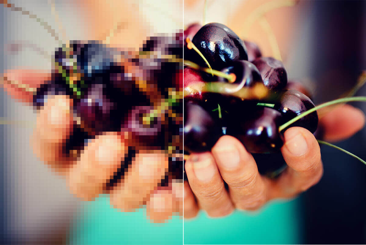
Image size and resolution can seem a bit mysterious if you’re unfamiliar, but those two things are key if you want to avoid a pixelated look or a site that moves slower than the dial-up internet of the ’90s.
If you’re designing something for print, multiply the inches of the size you need by 300 (the most common number of pixels per inch). So, by way of math, a 5×7 creation becomes 1500×2100 pixels. Use this size while you’re designing to avoid issues later.
For online display purposes, find a balance between display size (pixels) and file size (megabytes) so images display correctly without slowing your site down. The Roger, Pierce, and Sean options on the Save screen provide different ways to find your ideal compromise between file size and image quality. You can also easily adjust the size of your masterpiece with the Crop and Resize tools in the Basic Edits tab. Still feeling a little unsure about this whole size thing? We’ve got ya covered with our article on sizing and resizing images.
Beautify your pics (and your design)

A few basic edits can make a big difference in how professional your pictures look. Before you incorporate photos into your design, give them the virtual equivalent of a spit polish with a little cropping, saturation adjustment, sharpening, etc. Photo effects can also be helpful in establishing a consistent, on-brand look.
Your perfected pics shouldn’t be naked—and no, we’re not judging you for the content of your images. In design world, the term “naked images” pertains to images with an I-just-stuck-this-photo-here look, and their placement doesn’t seem purposeful. Borders, frames, and grid-like layouts should be used whenever possible in order to avoid in-the-buff images.
Colorful considerations
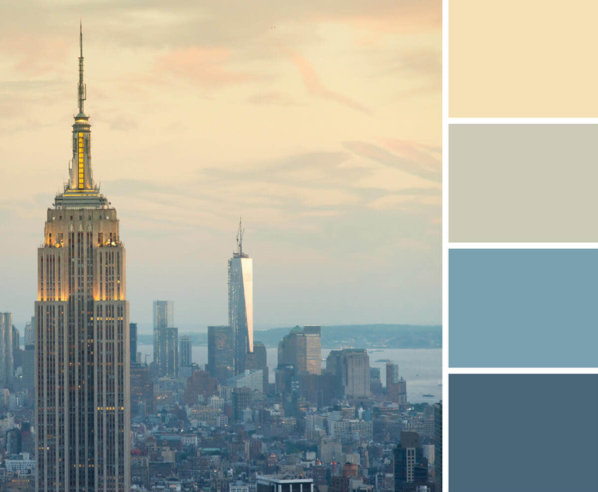
Unless you’re going for a rainbow-inspired vibe, you’ll probably want to limit the number of colors in your design. In most cases, two main colors and an accent color will do the trick, and try to avoid using more than five hues.
If you have already-specified brand colors, put those to use. And if you’re wondering what colors go together, making a color palette is a quick and easy way to master color pairing without diving too far into color theory. Color can also be used to establish that hierarchy thingamajig we mentioned earlier—making elements a different color than the rest of your design gives them more visual weight.
Think about who, when, and where
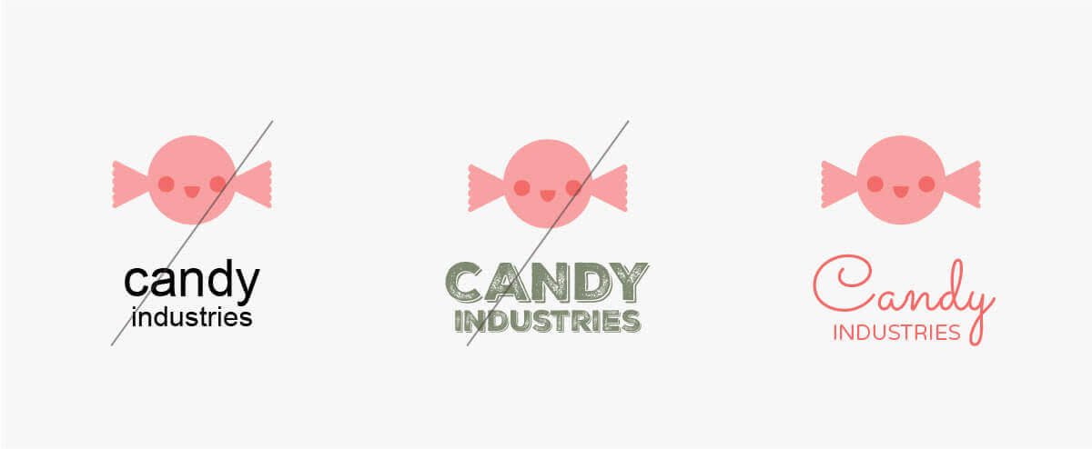
Your audience, occasion, and even the time of year can provide helpful design direction. Exquisite Corpse might be the perfect typeface choice for your Halloween party invite, but less than awesome if you’re designing a flyer for bingo night at the senior center. Fonts, colors—along with pretty much every design element—evoke some sort of feeling. For example, red shows up everywhere around Valentine’s Day because it’s the color of passion, and the Budmo Jiggler font is a prime choice for kids’ birthday party invites thanks to its playful vibe. Make sure the feels you get from each design element jibe with the overall message of your graphic design.
