The colors you choose to incorporate in your marketing materials and associate with your brand can have a powerful impact on the success or failure of your campaigns.
An astonishing 92.6 percent of people report color and visual components of the products or services they buy as the most influential factor in making their purchasing decisions. Choosing colors that’ll resonate with your audience before creating your marketing collateral is incredibly important.
To help make sure you’re working with the right colors for your brand and campaign objectives, here’s a few tips on how to choose the right color palette for your marketing materials:
Which colors align with your brand?

In business, color is proven to dramatically increase brand recognition. Think about a company like Nikon: Their signature bold yellow is hard to miss in their logo and it’s also applied as an accent color across their website. How about Etsy? Right away, the various shades of orange from around their marketplace are recalled. Pinterest has become iconic for their red brand assets. If your audience associates you with a color already, use that as your foundation.
If you have a company-wide color palette or set of colors you tend to use across your website, on product packaging, or in your past marketing materials, there’s no need to reinvent the wheel—start every new marketing campaign you create with these colors.
Identify colors that achieve your goals

If you don’t yet have a group of colors to pull from for your marketing campaign, take a moment to think about what type of emotional response you want to illicit with this campaign. Do you want your materials to feel exciting and bold? Calm and peaceful? Friendly and confident? Chances are, there’s a color that’ll help you quickly establish that connection.
As logo designer and brand strategist Ian Paget of Logo Geek explains, “Color is an integral part of a company’s brand identity. When selecting a palette, it’s important that you understand how competitors in your market are using color so that you can select ones that differentiate your business and marketing materials. Color can have a profound effect on how people perceive a business.”
“Navy Blue for example, such as that used by IBM, is one of the most trustworthy colors, while in comparison, orange can be deemed as much more fun and approachable,” he says.
“The ultimate goal is to take ownership of a color within your market. For example, if you see a red drink can, only one company comes to mind: Coca-Cola. The same is true of purple with Cadbury chocolate, which actually went as far as trademarking its color, Pantone 2685C, in the chocolate category.”
Find complementary colors

Once you have a clear idea of the colors to use to achieve your desired effect, it’s time to find a handful of complementary colors that’ll work well with your primary color. This will give you a polished color palette that enhances your marketing materials.
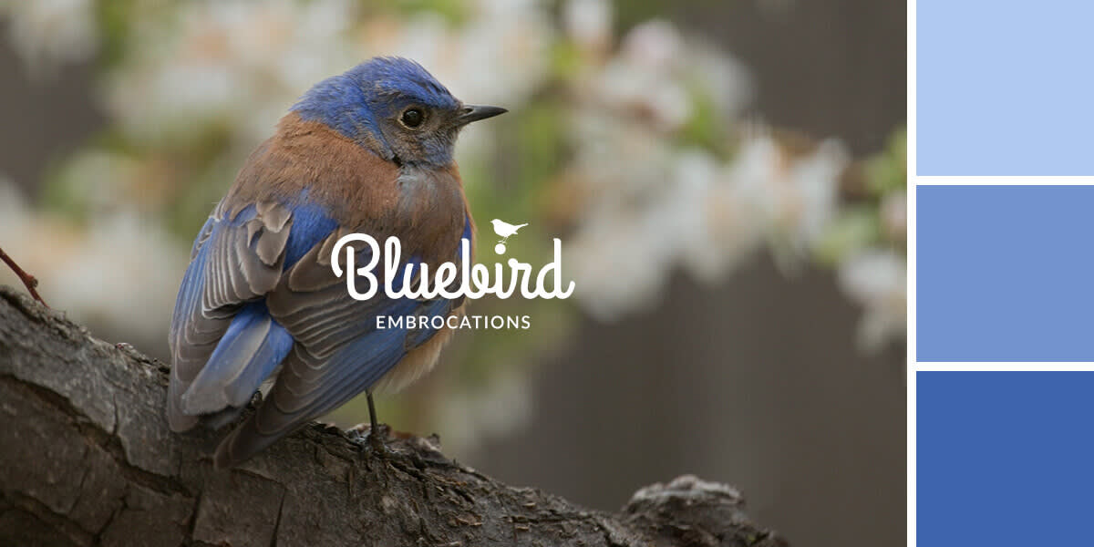
If your brand tends to use dark blues that are said to convey a sense of dependability and trust, start browsing through photos on a stock image site until you locate a few photos you love that use your primary color well. Then, pull out the different complementary colors that help enhance your primary color within that image—you can even use your image and PicMonkey’s tools to make a custom color palette. You can also use a tool like COLOURLovers to search for complementary colors and browse sample palettes.
Regardless of which color palette you choose to use in your marketing materials, remember that consistency is key to success when it comes to identification. In time, your regular customers will come to associate you with the colors you show them most frequently.
