Design, like most things, is a game of give and take—addition and subtraction. Adjusting the tiniest details, like the distance between letters, can be money moves.
Because spacing is super important in design, and because we want you to sound clever at artistic gatherings, we’re gonna get it all straight—tracking, leading, kerning— and also let ya know how to use these functions in PicMonkey’s editor with the Text palette.
Tracking, leading, kerning: What’s the difference?
Tracking, leading, and kerning have nothing to do with hiking or popcorn in case you were wondering. Most folks with even a bit of a graphic design background can easily confuse these terms because they all refer to the space around, and in between, words and letters—even pro designers can get the differences confused.

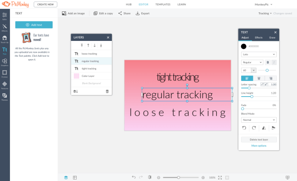
Adjust tracking in the Text palette using the Letter spacing slider.
Tracking. Tracking is a graceful nudging of all the letters in a selected area to be further apart or closer together. If you’ve seen an accordion being played, it’s a lot like that. Tracking is commonly (and understandably) confused with “kerning,” which refers to spacing between individual letters.

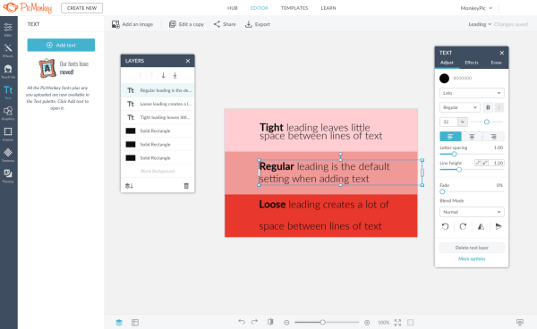
Adjust leading in the Text palette using the Line height slider.
Leading. Back in the olden days when words were printed on paper using a press, strips of metal (lead!) were placed between the lines of laid out text to ensure consistent spacing. Hence, the term leading (rhymes with “bedding”). It’s mostly used these days by professional typesetters or graphic designers, while the rest of us simply call it line height.
The importance of letter spacing
We’ve previously discussed how spacing is the queen in typographic hierarchy. A little extra space is not simply a pleasing aesthetic—it’s scientifically superior, in some instances. Studies revealed that increased letter spacing translates to faster, more fluid reading in both kids and adults.
But sometimes letter spacing a design choice that’s more about creating a vibe. Throw in a quaint curve and some well-paired fonts, and even a smidge of copy can become the linchpin of a killer campaign.

Loose leading and loose tracking demand more of the reader
On the flip side, there’s the alternative approach of eliminating space. Campaigns or entire brands can be defined by an intentional snugness among letters, up to and including the “chainlink” look.

Tight or snug tracking, as seen in this design, can be bold and powerful.
Do you, boo. With the tools at your disposal, the only true offense to your audience might be the just-rolled-out-of-bed appearance of default spacing. A little effort goes a long way.
Use tracking and leading in the PicMonkey app
Your mobile designs can hang with the best of them. On the PicMonkey mobile app, tweaking your tracking (letter spacing) and leading (line height) takes just a few seconds and can add heaps of swag.
To adjust letter spacing (tracking) in the PicMonkey app:
1. Tap the text you want to edit, select the Style tab, and tap Letter Space.
2. Move the slider to the right to spread letters apart, and to the left to bring them closer together.
3. Tap the checkmark in the upper right-hand corner to apply.
To adjust line height (leading) in the PicMonkey app:
1. Select your desired text box, then tap the Style tab, and tap Line Height.
2. Move the slider to the right to spread lines apart, and to the left to bring them closer together.
3. Checkmark to apply—done-zo!
Once you’ve given your letters and lines their much-needed spacing adjustment, go nuts on any other customizations. Grab your text box with two fingers; swing it around, pump it up, shrink it down. Pop a drop shadow on that thing. It’s your text—have some fun with it!
