Words are often relegated to the periphery of a picture, as a caption or a headline. They quietly serve their purpose of conveying information or explaining an image without interfering with the main attraction. But more and more, design trends are blurring the lines between text and image, breaking down the barriers that divide them. Text is being used as an integral part of the image—creating it, completing it, commenting on it.
Letters and pictures unite
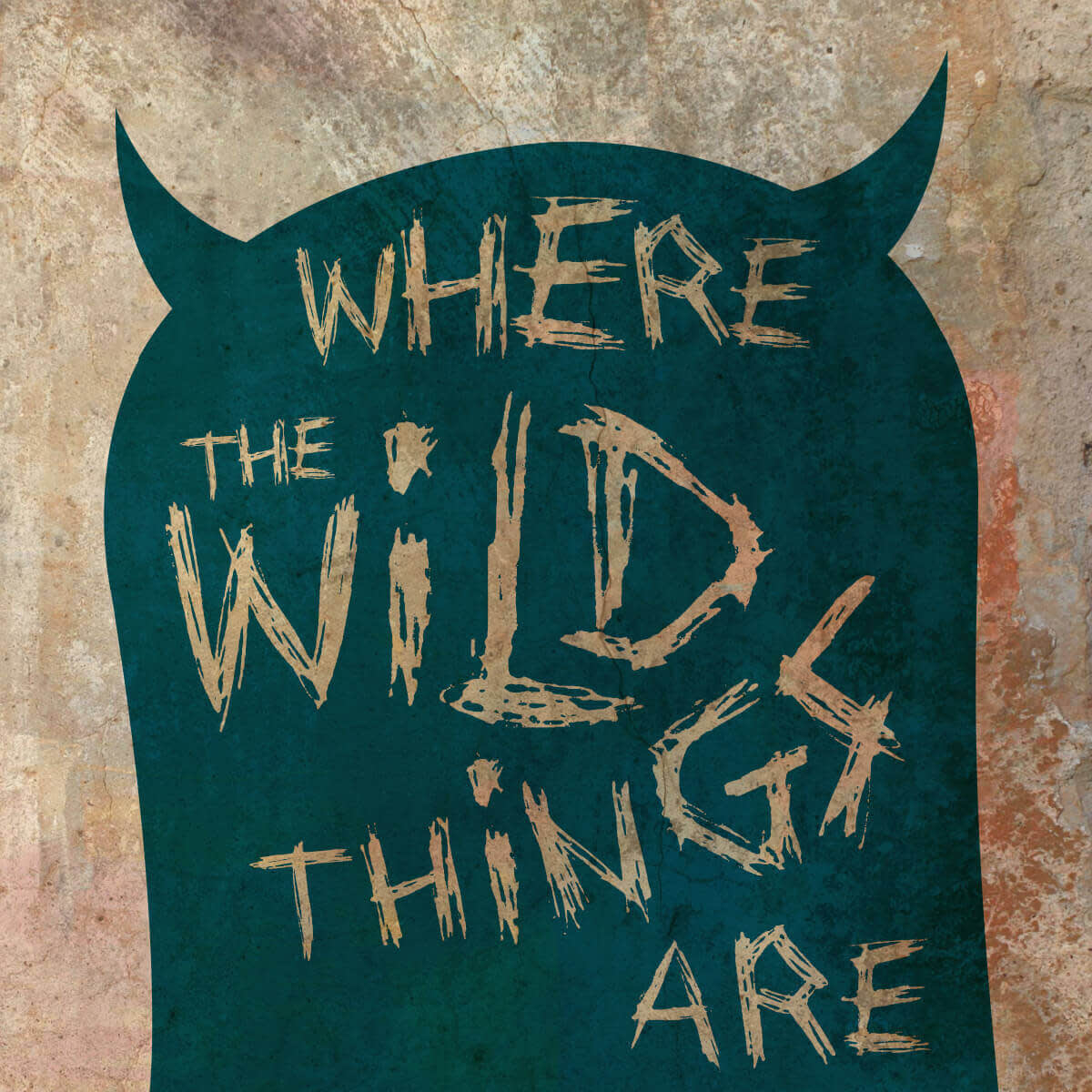
Our design for the beloved children’s book, “Where the Wild Things Are,” takes an iconic image from the story—the hood of the onesie that Max wore—and places the title on top of it. The wild-and-crazy-looking Drawing Blood font with letters of different sizes set at odd angles further evokes the mischievousness and mild scariness of the book.
Get the look:
Begin with a blank canvas, either white or a light cream color.
Add a Critter graphic in a dark color. Make the graphic a silhouette by making Color 1 the same as Color 2 and erase any parts you don’t want.
Add a light-colored or white text on top of the graphic.
Add a Smudge texture to the background.
Select the critter and use Blend modes (the Graphic option) to allow the textured background to show through, using the Fade slider to adjust the amount.
Select the text and do the same.
The art of the font
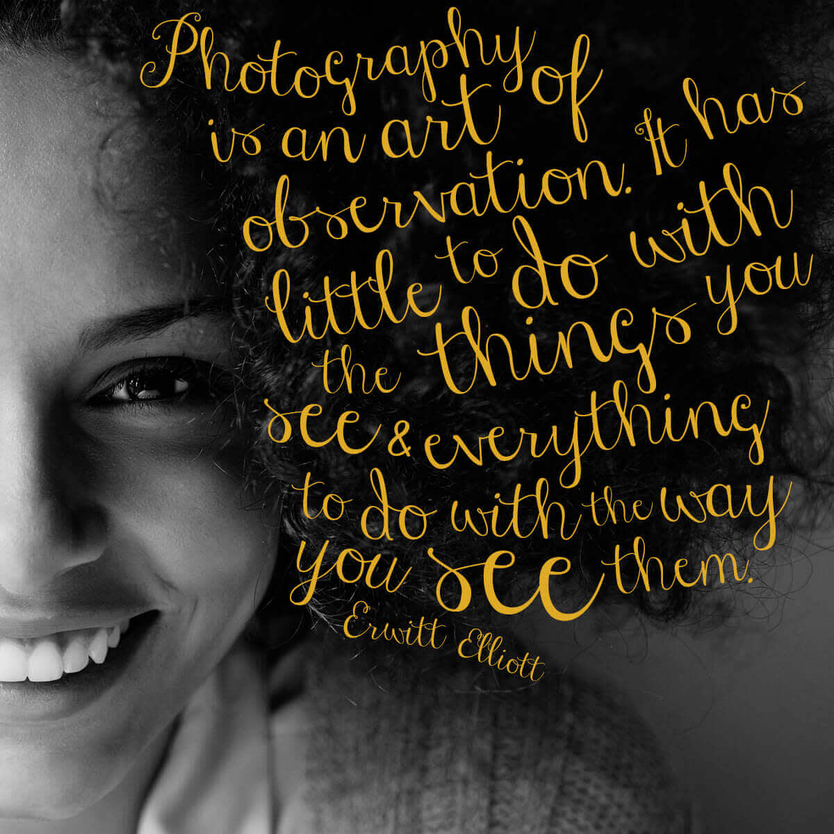
Some fonts are so pretty they can be used to decorate, not just explicate. The delicate swirls of a lovely script, the zany embellishments of a graphics-heavy font, or the carefree naturalness of handwriting can add a whole other dimension to your image. Viewers might be so mesmerized by the beauty of the font that they won’t even read the words at first. But once they do, they’ll be able to see the deeper meaning of your design and how the text and image work together so harmoniously.
This style is perfect for inspirational quote images. These motivational designs are so ubiquitous on social networks that the words of wisdom we’re trying to impart are getting lost in a sea of sayings. You can make yours rise to the top of people’s feeds by placing your quote on top of an image and playing with the shape and placement of the letters.
Tip: This image uses Janda Stylish Script in a bright yellow, which contrasts nicely with the black and white photo. Create and place each word separately to follow the lines and curves of the photo. In some cases, you may need to place two parts of one word separately.
Part text, part image
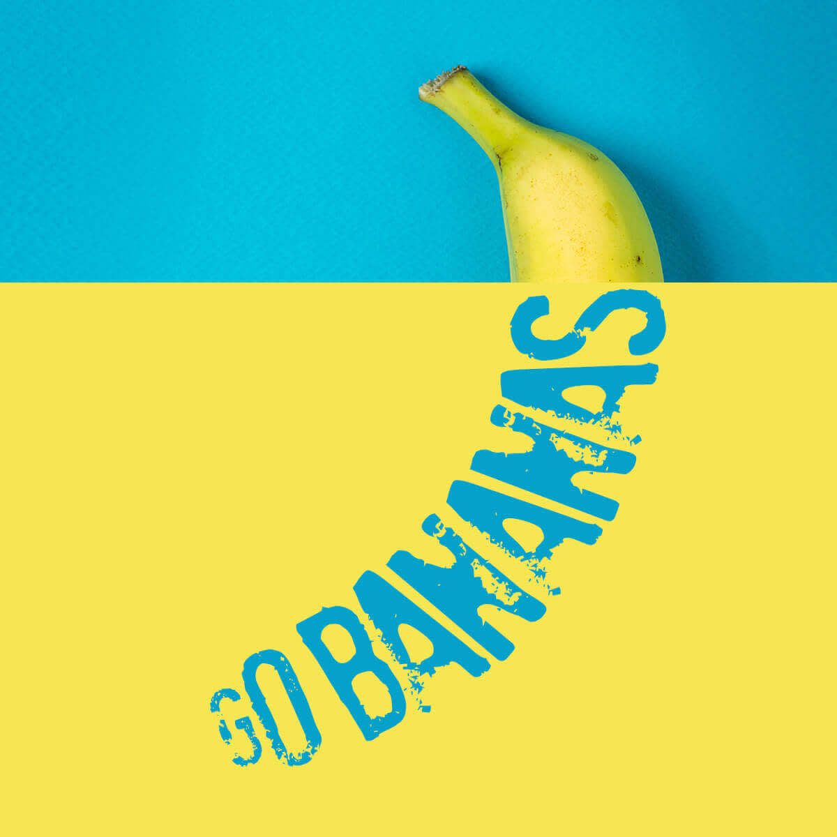
Look, text has had enough. After years of playing second fiddle to the image, it’s taking a stand. Not satisfied with being placed on top of an image, these feisty letters are replacing images—or at least portions of them. In this example, the text “Go Bananas” actually becomes a banana, simultaneously emphasizing the words and image, uniting them in a semiotic dance of symbolism and meaning. Mind blowing, right?
Tip: This design started off as a picture of a banana on a blue background. We then added text in Stampete one letter at a time over the banana, adjusting the shape and angle of the letters to match the outline of the banana. Use the eyedropper tool in the color picker to select the color of the blue background and use it for your text. Then add a large yellow rectangle shape to a portion of the design, covering up your text. Finally, open the Layers palette and bring the text layers to the top, so they appear over the yellow shape.
Use words to build a shape
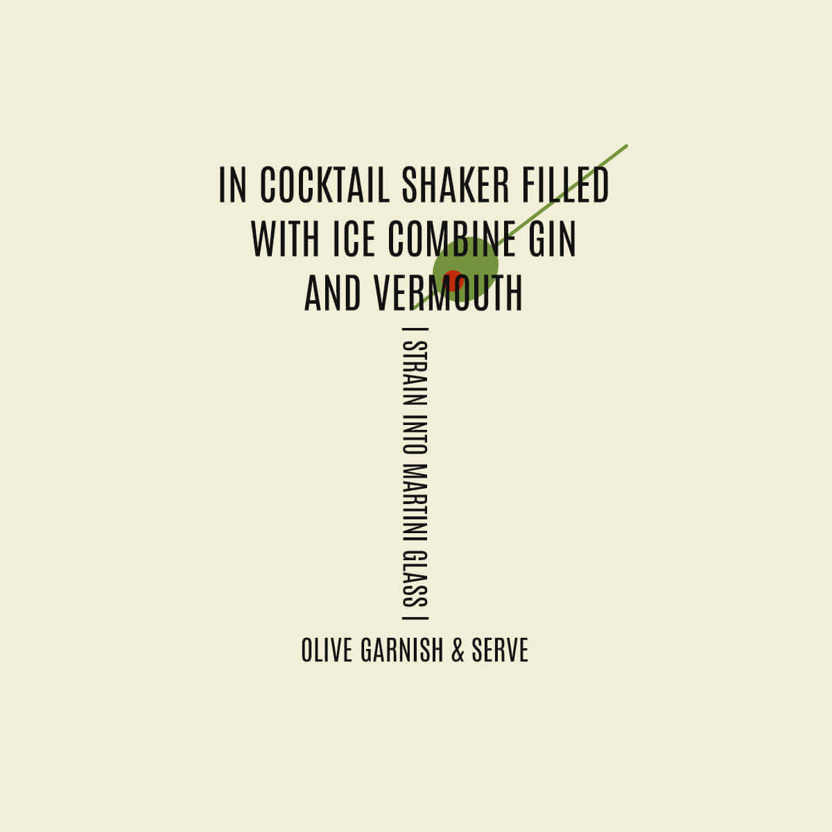
One trend in marketing these days is creating a puzzle of text in the shape of the product you’re trying to sell. Sure, you can just show a cup of coffee, but what if you could actually make that cup tempt the viewer with enticing words like rich, delicious, flavor, hot? You can change the font style, color, and size according to the product you’re selling. And if you’re not marketing a product, try using this technique for a party invite or baby announcement.
Tip: This image was created with five lines of text in the Antonio font, positioned to achieve the martini glass shape. The olive was made with shape graphics and placed behind the text using the Layers palette.
