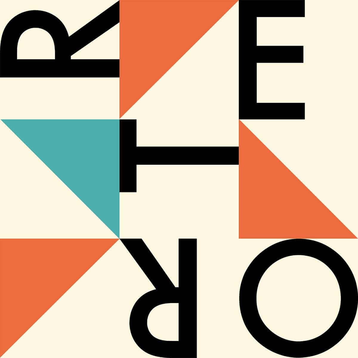
What’s mid-century modern design? Well, it’s a lot of things. It’s that really uncomfortable-looking brown couch in Don Draper’s apartment on “Mad Men.” It’s the opening credit sequence for Alfred Hitchcock’s “Psycho.” It’s the original corporate logos for IBM, AT&T, and United. This bold, eye-catching style has influenced everything from sofas to ski lodges, advertisements to album covers—and we think it’s high time for a comeback! So join us for a journey back to the 50s to see how you can infuse mid-century modern into your own designs.
Freewheeling and fun
A mere 60 years ago, fine art and commercial design converged to create the mid-century modern movement, which is considered a golden age in design. Revered by the art world yet accessible to the masses, it’s an amalgam of styles, from Bauhaus to Craftsman, cubism to futurism.
Mid-century modern has a definite playful side. Its illustrations are almost childlike in their simplicity, with bright colors, geometric shapes, and unadorned lettering. Lines are often uneven, edges are jagged, and forms are irregular. And yet, there’s a method to the madness. Mid-century modern design is based on an orderly, structured approach. It depends heavily on mathematical grids for placing objects. It puts a heavy emphasis on typographic elements, using clean, sans serif fonts like Helvetica, which happened to be invented in 1957 at the height of the movement.
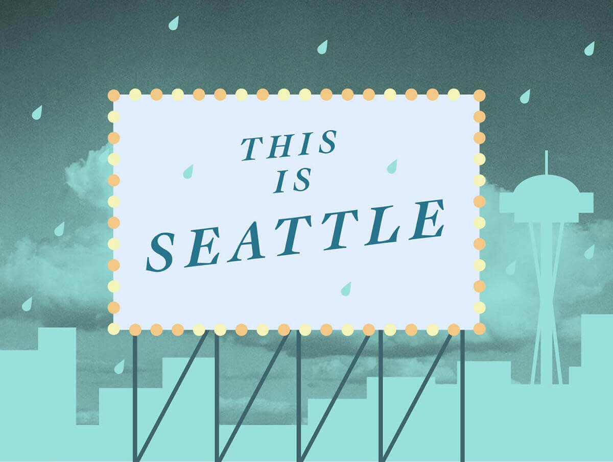
Tip: When creating a mid-century modern-inspired design in PicMonkey, Geometric graphics will be your best friends. Use these shapes to create your own graphic skyline and billboard like the ones in this image. The slanted Georgia font in the same shade of green as the sky unifies the design, and the raindrop graphic found in Symbols gives it a final flourish.
Playing with Picasso
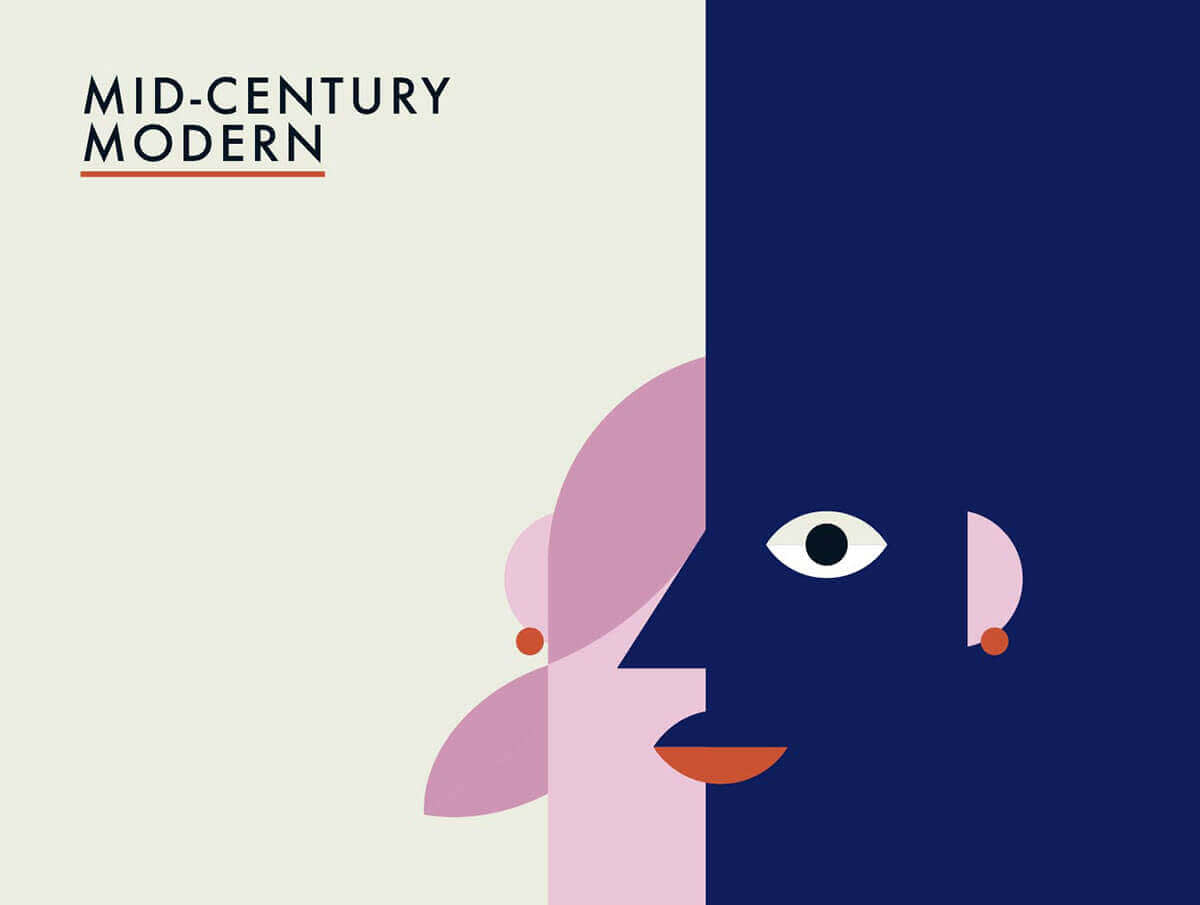
Pablo Picasso, one of the most important and influential artists of our time, had a major impact on mid-century modern designers. His use of geometrical shapes in nature, his constant toying with the human form, his borrowing from ancient art and sculpture, even his unique color choices and combinations show up repeatedly in commercial designs of the era.
Tip: Geometric graphics were used to create this Picasso-influenced image. The muted dusky rose color contrasts nicely with the bold navy blue, while the orange accents provide a burst of energy. The Futura font is classic mid-century modern.
Models and magazines

Cipe Pineles was a trailblazing graphic designer who made her mark as the art director of mass-market magazines like Glamour, Seventeen, and Mademoiselle. Not only did Pineles expose her mostly young female readers to a sophisticated look, she encouraged them to focus their energies on their careers and hobbies rather than finding a husband. One of her signature moves was to take a photo of a model and superimpose it on a stylized background composed of elements like swatches of color, leaves and flowers, or typed out words.
Tip: The secret to this re-creation of a Charm magazine cover is Blend modes. After making the background using a cream-colored canvas and rectangular pastel shapes, we put the image of an Audrey Hepburn lookalike on top using the Add your own button in Graphics. Then we used the Multiply option in Blend modes (in the Graphic palette) to play around with the transparency so that the shapes show up on top of the woman.
Cartoonish collage

Collage was a tool that mid-century modern designers used to amp up the energy, experiment with color, and add a touch of playfulness to their designs. Circular collages are perfect for giving designs a vintage feel, especially if you use colors like sea foam green, mustard yellow, and rusty orange. You can use collage for everything from book covers to party invitations to marketing fliers.
Tip: Circle collages are ridiculously easy to do. In Collage, click the paint pallet icon on the left to go to Background. Move the Corner rounding slider all the way to 100% to create circular images. You can give your collage that extra bit of retro-ness by choosing a cream-colored background, which will make it feel slightly old and weathered.
Heightening the drama
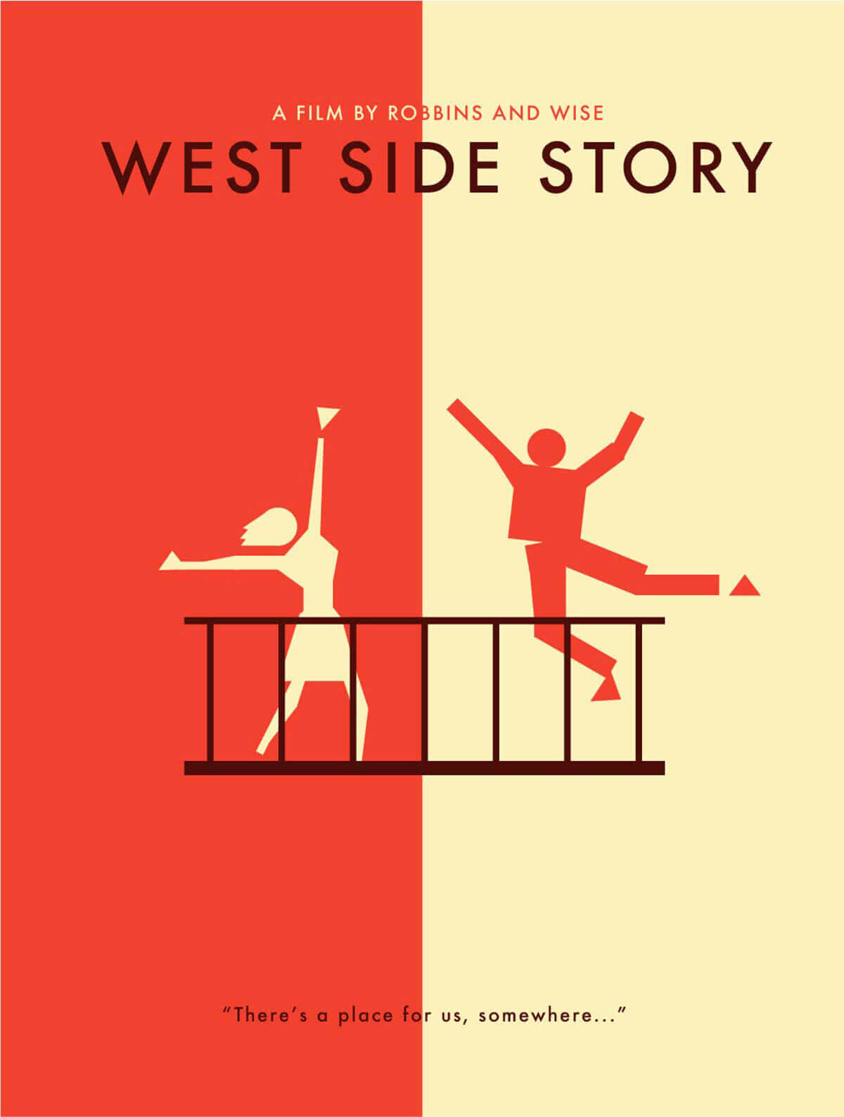
It’s no coincidence that the opening credits of “Mad Men” borrow heavily from Saul Bass. Considered a master of the form, Bass’s title sequences embody the mid-century modern aesthetic. There’s the disjointed body parts of “Anatomy of a Murder,” the protruding lines bisecting text of “Psycho,” the brightly colored undulating waves of “Charade.” Bass said that one of his goals was to get the audience to see familiar parts of the world in an unfamiliar way, which perfectly describes the essence of mid-century modern.
Tip: Using shapes to create body parts is a hallmark of Saul Bass’s style. Try it with our Geometric graphics and don’t worry if it looks a little sloppy—that’s part of the appeal. Another cool technique used here is bisecting the canvas with two contrasting colors, then placing images on either side using the opposite color. The simple, blocklike Futura font in dark brown used for the title echoes the balcony holding up the dancers.
Simple geometry

Geometrical shapes pop up everywhere in mid-century modern design. Sometimes they’re cobbled together to create a human face, a horse, a flower, or a musical instrument—stretching our imaginations and how we see things in our daily lives. And sometimes they’re used in their simplest forms, as building blocks, components of patterns, or large fields of color. These designers could take two shades of purple, a basic font, and a few hard edges and create something astounding.
Tip: To create an image like this, you’ll need to know a few simple tricks. First, to make elongated triangles, hold the Shift key while you resize the basic triangle shape, which will change its aspect ratio. Second, you’ll need to add your photos as graphics so that you can place them on top of the shapes and use blend modes to adjust the transparency. We’ve got a tutorial about how to do this with text, but it works just the same with shapes. Finally, you can find that drop shadow effect under Effects in the Text palette.
