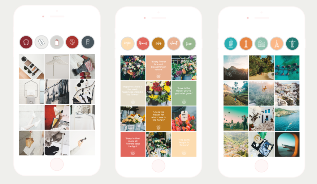
Planning your Instagram feed in advance layout can result in great page looks like these
Planning a beautiful and unique Instagram feed certainly takes extra effort, but a well-thought out grid is so worth it when the result is gorgeous. We’re seeing Instagrammers getting more and more creative with their page layouts, curating a whole feed in matching colors, or mixing up quotes and pics in a checkerboard page layout.
In this article we’ll explore how to get started with Instagram feed planning, offer inspiration and examples of impressive accounts and how you can get the same look with PicMonkey and we’ll link you to tools to help make your Insta-vision a reality. Let’s get going!
Define your brand’s look with a moodboard
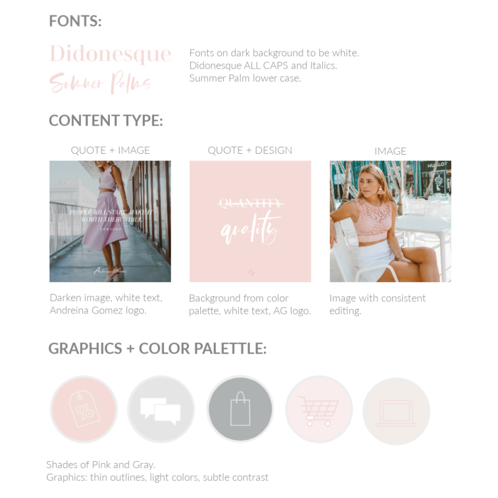
PicMonkey’s Senior Social Media Manager, Fabiola “Fabs” Millican, recently helped her friend’s clothing business plan out a stylish and professional-looking Instagram feed. Before making any posts to the ‘gram, Fabs created a moodboard to define what the brand looked like, including fonts, colors and three types of posts that could best tell the business’ brand story.
In the mood board above, you can see that Fabs chose soft colors, simple styling and attractive fonts that convey the brand’s feminine, tropical aesthetic while never overwhelming the actual product.
When posting to Instagram in the future, the brand can alternate post types—image + quote, quote + design, or image—in any order, and the overall feed will continue to look consistent as it grows because all three post types play well together.
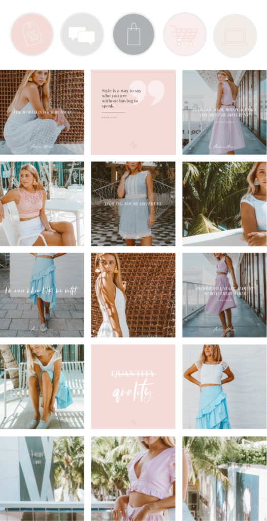
A feed mockup using various post types
The result is an Instagram feed with a cool layout that looks professional. The careful attention to design shows that the business behind it cares about its products and about its customers’ experiences. Read more about creating moodboards in our article and tutorial How to Make a Brand Moodboard.
8 Instagram layout ideas that will inspire you
We’ve combed through some of our favorite accounts to find inspiring examples of unique Instagram feed layouts. Check out these different ideas below and learn how to get the look in PicMonkey.
1. Alternate post types for a checkerboard effect
The checkerboard layout employed by Brit + Co and StichFix is arguably the easiest look to achieve and to maintain because it’s simply alternating two post types. No shade intended though because this image/quote layout looks fantastic! It demonstrates how versatile quote posts can be because you can change the text, color and font, add a graphic or a textured background.
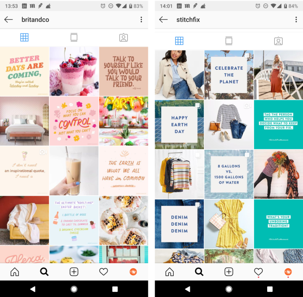
Get this look in PicMonkey: Using an Instagram post template or a blank canvas sized for Instagram, you can design your own quote template. Just open a template and design to your preferences. Your work will save to Hub automatically, remaining infinitely re-editable. That means you can return to the editor, open a copy, and quickly change up the text or color or background to create new posts.
2. Get colorful with a rainbow/ombre layout
This type of feed pays close attention to creating a subtle transition from one color into another. Space Tie is winning at the ombre effect from orange to yellow, while Nailed It! Media is going for the jewel tone, rainbow look.
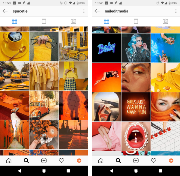
Get this look in PicMonkey: Use Tint in the Effects tab from the left menu to color your photos, and use the Fade slider to pump up or tone down the color as you like.
3. Make some room for borders
This airy style gives viewers a little breathing room by leaving extra space around images, and evokes an analog, Polaroid collage look. You can do a simple square border, or alternate image formats like Garance Doré and Dita Eyewear has done, using both portrait and square formats, to give a more visually interesting look.
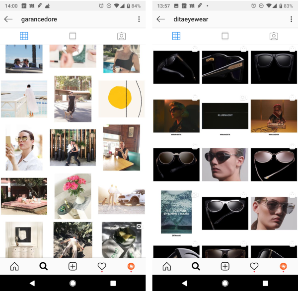
Get this look in PicMonkey: Start with a white blank canvas in the size you prefer. Click Add an image to bring in your photo. Use Resize under the Edits tab to shrink down your pic, leaving space around the image.
4. Get matchy-matchy by consistently using one filter
Have a favorite color or a hue that you want to associate with your brand? Don’t be afraid to stick with a single tone for your feed. It works like a dream for Victoria Suzanne and Nat Loves That and it’s easy to manage because you know that all the posts will match when you’re using the same filter.
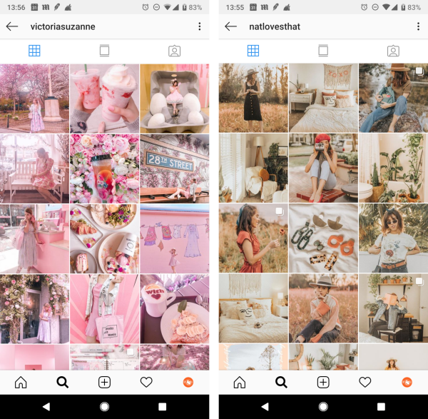
Get this look in PicMonkey: In the Effects tabs you’ll find a wealth of filters that you can apply to your images. Check out Pink Fog to get the @victoriasuzanne look, or go for a more nostalgic sepia tone like @natlovesthat by applying the Tranquil or Dusk effects.
5. Spread out with the giant square look
You’ve probably seen this giant square style of posting before and exclaimed, “Whoa!” and wondered, “How’d they do that?” because it looks so freaking cool. The easy-peasy way to do this is to employ an app like Later, Preview, or Instagram’s own Layout app to create this kind of post, like choreographer Anna Matuszewski‘s big format portrait.
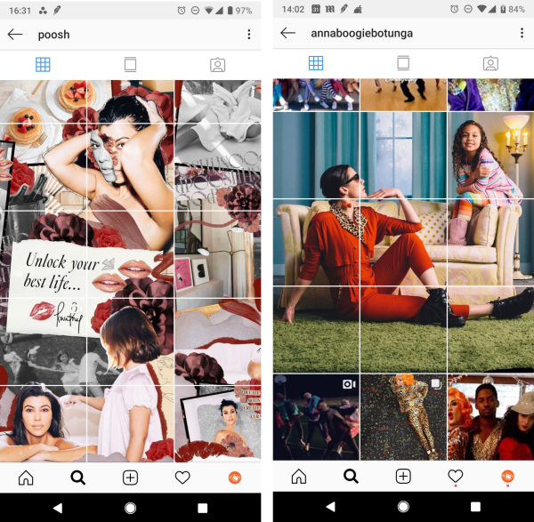
Get this look in PicMonkey: Before you use a layout app to create your giant square, you can spiff up your pics with effects, or even add graphics. We love how Poosh created a scrapbook-looking collage image. To emulate this look, add our ripped paper graphics and script fonts to your images, in PicMonkey, before exporting to your computer.
6. Stay true to your aesthetic with brand colors
If your brand is associated with a particular aesthetic, or you want it to be, consider staying within your moodboard colors for all your Instagram posts. The Madewell brand evokes a simple and down-to-earth ethos, so terracotta and sky blue works beautifully in their feed, while Eileen Fisher is known for a neutral palette, which is reflected in their feed.
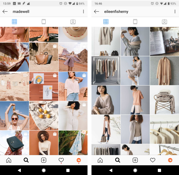
Get this look in PicMonkey: The idea here is that your feed has a cohesive color scheme, so use the hex codes or the eyedropper tool to color backgrounds, graphics, or text in your image.
7. Put the pieces together with a puzzle layout
This page layout is unexpected and invites the eye to roam around in a different way than when viewing a standard Instagram layout. Above, CND and IAmAlexFord work that layered look, collage look.
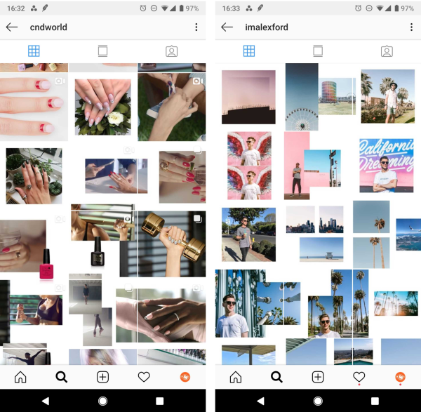
Get this look in PicMonkey: On a blank canvas, add your images, arrange and resize to get the layered look you desire. Make your canvas twice as wide as an Instagram post (2160 x 1080 px), lay out your photos, then use the Crop tool to cut your image into two, perfectly-sized Instagram posts.
8. Layer in mod graphics with overlapping designs
To be perfectly candid, we��’re not entirely sure of the method that Gina Martin and Treasures & Travels Blog used to achieve this layout magic on a large scale, but we do know that it looks terrific with mod graphical elements like paint smears and squiggly lines overlapping the images.
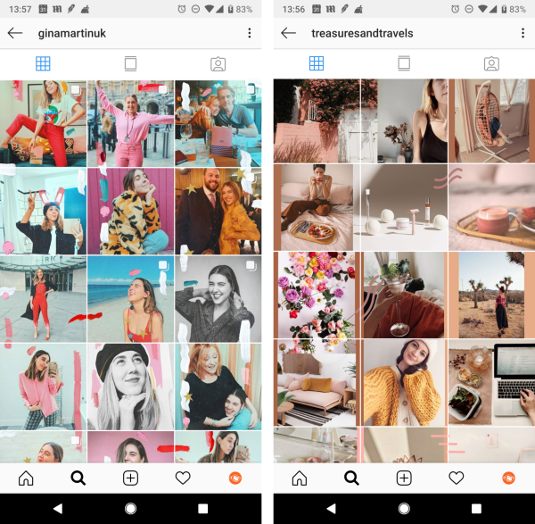
Get this look in PicMonkey: You could create two or four Instagram post photos with overlapping graphics by sizing a blank canvas to accommodate two side-by-side pics (2160 x 1080 px), or a square of four (2160 x 2160 px). Click Create New in the editor, then enter your custom sizes in the upper right corner, last, click Make it! Bring in your images and choose from our library of graphics to layer over them. When done, use the Crop tool to divide your canvas into single 1080 x 1080 px Insta posts.
Feed layout and planning tools to make your life easier
You needn’t cut and paste and section and crop all day long, friend, we know you have better things to do. So after you polish your pics to perfection in PicMonkey, try out these tools to arrange your posts, visualize different layouts, and to schedule the cadence in which they post.
The result of grid planning is a feed that looks both cohesive and gorgeous using a combination of post types which adhere to your brand’s style guidelines. The key to achieving these looks is planning ahead by considering what a full grid of posts would look like, perhaps drafting mock-ups before creating the posts, and then scheduling them to post in the proper cadence. Millican says a feed that looks as good as these is, “good for at least two weeks.”
