Austin Kleon, author of Steal Like an Artist, said, “You don’t want to look like your heroes, you want to see like your heroes.” Great advice if you want to emulate an aesthetic without simply copying it. If you look at what those you admire are trying to accomplish, and how they’re doing it, you can put your own stamp on a technique or look.
Here are some movers and shakers (look it up) who design with PicMonkey and totally kill it on social media. Let’s take a peek under the hood and see how they’re doing it.
@hayleymariemcbride

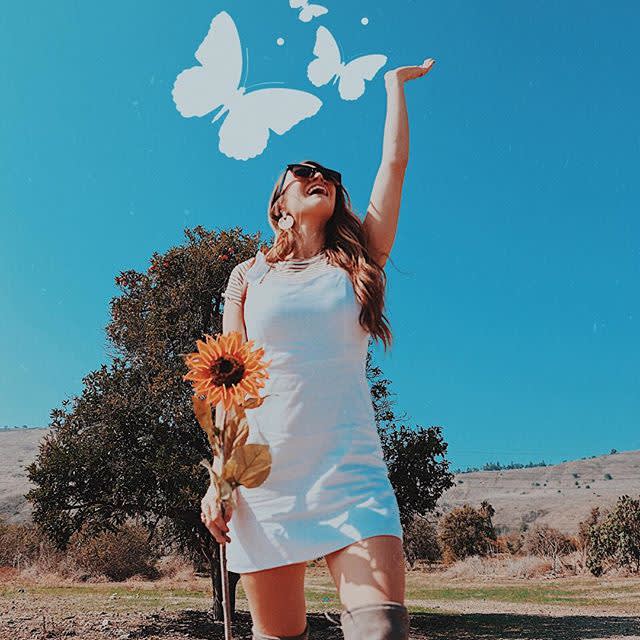
So we’ll start with some adjectives: exuberant, joyful, radiant. Having an idea of a theme or an idea you want to illustrate can provide a foundation and direction for your project.
The first step might be choosing an effect that plays with the lighting. For an image like this, that might be Boost to emphasize the sunlight and blue sky. And about that sky? Was it cloudless in the original photo? Dunno. But clouds would draw the eye away from the central image and the butterflies. Removing distractions like that is the perfect application of our Clone tool.
Now to the butterflies. Those are a graphic from the Animals section under the Graphics tab (desktop) or the Nature tab (mobile). Use the Eyedropper to make their color match the image’s palette, and you’re flying high.
@denise_angela

So what’s the artist going for here? Maybe and expression of whimsy, maybe a celebration of autumn, maybe an acrobatic audition. The design is a great example of how something as simple as a brushstroke can totally make an image stand out. Again, starting with the Eyedropper or Color Picker is a quick way to match colors.
To create this type of look, use the Draw tool to make some quick diagonal lines across the whole image, then use the Erase tool to remove the lines from your subject, creating the illusion of depth. And don’t forget the mini pumpkins. We recommend one per hand.
@larissa_anotherday

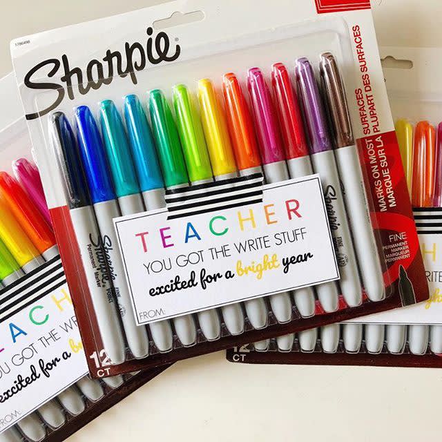
Sure, you can print pretty much anything you create in PicMonkey, but designing specifically with print in mind can produce eye-catching results with traditional print elements, like fonts, colors, and borders. That’s all that’s being used in the design above. Changing font color to reflect the colors of the product and to provide emphasis are visual cues that draw the viewer’s attention to specific words. Imposing limits on yourself based on what will print well might spark a different type of creativity.
@Hanenah19

And lastly, how about some flat lay photography? Grab a few items that inspire you, compose the shot, and make some final edits in PicMonkey. You can go as elegant or chaotic as your mood dictates.
