
Start branding fast with a color palette template.
Knowing how to make a color palette is an essential early step in presenting your brand to the world. The colors you choose will serve as a visual narrator for your audience, telling the story of your brand's personal aesthetic.
Color palettes make it easy to quickly replicate your brand’s look when creating your website, digital assets, social media posts, and business cards. Add a color palette to a mood board containing images that represent your brand, and you’ve got a full-on handy dandy branding kit.
Now here's how to make a color palette for the very first time.
How to make a color palette in 5 steps
Open a color palette template in PicMonkey.
Swap the template's images with your own.
Select one of the color palette cells and click Change color on the left tools menu.
Use the Eyedropper tool to extract colors from your images and create a brand palette.
Download or share your color palette.
1. Open a color palette template in PicMonkey

The easiest way to create your brand color palette is by using one of PicMonkey's color palette templates. Of course, if you'd prefer to start from scratch, you can always make your own palette with our Collage tool.
To use a template in PicMonkey, just click Create new at the top of the PicMonkey hompage, then click Templates and search "color palette." Select the one you want in order to preview it in the Editor.
2. Swap the template's images with your own

Next, you'll want to either swap the template's images with your own, or browse our stock photo library for images that represent your brand.
In our example, we're an oddly-specific Chicago-based pizzeria called Chicago Joe's. The images we chose have the aesthetic we're going for, while also featuring a range of light-to-dark hues that we can choose from. We want to capture the colors of our pizzas, while also nabbing a bit of that city feel...the golden warmth that comes from fresh baked 'za, as well as eating said 'za amongst the vibrant hues of the city at night.
Need help choosing colors? Start by learning the basics about color theory.
3. Select a color palette cell and open the color picker
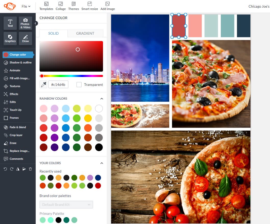
Click one of the color palette cells in your template to open up the Graphic Tools menu on the left. From there, click Change color. This will open up the color picker.
4. Use the Eyedropper tool to extract colors
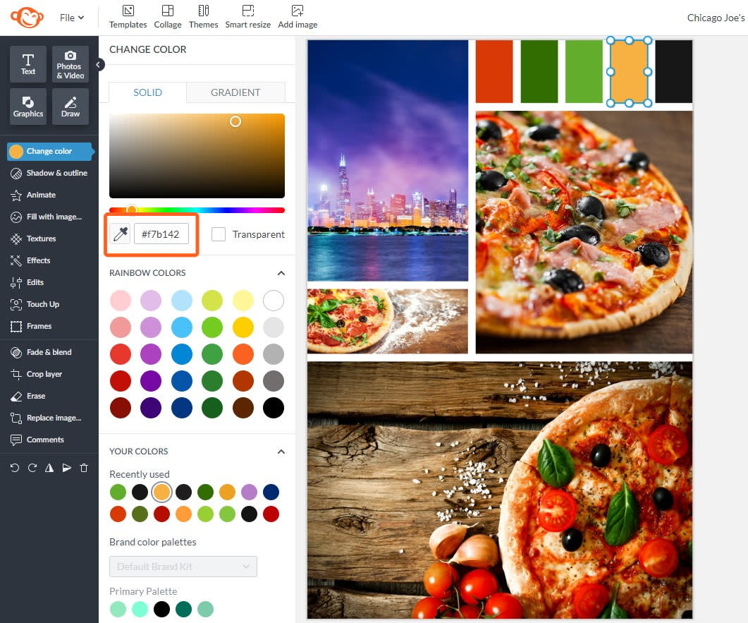
Use the Eyedropper tool to select the prominent colors in your photos by hovering over the images until you find a color you like. The hex code of the color will display— it’s that 6-digit string of letters and numbers that digitally represents a color.
In our example above, we've extracted colors from our images and filled the color palette cells with them. The yellow-gold we extracted has a hex code of #f7b142.
Why does this matter? Well, now you know exactly what shade of yellow it is, and you won’t have to try to match it or guess when you make a new design — just enter your hex code for a perfect match and your branding stays consistent.
5. Download or share your color palette

Your finished design will autosave in PicMonkey’s integrated cloud storage, Hub, which you can access from anywhere. That means you can come back to your branded image files anytime and update them as you desire because they remain layered until you export them.
Share your color palette with your team, your designer, your product packaging vendor, anyone you want, by exporting your file directly to email or through file sharing via a unique link from Hub.
Click Download on the top toolbar to save your design to your computer.
Pro tip: Have your colors? Good — time to build your complete brand kit.
Tips for choosing colors using the color wheel
Remember, you can build a color palette from just one image if you want to (and our color palette generator can do this for you in seconds). Even the simplest of images contains more colors than you may realize at first glance, and having an idea of which types of colors play nicely with each other can help you pull the right ones from your picture.
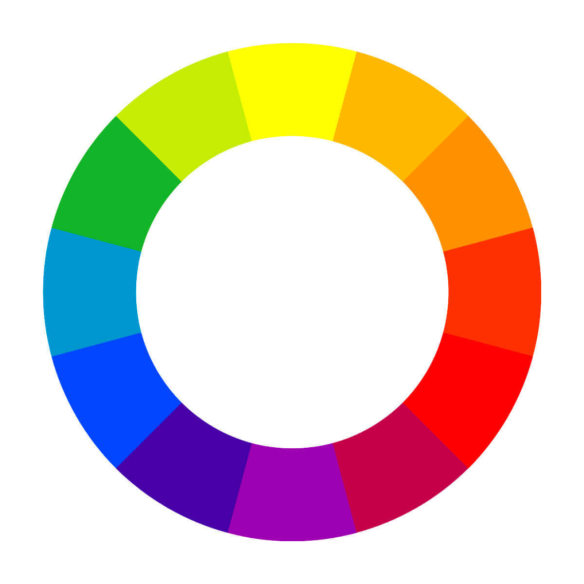
Consider this color wheel and with the bullets below, learn how you can reference it to choose a harmonious color scheme.
Monochromatic
Different tints (base hue + white), tones (base hue + grey), and shades (base hue + black) of one color, plus a neutral. Discover how to effectively use monochromatic colors in your designs.
Complementary
Colors opposite each other on the color wheel in different tones, tints, and shades.
Analogous
Colors that sit next to each other in the color wheel.
Split complementary
Pick one color and find its complementary color (the one right across from it on the color wheel). Then find the colors on either side of the complementary color. Those two colors and your original color make up a split complementary color scheme.
Triadic
Colors that are evenly spaced around the color wheel.
Tetradic
Involves two pairs of complementary colors.
Pastels
Pale versions of saturated hues that are soothing and light-hearted. Learn more about pastel colors and how to use them.
For more information on creating color palettes for your marketing materials or making secondary color palettes, check out the articles linked here.
