Confession time: even here, in the hallowed halls of PicMonkey HQ, we occasionally create graphics that are … well … not all we hoped they’d be. Maybe it’s the sheer number of options. Maybe it’s the fact that most of us are not actual designers. Either way, we sometimes need serious design tips.
In that spirit, we asked PicMonkey designer Crystal Goade for five tweaks that would make our designs better. Because Crystal is generous and awesome, instead of telling us “go away, I have a real job to do,” she sat down and walked us through it.
Here are five tweaks to three designs that took them from meh to a-MEH-zing—in about five minutes apiece.
Intern Cooper: Halloween gig promo poster
Cooper’s our intern-of-all-trades, sportfully ping-ponging between projects every time one of us leans over her desk to be like, “Hey buddy, got time for one more project today?”
She crafted the following gig poster for an imaginary Halloween concert. Thanks Cooper!

Now, this graphic’s got a lot of the elements you want to see in a Halloween event poster: prominent orange and black, lots of big energy, and a dripping, spattery grunge label. (The grunge is an especially nice touch for a band.)
That said, Crystal saw room for improvement. Here are her five tips for instantly embettering this graphic:
To keep focus on the band, remove the Polaroid frame and enlarge the photo so it covers the whole canvas.
Maximize the sloppy grunge feel of this graphic by taking that Label graphic and making it biiiiiiiiiiiiiiiiig. However, we still want our chaos to be the controlled variety, so slim down its color palate from two colors to just basic black.
Change the top and bottom fonts to Futura Medium to make the display font (Shlop) stand out. Futura Medium is a clean, simple Sans-Serif, ideal for communicating supporting information like time and place.
Once again, we simplify! This time, it’s graphic reduction: get rid of the spiderwebs and change out the pumpkin frame for a simple black bar.
Straighten the bottom text, align it left, and move “The Spooky Pumpkins” onto our label. This completes the poster’s font hierarchy: the decorative display font is big and bold, right at the top. The smaller supporting font is clean and super-legible.
When you do all that, here’s what happens!

Now that’s hella readable.
Anne: Prom dinner invite
Anne is our management and organizational maven. She keeps the trains running on time here in the Marketing department, but without the hideous excesses of fascism. And Anne’s daughter is graduating this year! Sounds like time for a prom-night dinner.

We loved a lot of things about this invitation. First of all, helloooooo glitter! We just talked about getting a glitter look through text masking, and we were thrilled to see Anne dive into the trend. Furthermore, Crystal informed me that Anne’s main font choice (Lobster Two, if you dig it) was spot-on for this design.
That said, she had some constructive critiques:
This card uses text masking, so the background should be either black or white. To keep it light and fun—a good choice for springtime parties—go with white.
Embiggen the skyline graphic so it fills up the whole bottom of the canvas.
Remove the curlicue graphic.
Now, clean up the text! This involves resizing (the display font stayed about the same, but the supporting text got smaller); changing the date, time, and “Class of 2016” to a bolded Lato; getting rid of the drop shadow, and changing the supporting text to black.
Add a soft filter like Rapture, faded from the default slightly (we went to 40%).
Here’s the after shot:

Kind of amazing that this is still essentially the same design, right?
Elisa: book cover
What? Me??
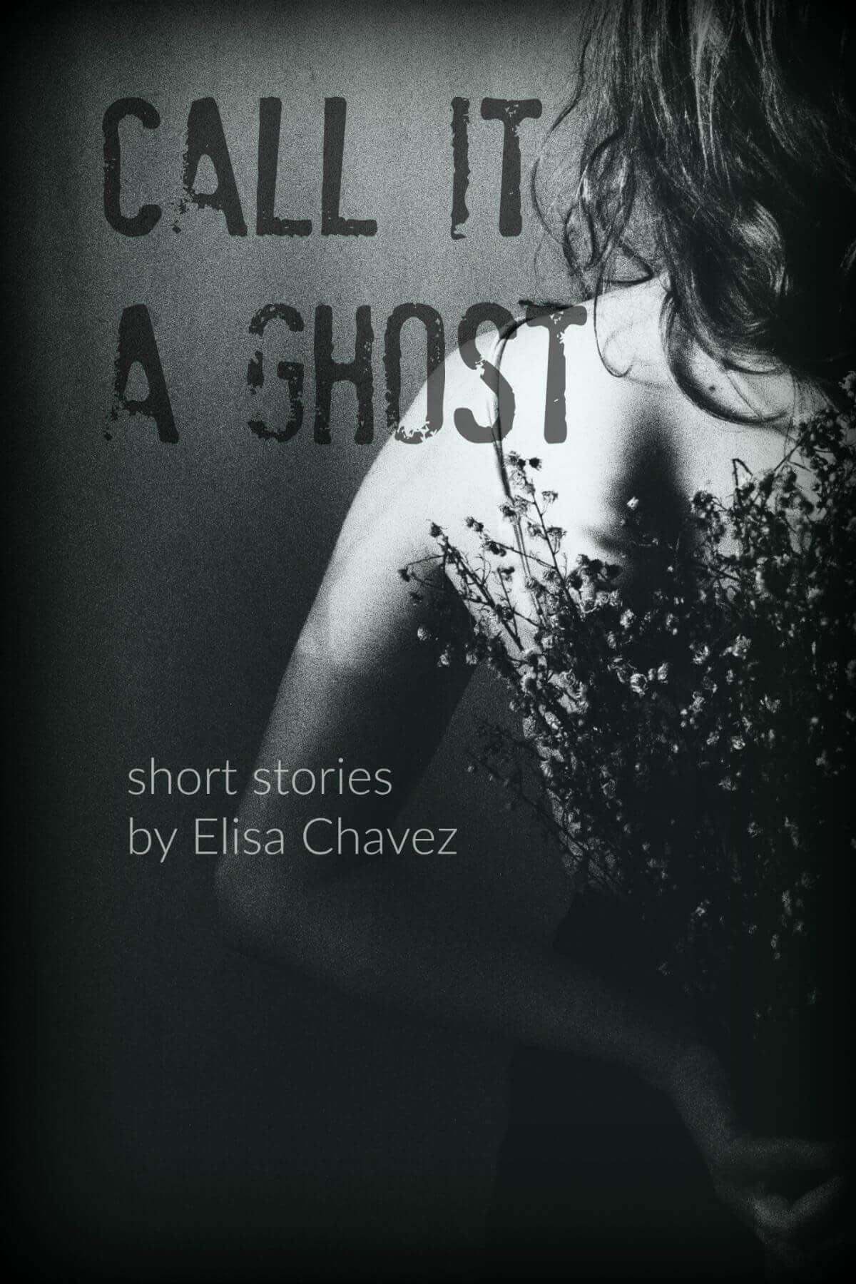
Yes, readers, like all your most pretentious friends, I cherish ambitions of publication. As a result, I’m constantly noodling on cover designs to “inspire me to finish something one of these days.” Here’s my latest attempt, created for a not-yet-written folder of scary short stories.

Crystal gave the designer thumbs-up to my choice of image, the title font, and the semi-transparent, “ghostly” text. However, she also offered some gentle-yet-insistent advice:
Creepify this image by turning it black and white. Crystal suggested using one of my saved custom effects, and it worked like a charm.
Make the title bigger and give it more breathing room by tapping it in and down slightly.
Change the support font to something lighter and slimmer. (Once again, we went with Lato: it’s just a good choice.)
Change the text’s blend modes: title to Multiply, subtitle to Normal.
Last of all, amplify the ghostly quality of the title and subtitle by fading both: the title went down to 40%, while the subtitle was faded to 35%.
Once I did all that, this is what I had:

Gorgeous gothic spookery! I was totally bowled over by how Crystal’s tweaks took what was in my head and made it visual.
